4th of July Sale
50% Off Bookmap Global+, Data & Add-Ons
Save on Global+, market data, and add-ons from July 3–13.
News & Announcements
March 30, 2024
Updated
SHARE
Bookmap’s Stops & Icebergs Sub-Chart with MBO Data
See Stops and Iceberg Transactions with Precision in Bookmap’s Stops & Icebergs Sub-Chart
CME Market-by-Order (MBO) data is a rather new development and has many advantages for trading data visualization. Leveraging the unique characteristics of this data feed, Bookmap has developed some of the best indicators for day trading futures available. These tools offer traders a level of market transparency previously unseen and a huge edge for order flow trading.
A Brief Introduction to Market-by-Order Data
Market-by-Order data is a new data type disseminated from the Chicago Mercantile Exchange (CME) for Futures markets. It differs greatly from the older traditional Market-by-Price data. Here’s a brief explanation from CME website:
“Market by Order (MBO) describes an order-based data feed that provides the ability to view individual queue position, full depth of book and the size of individual orders at each price level. Market by Price (MBP) is the price-based data format that remains available and delivered in the same data feed. MBP restricts updates to a maximum of 10 price levels and consolidates all the quantity into a single update for each price level, which includes total quantity and number of orders. Individual queue position and order sizes cannot be determined with a high degree of accuracy.”
Advantages of MBO Data
Right off the bat, we can see three major improvements with MBO data.
- Full order book depth; it is not limited to a maximum of 10 price levels.
- Transparency into the size of orders at each price level.
- Details of the orders’ position in the queue at each price level, including your own limit orders.
MBO data offers a great step forward in market transparency for CME Futures—and combined with Bookmap’s innovative tools—greater insights gained from market depth analysis. Let’s take a closer look below.
MBO Advantages with Bookmap
Bookmap offers a MBO Bundle addon available from the Bookmap Marketplace. Please note Rithmic Futures data feed and CME data is required in order to use the addon bundle.
The MBO Bundle addon includes:
- Stops & Icebergs Sub-Chart Indicator (SI Sub-Chart)
- Stops & Icebergs On-Chart Indicator
- Liquidity Tracker Pro
- Tradermap Pro
Bookmap’s MBO Bundle addon derives much deeper market transparency from MBO data thanks to Bookmap’s proprietary handling of unique MBO order IDs and the timestamp arrival of orders within the queue.
Introduction to Bookmap’s Stops & Icebergs Tracker
Included in Bookmap’s MBO Bundle is the Stops & Icebergs Sub-Chart. In this article, we will cover only Bookmap’s Stops & Icebergs Sub-Chart (SI Sub-Chart). The SI Sub-Chart precisely displays the transactions of Stop Orders and Native CME Iceberg Orders with precision. Let’s take a look at the indicator’s visual outputs and available configuration parameters in the addon’s settings.
![]()
Fig 1 – Bookmap’s Stops & Icebergs Sub-Chart outputted in the Subchart and Widget panel. The Iceberg Tracker is blue and the Stop Tracker is red. Note that Stop Orders and Iceberg can be displayed together or separately in the Subchart and Widget panels. Here they are displayed together.
![]()
Fig 2 – The way Icebergs and Stops are visualized within the Sub-Chart is customizable. Clicking the gear cog icon brings up a menu for output in Circles, Vertical bars, Horizontal bars, or Text format.
![]()
Fig 3 – Bookmap’s Stops & Icebergs Sub-Chart Settings User Interface.
Stops & Icebergs Settings
Bookmap’s Stops & Icebergs Sub-Chart has the following Settings Options as seen in Fig 3.
- Stop / Iceberg orders (Cumulative Volume Delta)
- Size – check one or both boxes to define a minimum and/or maximum of all executed Stop/Iceberg orders to be displayed on the Sub-Chart. Any number at or below the inputted minimum value up to the maximum value (if defined) will be displayed. If left unchecked, the Sub-Chart will display all executed Stop/Iceberg orders.
- Accumulate as
- SUM – each value is outputted and added to the previous cumulative output. For example, suppose the output currently reads as zero. If 10 buy stops transact, then the output would be 10. If another buy stop order of 7 transacts, then the output would be 17. Suppose a sell stop order of 5 transacts, then the overall cumulative summation would then be 12.
- EXPONENTIAL – each value is outputted in a cumulative fashion just as in the SUM setting. However, the output value begins to decay 50% (half-life) based on the selected time parameter. For example, suppose the last cumulative output was 12 and the 1 min time parameter was selected. If no other transactions occur, then after 1 minute the value of 12 will decay 50% and the output will be 6. If another minute passes without any new transactions, the output value would be 3. For practical uses of the EXPONENTIAL setting, please read about the Synchronizing setting below.
- RESET – each value is outputted in cumulative fashion just as with the SUM setting. However, the cumulative output resets to zero based on the selected time Parameter. For practical uses of the RESET setting, please read about the Synchronizing setting below.
- SLIDING – the total sum across the chosen time period is outputted and resets at the end of each interval. For example, If 1 min is chosen, those data are continuously outputted across that slice of time.
- SUM_SAME_SIDE – the value continues to accumulate on one side (buy or sell), until any orders are transacted on the opposite side, resetting the value to 0 and showing the last transaction. For instance, if at first 23 buy icebergs are transacted, and then another 17, the total output at this point will be +40. If just one sell iceberg order is transacted, the output automatically resets this new level (-1 in this case), accumulating the total sum of all sell icebergs until a buy iceberg is detected by the Sub-Chart, resetting the value once again.
- Axes vertical alignment – when the Symmetric Stops or Icebergs boxes is checked, the y-axis value is centered vertically in the Sub-Chart at zero. If the Symmetric option is selected for both Stops and Icebergs, then the y-axis values for only zero will be the same. However, all other outputted y-axis values will differ between Stops and Icebergs with varying vertical scaling. Checking the Align option instead will align their entire axis/axes.
- Alerts – An alert is triggered when a Stop and/or Iceberg at equal or more than the respective inputted volume value is transacted within a specific timeframe (measured in seconds). This threshold can be applied on the indicator’s values, and can be signaled by text and/or voice. The volume of the alert sound can be adjusted with the slider. Please note, alerts work independent from the Sub-Chart output values.
- Statistics – This box tracks the total Trades and MBO updates received since loading the indicator.
- Remove – if you want to remove the Stops & Icebergs Sub-Chart addon, then click this button.
- Auto enable – The indicator automatically enables at Bookmap startup.
- Auto load – The indicator automatically loads at Bookmap startup.
Stop Orders Sub-Chart Explained
Bookmap’s SI Sub-Chart identifies Stop Orders once they transact. Stop Orders remain unlisted on the order book, however once they are triggered and transacted in the market, these Stop Orders will be accurately detected by Bookmap’s Stops & Icebergs Sub-Chart.
When Stop Orders trigger, they become aggressive market orders and transact at the current market price, just like any other market order. In Bookmap’s SI Sub-Chart, a Buy Stop Order transaction is counted as a positive value, and a sell Stop Order transaction is a negative value. Let’s take a closer look at a simple example in Fig 4 to understand the exact mechanics of how the Stop tracker operates.
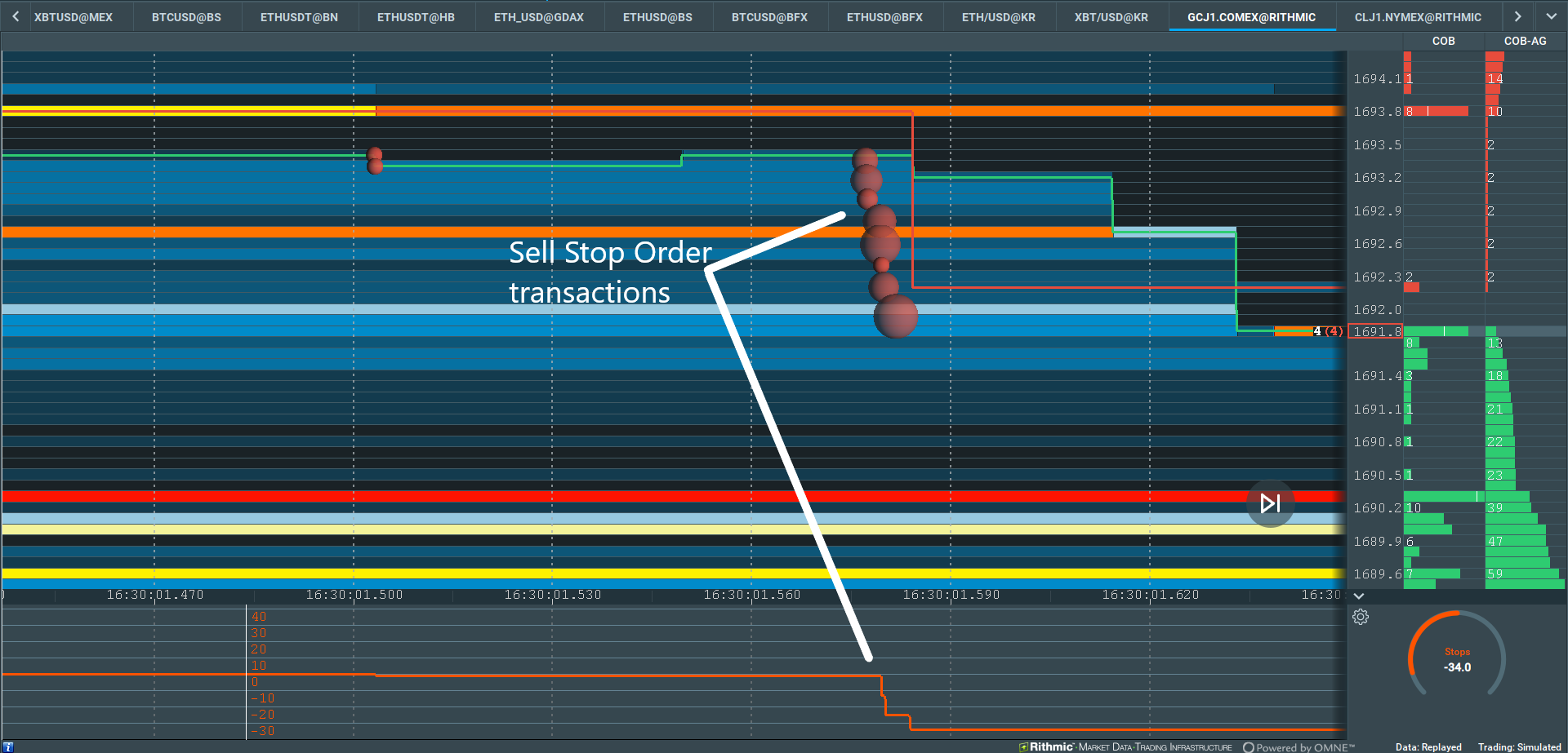
Fig 4 – The Stop tracker within the SI Sub-Chart identifies transacted market sell orders (red dots) as triggered Sell Stop Orders and plots the output (red line). The Settings displays the output with the SUM Accumulation; each value is subtracted from the previous cumulative whole.
In Fig 4 we can see how the aggressive market sell order transactions (red dots) sweep the order book and take the best bid from 1693.4 to 1692. This is a Stop Run. The SI Sub-Chart clearly identifies the triggered Stop Orders and plots the results. Since we are using the “Accumulate as SUM” setting, the Stop tracker output value was -1 before the Stop Run occurred. After the Stop Run, the value becomes -33. Therefore precisely 32 Sell Stop Orders were transacted.
Stop Orders and Stop Runs on Higher Time Frames
Let’s take a look an example of Stop Order transactions example on a higher timeframe.
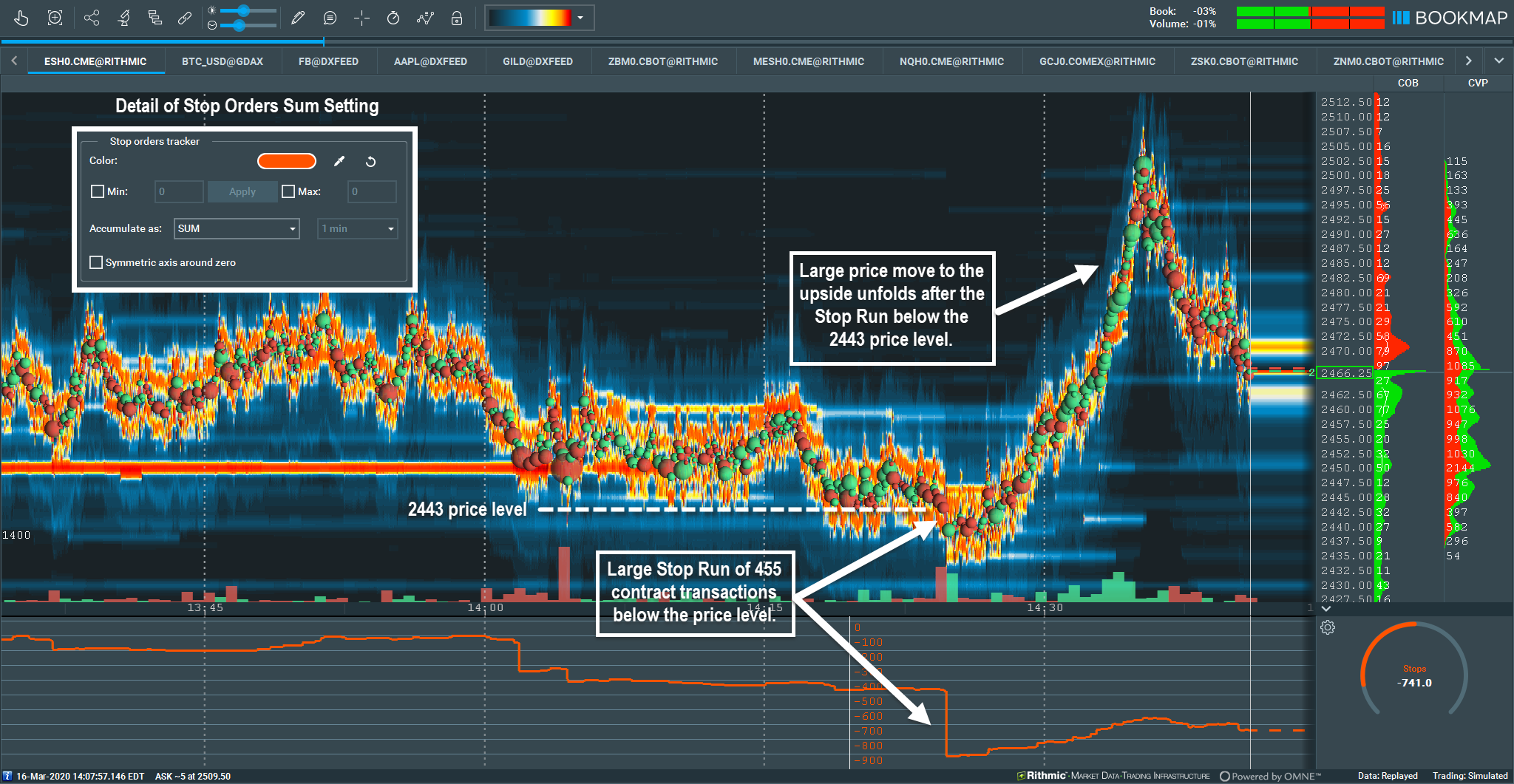
Fig 5 – Higher time frame Stop Sub-Chart example, using the SUM accumulation setting. The Stop tracker within the Sub-Chart identifies the transacted market sell orders (red dots) as triggered Buy Stop Orders and plots the output (red line).
In Fig 5, we can see how prices formed a consolidation range at the 2443 price level. The level breaks and the Stop tracker reading shows 455 Stop orders were transacted. The Settings display the output with the SUM Accumulation; each new value is added to the previous value and plotted over time.
This was a significant Stop Run on a higher time frame chart. After the initial Sell Stop Run, the order flow shifted and buyers began entering the market. The result was a move back through the other side of the day’s swing. Identifying the Stop Run in combination with the heatmap gave strong insight and confluence to the possibility of a price reversal taking place.
It is important to note the SI Sub-Chart does not generate buy and sell signals; it is to be used in confluence with other order flow activity. The SI Sub-Chart outputs objective data about the types of orders and specific players in the market. This important information offers a significant level of transparency that can be used to gain a powerful edge together with many various strategies and trading methodologies.
Iceberg Orders Sub-Chart Explained
The S-I Sub-Chart also identifies Native CME Iceberg Order transactions. No more guesswork is required since CME MBO data assigns iceberg order transactions with unique OrderIDs. Note the Bookmap Global+ version already includes synthetic iceberg detection. Synthetic Icebergs differ from native CME Iceberg orders (see the definition here). Synthetic Iceberg Detection is based on microstructural events and false positives can occur. The SI Sub-Chart displays Native CME Iceberg with precision based on the MBO data.
Iceberg Orders still remain hidden when watching the order book in real time, However, once the exposed portions of the Native Iceberg transact, then the SI Sub-Chart can display them. This offers traders a distinct advantage by exposing larger player’s positions using iceberg orders.
In the SI Sub-Chart output, a positive value represents any filled native iceberg order portion on the bid (positioned long), a negative value is any filled native iceberg portion on the ask (positioned short). The exposed tip of the Iceberg order functions like passive limit orders. Visit our Wiki page to learn more on Iceberg Orders.
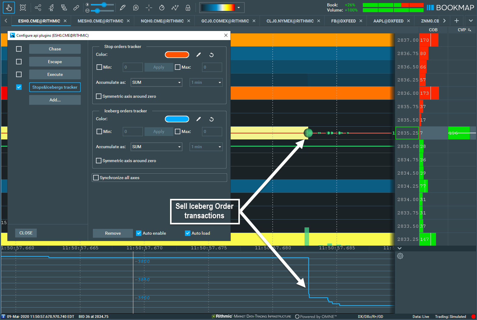
Fig 6 – Iceberg Sub-Chart displays long iceberg orders transacting on the best bid.
Fig 6 displays the SI Sub-Chart Iceberg Order output. The green dots are aggressive market buy orders transacting into unseen Iceberg Order on the best offer. In the Sub-Chart window panel, the blue line is the Iceberg output and registers over 100 Sell Icebergs transacted.
Iceberg Orders on Higher Time Frames
Let’s take a look at a higher time frame chart example.
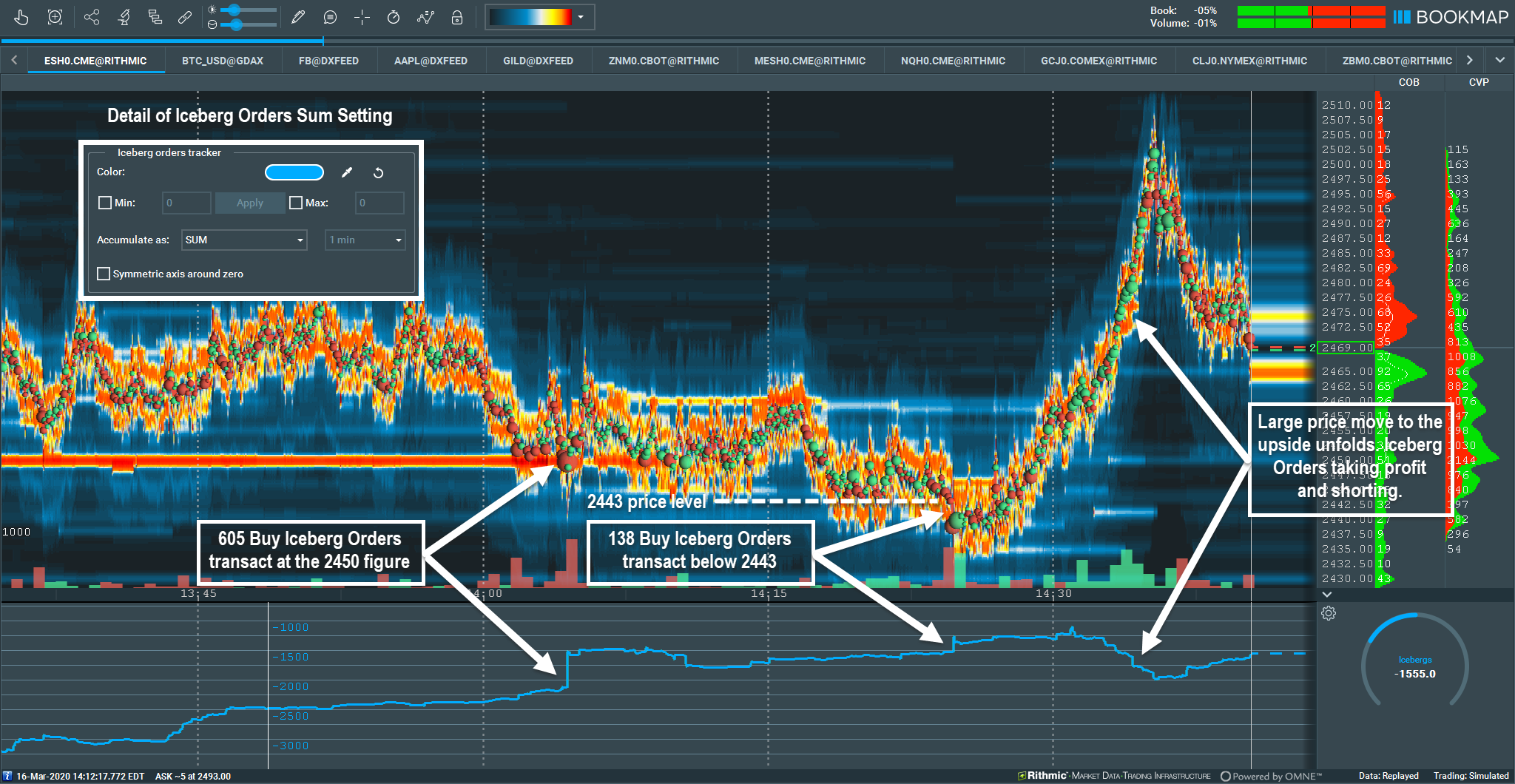
Fig 7 – Higher time frame Iceberg example, using the SUM accumulation setting. The Iceberg Sub-Chart identifies market sell orders (red dots) transacting into Iceberg Orders and plots the positive output (blue line).
In Fig 7, we see how 605 Buy Iceberg Orders transacted at the 2450 figure. About 20 minutes later, another 138 Buy Icebergs transact below 2443, absorbing the downward price momentum. As prices move back up and make higher highs, we see how Iceberg Orders are used to take profit and get short into the move higher.
Combining Stops and Icebergs Outputs
Now let’s plot both the Stops and Icebergs with with a different example. We’ll look at this chart example with the different output settings of SUM, EXPONENTIAL, and RESET.
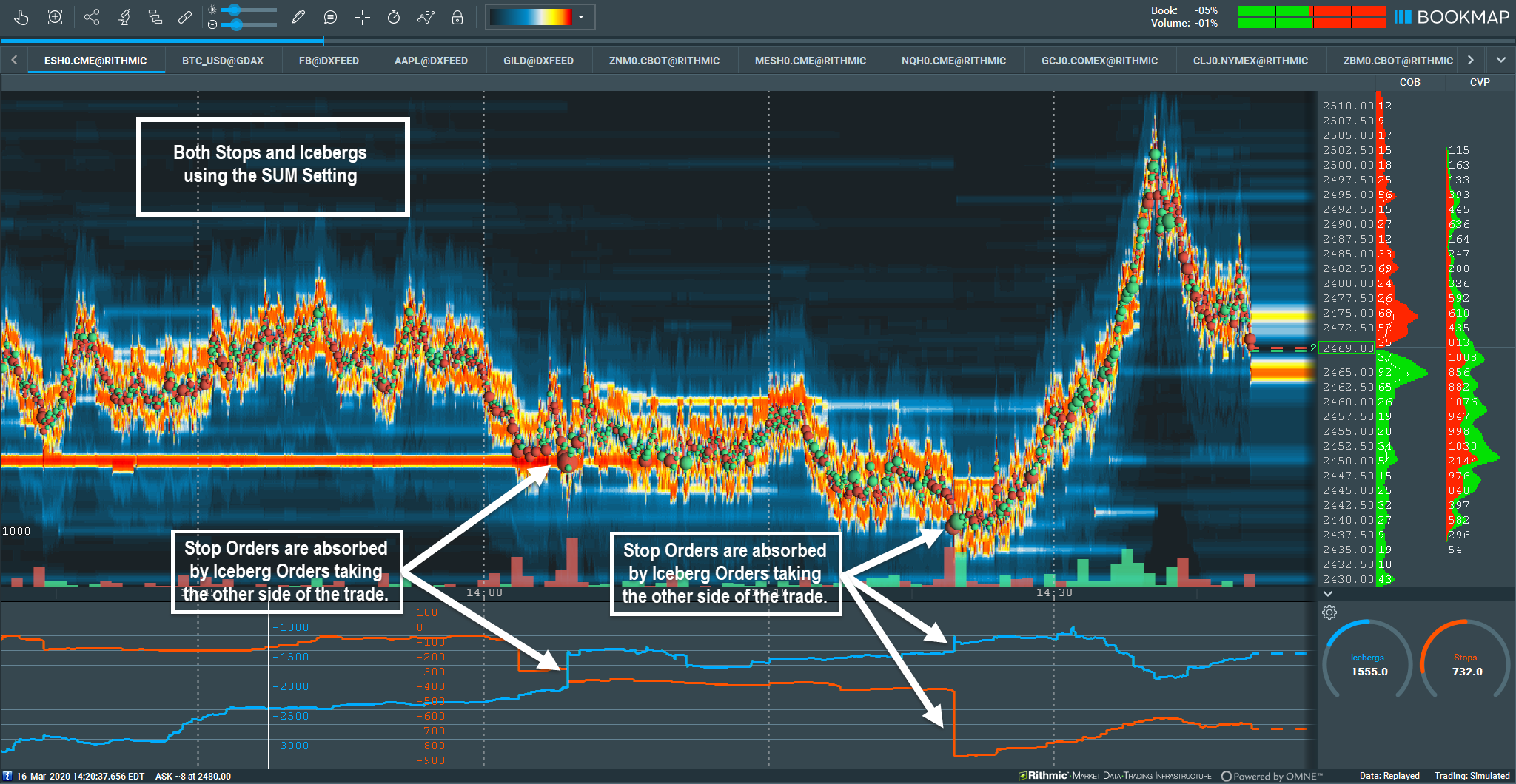
Fig 8 – The SI Sub-Chart displaying both Stop and Iceberg orders together using the SUM Setting. Note how both vertical axes are not synchronized nor symmetrically vertically aligned.
In Fig 8, we can now get additional insight with both the Stops and Icebergs displayed; we can see the relationship between the two. Both Stops and Icebergs spiked precisely at the same time. Larger player’s Iceberg Orders were taking the other side of the trade and absorbed the Stop Runs in two distinct areas. Gaining insight to this information is only obtainable with Bookmap’s SI Sub-Chart. This dual confluence lends to heightened probability of a reversal, once the order flow begins to shift to the buy side.
Up to this point we have been accessing only the SUM accumulation setting. Let’s also take a look at the EXPONENTIAL and RESET settings below in Fig 8 and Fig 9.
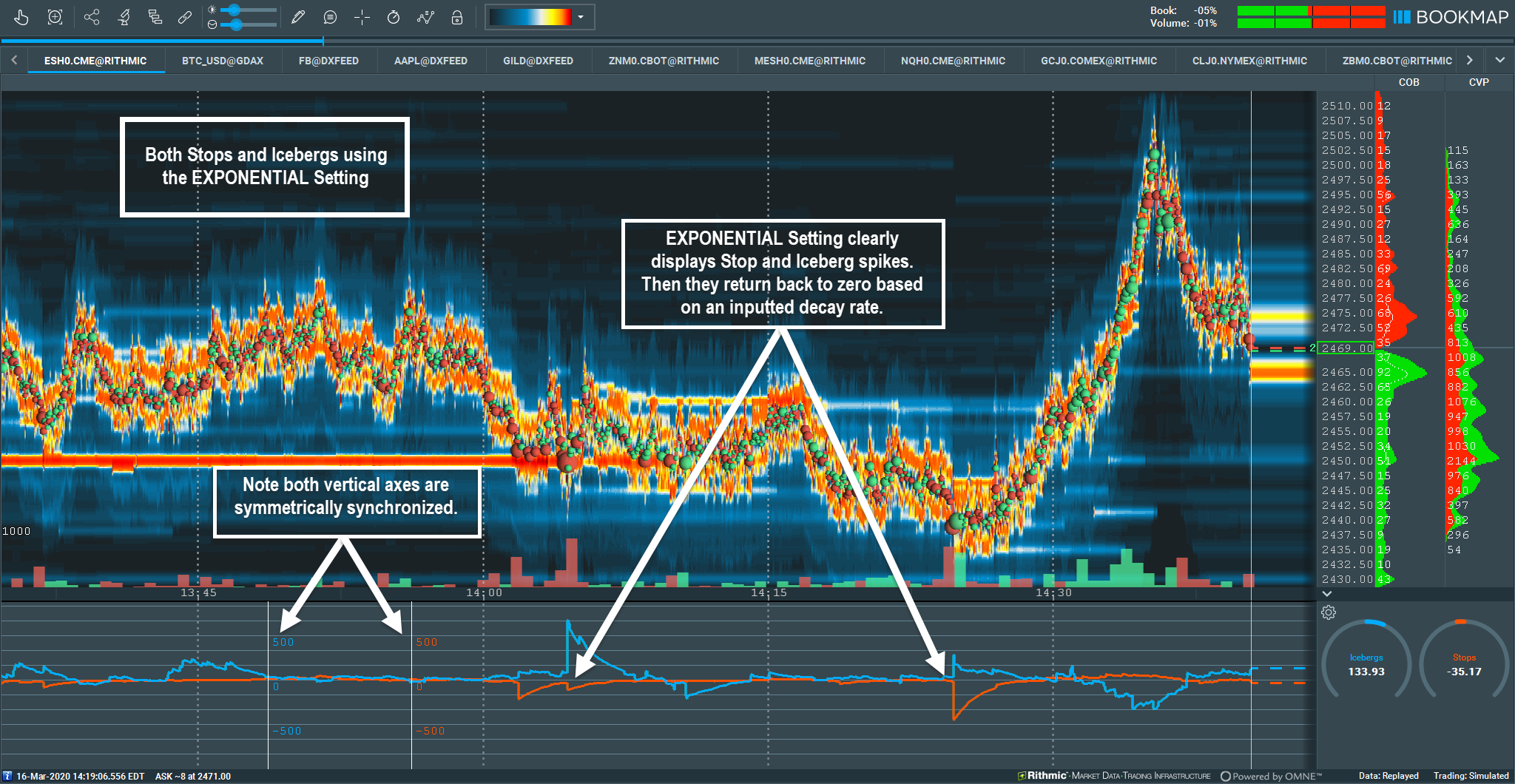
Fig 9 – EXPONENTIAL Setting displays initial spikes in both Stops and Icebergs and returns back to zero based at an exponential decay rate.
Direct comparison between icebergs and stops transactions can be easily visualized with the SI Sub-Chart Accumulate EXPONENTIAL setting. Specific data spikes will reset back toward zero due to the half-life exponential decay over time. The Y-axes are symmetrically synchronized, which allows for a one-to-one output comparison between stops and icebergs.
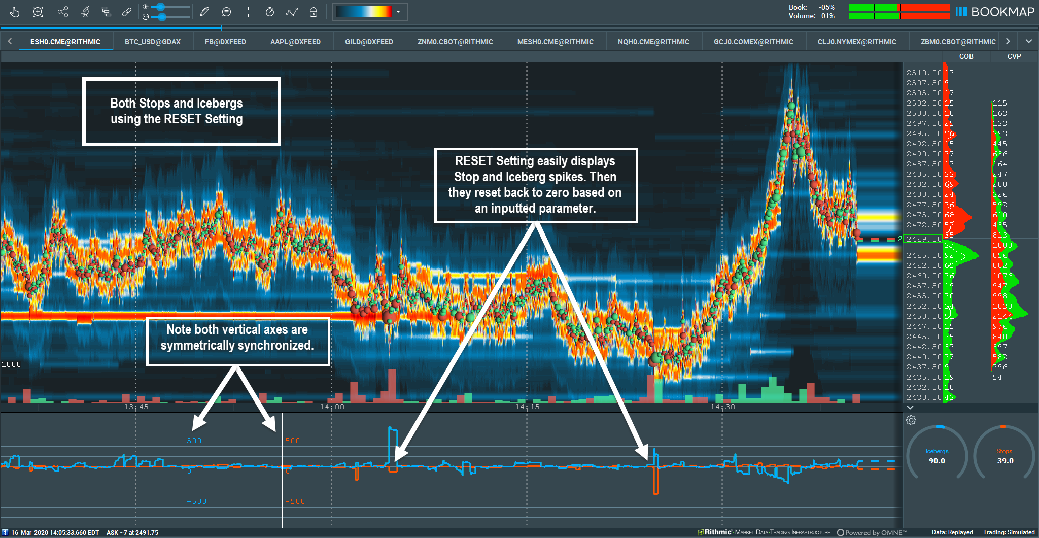
Fig 10 – The RESET Setting displays initial spikes in both Stops and Icebergs and resets back to zero based on the user specified time parameter input. In this example, the RESET occurs after 1 minute.
The SI Sub-Chart accumulate RESET setting clearly displays specific data spikes which then reset immediately back to zero based on the inputted time parameter. Note both the synchronized and symmetrical vertical alignment of the Y-axes. This allows traders to directly compare outputs between stops and icebergs.
More Examples
Let’s take a look at more examples with various market instruments and settings to better understand the edges gained from the SI Sub-Chart display of Stops and Iceberg Orders.
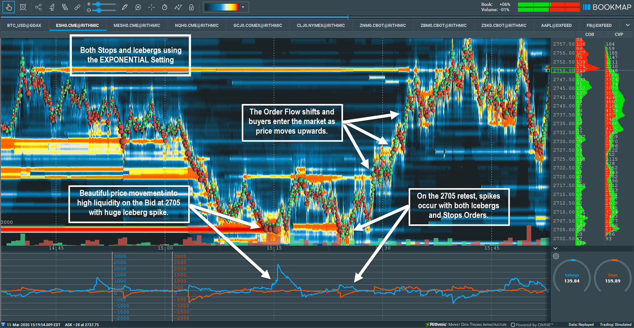
Fig 11 – The S&P e-mini with EXPONENTIAL Setting displays initial spikes in both Stops and Icebergs and resets to the half-life decay rate based on a 1 minute time parameter.
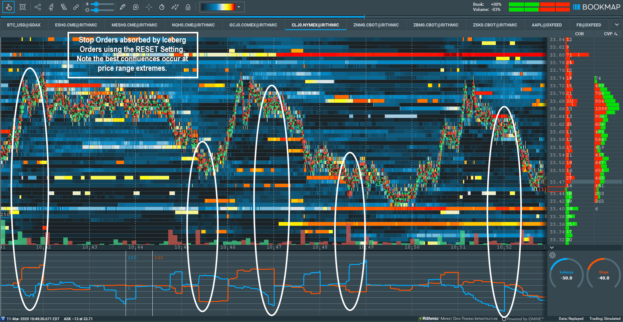
Fig 12 – Crude oil range bound insights with the SI Sub-Chart can be incredibly helpful; this allows traders to understand the context between Stops and Iceberg orders at range extremes. The Accumulate RESET setting is used here; the outputs reset to zero within the 1 minute parameter.
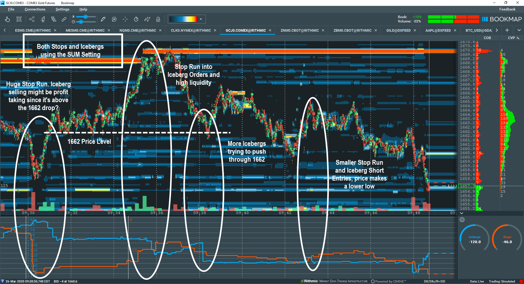
Fig 13 – Gold with an initial V-bottom Stop Run and return back to high liquidity on the offer. Look at the relationship of Stop Orders and Icebergs to gain insight into the downside price movement.
Conclusion
The advantages of Market-by-Order data from the CME are undeniable. Now traders have transparency into market activity like never before. Bookmap’s Stops & Icebergs Sub-Chart allows an even deeper level of transparency due to Bookmap’s proprietary handling of unique MBO orderIDs and the timestamp arrival of the orders within the queue.
Although MBO data is incredible and Bookmap’s SI Sub-Chart offers unbelievable market transparency, traders still need to apply proper money and risk management techniques. When used together with solid trading methodologies, the SI Sub-Chart becomes an incredibly powerful tool. Now within the market structure, it is possible to see precisely where other traders’ stops are triggered and transactions of larger player’s iceberg orders. This offers a distinct advantage.
Ready to step up your trading game and get in-depth insights to maximize your profits?
Sign up for Bookmap today.
Sign Up Now