20% Off Just for Blog Readers — Until July 31.
Use code BLOG20-JULY for 20% off your first month of Bookmap Only valid through July 31.
Trading Basics
October 26, 2024
SHARE
How Bookmap Order Flow Provides Stock Traders With An Edge?
Most trading platforms have well-known candlestick charts. On their basis, traders make technical analysis using indicators, drawing tools, looking for candlestick patterns and price formations. But despite their popularity, the candlestick chart shows OHLC prices. This limits the vision and understanding of the causes of price movement.
Bookmap platform, in collaboration with the dxFeed data provider, provides stock traders the visualization of extended market data. Right on the chart traders can enable unfiltered Best Bid/Ask lines, Volume Dots, an evolution of current and historical Limit Order Book as a heatmap, and much more.

Candlestick chart does not show the most important trading information
Using these features traders will see:
- full market transparency and actions of all traders
- at what levels large orders are concentrated
- how changes in liquidity affect the future price movements
- how large traders set traps and how to avoid them
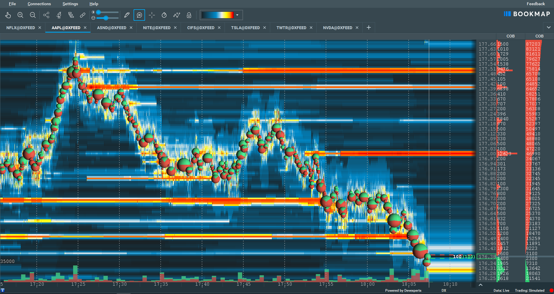
General view of Bookmap platform
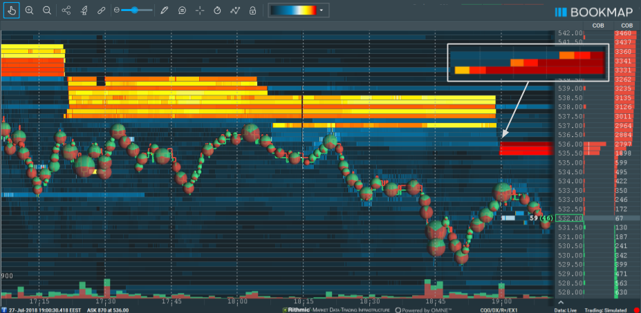
Heatmap is the key element of Bookmap
Most platforms that provide an Order Flow analysis show market activity in the form of Footprint chart. This allows you to see the actual execution and the number of aggressive buyers and sellers. But this type of chart does not show the levels of limit orders accumulation and the place of liquidity formation.
With Bookmap, any change in the order book — placement, change, cancellation, or execution — is displayed on the chart as Heatmap view. The more limit orders placed on a certain level, the brighter the level displayed on the map. Thus, the trader sees the full picture of the market, the current mood and the intention of other participants in the trading process.
Brighter heatmap fields symbolize a large number of shares in the order book
In addition to basic market data, Bookmap provides traders a full Order Depth in real-time. Chart scaling to nanoseconds allows you to see the sequence and exact time of order execution. By default Bookmap chart updates at a rate of 40 frames-per-second, displaying the market in real-time with a CPU consumption of 1-3% per chart. This has become possible thanks to advancements in video-card GPU technology.
Best Bid and Offer lines represent the highest buyers and the lowest sellers price. This helps to see how the spread changed over time and under what market actions.
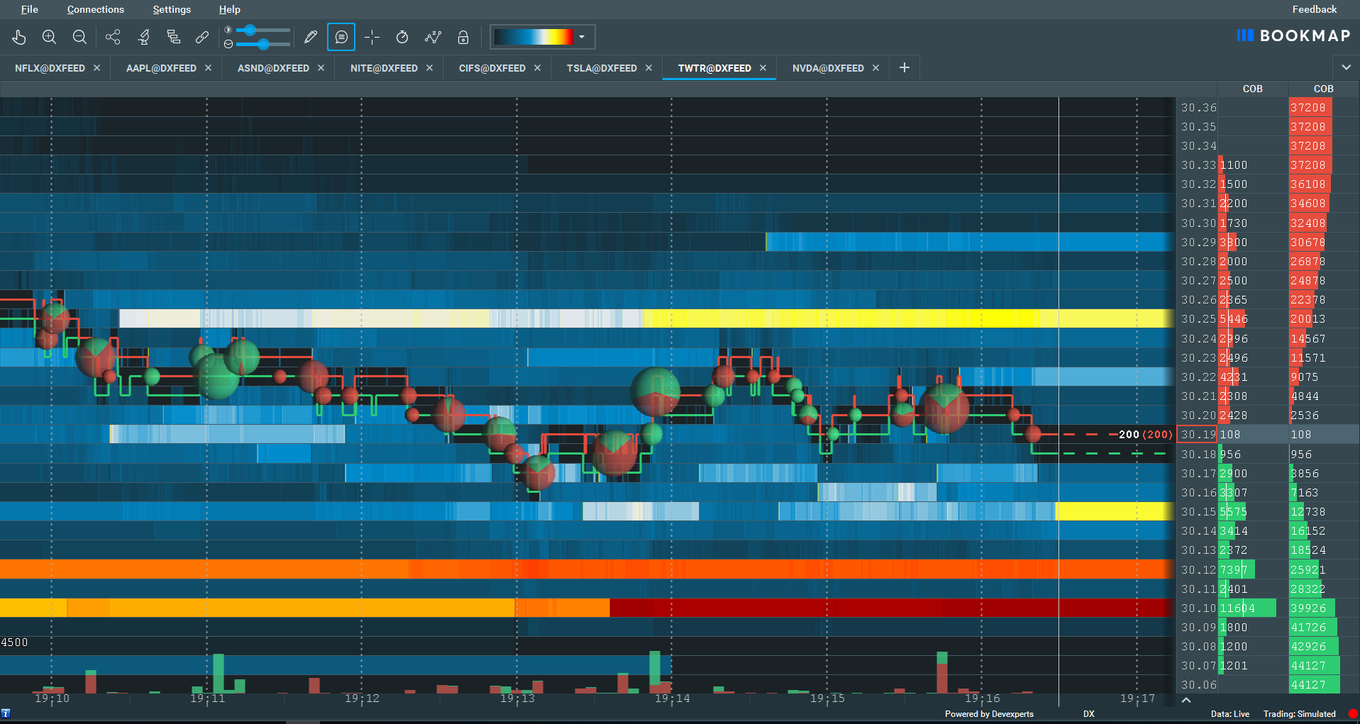
Seeing how the market liquidity is changing gives you a huge advantage. If you add executed trades to the chart, you will see how the price reacted to the liquidity levels. Volume Bubbles shows the volume of executed trades in a specific period. Its size depends on the number of executed contracts. The division of the circle into the red and green sections indicates how much of the total amount refers to buy or sell aggressive trades. Thus, traders receive important information about who controlled the market situation. Increasing the chart to millisecond allows you to see how orders were executed.
Volume Bubbles represent the executed trades at a specific point
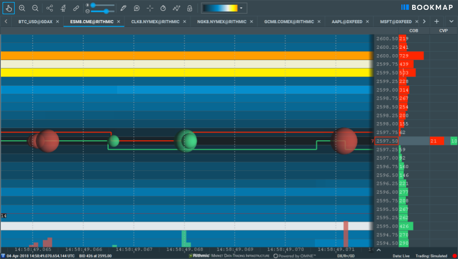
It’s not a secret that large order size on the stock market has a significant effect on price. Therefore, to minimize this effect, large traders use different trading algorithms and special order types like Iceberg order. Using such orders, a market maker or large trader can divide the full order size into parts, and hides the real volume from other participants. With the help of the Iceberg Detector functional, all hidden orders are visible on the chart. Such orders are shown on the chart, as numbers near Best Bid & Offer lines.
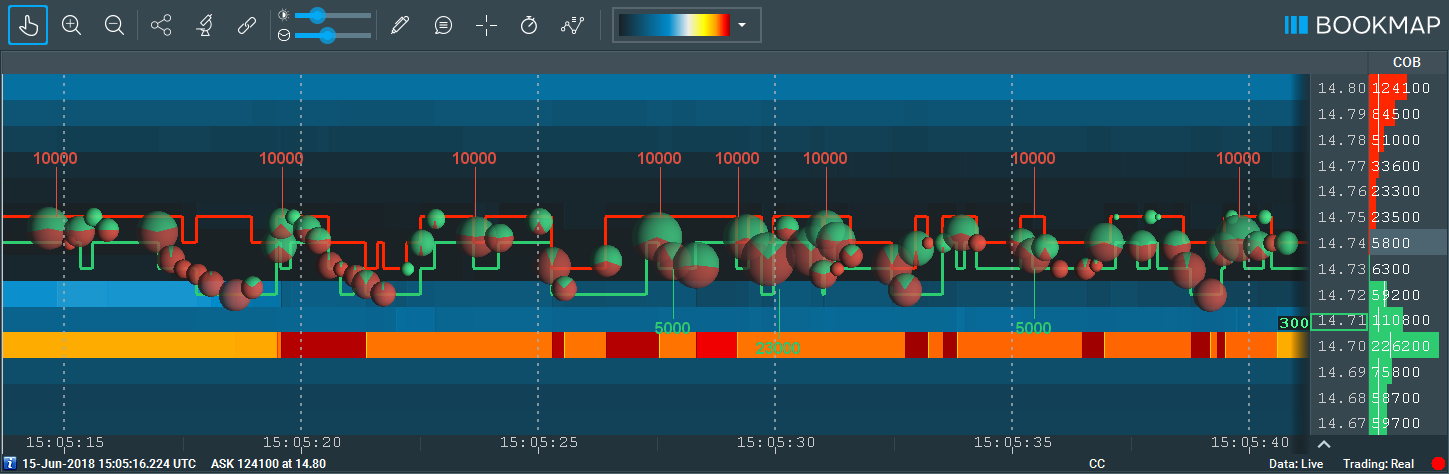
Bookmap uncovers Iceberg orders and displays them on a chart
In the example below, you can see how a large trader sets significant amounts of buy orders near the best ask price, causing the price to move up. You can see how the trader placed orders of different sizes, at different prices, and various time, to be undetected by other algorithmic traders. But this activity is easily spotted with a single glance at Bookmap chart.
Large Trader placed orders with various size, price and on different time
By using the Imbalance indicators, the trader will at a glance understand who influences the price – buyers or sellers. For instance, if the Order Book Imbalance shows + 50%, this indicates the interest of buyers to raise the price higher. On the other hand, this may indicate the intention of sellers to push price higher to facilitate their short positions.
If the Volume Imbalance value is in the positive zone, it will tell about the overbalance of buy market orders and vice versa.
All these tools provide stock traders with excellent clues to what the market might be trying to do and how it might react to certain prices. By analyzing the Order Flow, it becomes clear the intentions and expectations of market participants to future price movements.
Connectivity to major US stock exchanges & ECNs provides full market depth data that enable you to stay one step ahead in the highly competitive markets.
Discover more profitable trades with powerful order flow analysis tools. Start using reliable stock market data with Bookmap and dxFeed.
FAQ
How does Bookmap help stock traders compared to traditional candlestick charts?
Unlike candlestick charts that only show OHLC prices, Bookmap provides real-time visibility into liquidity, order flow, and market participant behavior, offering a much clearer view of why prices move.
What is the role of the Heatmap in Bookmap?
The Heatmap visualizes the placement, movement, and cancellation of limit orders over time. Brighter areas represent higher liquidity, helping traders spot support, resistance, and hidden market activity.
How does Bookmap detect hidden orders like Icebergs?
Bookmap’s Iceberg Detector reveals hidden large orders near the best bid and ask, displaying them directly on the chart so traders can identify institutional activity that would otherwise be invisible.
What is the advantage of using Imbalance indicators in Bookmap?
Imbalance indicators show which side — buyers or sellers — has greater control of the market, helping traders anticipate price direction based on real-time shifts in order flow and liquidity.