See market activity more clearly in real time.
Compare plans to access deeper market visibility for market activity.
Education
March 31, 2024
SHARE
The Most Common Chart Patterns
Visualizing the patterns of price movements on charts is what technical analysis is all about. Looking out for common chart patterns can quickly tell you if the market is range bound, trending up, or trending down. It can also give insights into the potential direction of price breakouts, especially when using trendlines.
Technical analysis is a relatively old practice and is used to attempt to forecast market movements. However, it is worth noting that there is still an element of probability inherent in every chart pattern.
What Do Chart Patterns Represent?
A chart pattern is a repeating shape or line drawn on a price chart that aids in predicting potential future price fluctuations, such as breakouts and reversals.
Based on historical price data, technical analysis relies on the old adage that history doesn’t repeat, but it certainly rhymes.
Supply & Demand
Chart patterns represent the supply and demand of the market.
Of course, the role of supply and demand in financial markets is all down to the complex interactions between the various forms of market orders and limit orders. In other words, it’s about liquidity.
But representing this final output on a historical price chart is a quick and easy way to get a feel for any market. You will be able to see the supply and demand of buyers and sellers, as well as quickly identify which way the market is currently moving.
Predicting the next price move with the help of chart patterns is not guaranteed, but it is a good start for approaching the markets.
Types of Chart Patterns
There are essentially two types of chart patterns: continuation patterns and reversal patterns.
When price is moving in a particular direction and the trend looks strong, this will be represented in a continuation pattern.
But when momentum is stalling and price trends show signs of turning, this will be seen as a reversal pattern.
Technical analysts use a variety of continuation and reversal pattern signals to indicate that a trend is likely to continue or reverse. Let’s look at some of the most common examples.
Continuation Patterns
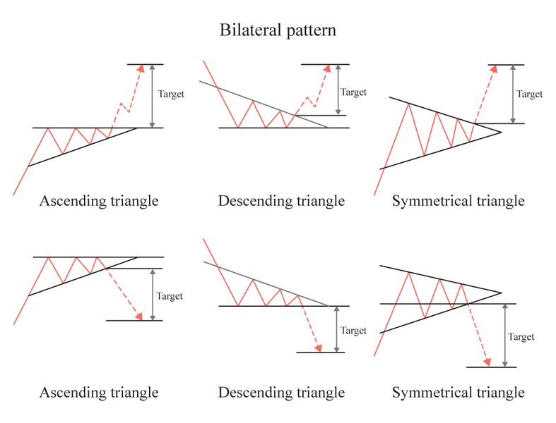
- Triangles
As the price action becomes more and more compressed, a triangle is formed. Ascending triangles, descending triangles, and symmetrical triangles are the different types of triangles.
When rising swing lows are connected, they form an ascending triangle. All swing highs reach the same level when connected, creating a horizontal trendline.
A descending triangle is the opposite: lower swing highs, which when connected, form a downward sloping trendline. A horizontal trendline forms when the swing lows are connected.
The swing highs and lows of a symmetrical triangle get progressively tighter. As a result, the two trendlines inverse towards each other.
- Pennants
The pennant is a smaller version of a triangle. A pennant is often an area with a tight price range or consolidation that becomes even smaller as time goes by. The trendlines that make up the pennant converge on each other, suggesting that the closer the current price is getting to the edge of the pennant, the more imminent the breakout.
- Flags
Flags and pennants have a lot in common. After a price increase or decrease, they form a narrow trading range.
A flag moves between parallel lines in either an upward or downward direction, like a flag hanging off a pole.
- Wedges
A wedge is similar to a pennant, only with a wedge the trendlines are moving in the same direction.
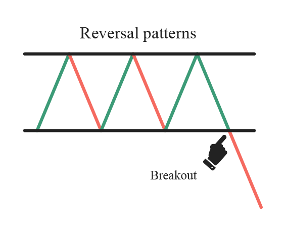
Reversal Patterns
Chart reversal patterns suggest that the tide may be turning for the previous price trend.
Chart patterns that form during an upward trend indicate an impending trend reversal may be in play, and that price will soon fall. Reversals during a downtrend indicated that price could soon be moving higher.
- Double Top
This pattern is typically seen as a bearish reversal on bar charts, line charts, and candlestick charts. A pattern of peaks and troughs in multiple successive waves with roughly equal heights between them indicate a reversal may be imminent.
If price falls through the bottom of the range, then that is confirmation of the signal.
- Double Bottom
Double bottoms are the inverse of double tops, with a breakout through the top of the range of troughs confirming the signal.
- Head And Shoulders
A head and shoulders pattern looks the name suggests, with the head being at the peak and therefore middle of the pattern.
The shoulders make up the neckline, a break of which suggests the reversal is in play. Some technician use the distance between the head and the neckline as a price target for taking profits.
Conclusion
Chart patterns are a simple way to quickly see what the market is showing. They are applicable to all markets, from stocks to futures, and even crypto.
Despite being simple, they are not foolproof and ignore a lot of other information available in the market. If you want to increase your edge, you can look for chart patterns within the context of market liquidity.
You can try it out today for free. Click here to get started.
Sign Up Now