Our 4th of July Sale is Live
Offer Valid July 4 – July 11
Get 50% off Global+ AND data for 3 months—or save 30% on Global+ for the full year
Claim Your DealReady to see the market clearly?
Sign up now and make smarter trades today
Education
December 11, 2024
SHARE
The Role of Color Psychology in Market Data Visualization

Color photography was started in the 1890s. This groundbreaking discovery
broke all the creative boundaries and left people curious about the artistic
possibilities it could offer.
In 1994, one such landmark possibility was turned into reality when Leland
Wilkinson
developed the first computer program
to produce heatmaps with high-resolution color graphics. This event marked
the introduction of data visualization in the financial markets. Gradually,
the level of artistry evolved, and colors were introduced.
The use of colors in trading platforms isn’t just about aesthetics; it’s a
powerful tool that can transform how traders interpret data, make decisions,
and ultimately find success in the market.
Through this article, we will uncover the often-overlooked aspect of trading
and explain how you can make better trading decisions by practicing color
psychology. Let’s get started.
The Fundamentals of Color Psychology
Colors, like features, follow the changes of the emotions – Pablo Picasso
Undoubtedly, colors impact human emotions, behaviors, and perceptions. Color
psychology, as a field of study, can be broken down into two main aspects:
-
How do humans process color?
-
What emotions are triggered by different colors?
How Do Humans Process Colors?
Humans process colors using their eyes and brains. Let’s have a closer look
at this process:
-
Detection of Light by Photoreceptor Cells:
-
Light enters the human eye and falls on the retina.
-
The retina of the human eye contains two types of photoreceptor
cells:-
Rods:
-
They are responsible for detecting low levels of light.
-
They are more sensitive to shades of gray.
-
-
Cones:
-
They function best in bright light.
-
There are three types of cones:
-
Blue: Sensitive to short wavelengths
-
Green: Sensitive to medium wavelengths
-
Red: Sensitive to long wavelengths
-
-
-
-
-
Production of Color Sensations:
-
When different wavelengths of light interact with these cones,
they produce various color sensations. -
For example, a mixture of red and green light stimulates the red
and green cones, creating a perception of yellow.
-
-
Color Processing in the Brain:
-
Once the cones detect and process light, the brain plays a
crucial role in transforming this information into the rich
spectrum of colors we perceive. -
Different parts of the brain (such as the visual cortex) help in
this process.
-
What Emotions Are Triggered with Different Colors?
Colors can evoke emotions. While this interplay between colors and emotions
is influenced by cultural and personal factors, certain colors possess
universal emotional triggers. Let’s understand some of the common
associations:
|
Color |
Emotion(s) Triggered |
Usage |
|
Red |
|
It’s commonly used for stop signs and warnings.
|
|
Blue |
|
It is often used in corporate branding and healthcare |
|
Green |
|
It is often used in eco-friendly and organic product |
|
Yellow |
|
There is no dedicated use. However, it can also signify caution and is used in road
|
|
Black |
|
There is no dedicated use. |
Integrating Color in Financial Market Visualization
Color plays a crucial role in financial market visualization, particularly
on trading platforms. Let’s begin by understanding some history behind their
usage.
Historical Use of Red and Green:
Since the tradition of color coding started in financial trading, “red” and
“green” are the two primary colors that have been used consistently. These
colors are primarily associated with up-and-down movements in stock prices.
See the table below:
|
What Does Green Symbolize in Financial Trading? |
What Does Red Symbolize in Financial Trading? |
|
Green indicates a rising or positive trend in stock |
Red indicates a falling or negative trend in stock |
|
It signals:
|
It signals:
|
Modern Innovations in Color Choices
Modern trading platforms and market analysis tools, like Bookmap, are
consistently diversifying their color palettes. This helps with enhanced
data visualization and reduces the cognitive load of users. Let’s have a
brief look at the modern innovation efforts:
-
Accessibility:
-
Designers are paying more attention to the accessibility of
their platforms. -
This includes ensuring that color choices are friendly to
individuals with color vision deficiencies, such as red-green
color blindness.
-
-
Customization:
-
Some platforms are allowing users to customize their color
schemes. -
This empowers traders to select colors as per their individual
preferences.
-
-
Visualization Techniques:
-
New, improved versions of heatmaps and candlestick charts are
appearing. -
These utilize a wider range of colors to represent different
data points or trends.
-
Cognitive Load and Color Consistency
Cognitive load refers to the mental effort or strain required to process and
understand information. In the context of financial market visualization and
trading platforms, maintaining a consistent color scheme across platforms
can reduce mental strain and help traders quickly decipher the secret a
color wants to reveal.
How Does Cognitive Load Affect Trading Decisions?
Traders face an overwhelming amount of data, numbers, charts, and real-time
market information when making decisions. A high cognitive load can lead to:
-
Mental fatigue
-
Slower decision-making, and
-
Increased potential for errors
Why Is Color Consistency Important?
There are several reasons for maintaining color consistency. Let’s
understand them:
-
Color consistency reduces cognitive load and allows traders to
expend less mental energy while deciphering the meaning of colors. -
A consistent color scheme allows traders to quickly interpret
information. -
There are reduced chances of confusion and misinterpretation.
Enhancing Data Interpretation with Strategic Color Utilization
Color plays a crucial role in highlighting market anomalies. Its effective
utilization aids traders in quickly discerning complex market data. By using
varied color shades, gradients, and specific color intensities or
variations, traders can pinpoint potential opportunities or risks.
Strategic color utilization isn’t just a theoretical concept. Let’s justify
this statement through some examples:
Example 1: Identifying Rapid Price Fluctuations
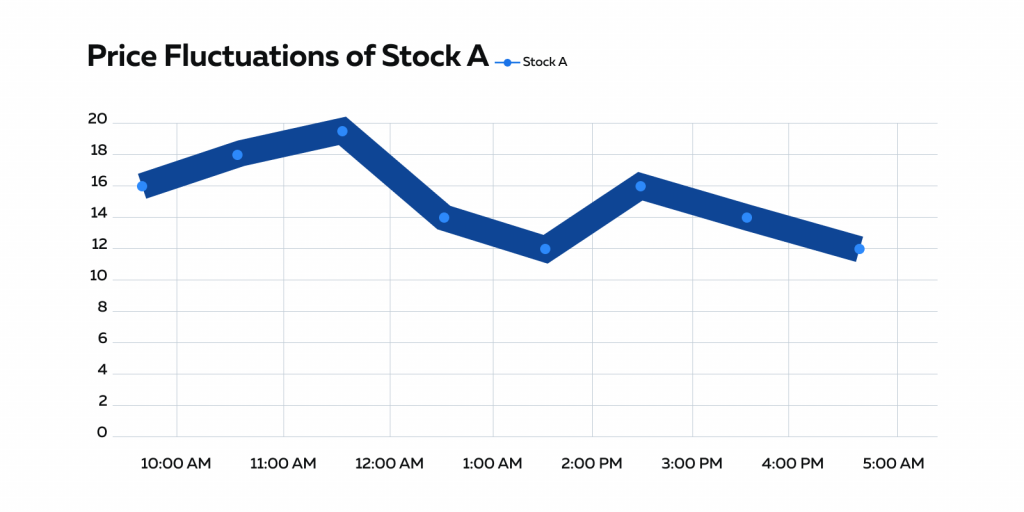
Refer to the line chart below which tracks the price of Stock A.

In the absence of color coding and usage of color gradients, it becomes
tough for traders to understand the market trends and sentiments. Thus, to
highlight rapid price fluctuations or anomalies, modern market analysis
tools employ color gradients.
For instance:
Using Cool to Vivid Color Gradients:
|
Using Cool Colors |
Using Vivid Colors |
|
When the price remains relatively stable, the line can |
When there’s a sudden and significant price increase or |
|
How does this help traders? This transition immediately catches a trader’s eye and |
|
Example 2: Heatmaps for Volume and Momentum
Heatmaps are an effective way to represent market data. They use color
intensity and quickly reveal anomalies in trading volume or momentum. Let’s
see how the two most common types of heatmaps can help:
|
Volume Heatmap |
Momentum Heatmap |
|
In a heatmap showing trading volume:
|
|
|
How does this help traders?
|
|
Example 3: Candlestick Charts for Price Patterns
Candlestick charts are widely used to analyze price patterns. The color of
candlesticks is a key element that helps traders identify bullish and
bearish patterns:
-
Bullish patterns:
-
Bullish patterns on candlestick charts indicate the potential
for price increases. -
These patterns are typically depicted in colors like green or
white, helping traders recognize periods of optimism and upward
momentum in the market.
-
-
Bearish patterns:
-
Bearish patterns on candlestick charts, on the other hand,
suggest the potential for price decreases. -
These patterns are often depicted in colors like red or black,
signaling periods of pessimism and downward pressure on prices.
-
Bookmap’s Application of Color in Visualization
Bookmap is a modern market analysis tool that uses color coding to optimize
market data visualization. Here are some key applications:
-
Key Data Points are Highlighted:
-
Different colors are used to highlight specific data points such
as:-
Price levels
-
Volume bars, or
-
Support/resistance areas.
-
-
For example, brighter or bolder colors can be used for
significant price levels or recent market events to draw the
trader’s attention.
-
-
Market Conditions are Distinguished:
-
Colors are used to distinguish between various market
conditions. -
For example, specific colors are used for:
-
Trending markets
-
Ranging markets, or
-
High volatility periods.
-
-
-
Depth of Order Book is Indicated:
-
Bookmap uses colors to indicate the depth of the order book.
-
For example, a color gradient represents the density of orders
at various price levels.
-
-
Volume or Liquidity Levels are Color-coded:
-
Color coding is used to visualize areas of high volume or
significant liquidity. -
This makes it easier for traders to identify potential reversal
or breakout points.
-
Conclusion
Colors trigger emotions. This saying strongly applies to the world of
financial trading and market data visualization. Well-thought-out color
choices can streamline data interpretation, reduce cognitive load, and help
traders make faster, more informed decisions.
Usage of popular market analysis tools, like Bookmap, which maintains
consistency in color usage, can highlight anomalies, trends, and market
events. This consistency makes it easier for traders to identify potential
opportunities and risks.
Are you ready to experience the power of customizable color visualization in
market data? Dive into Bookmap, where you can tailor your market data views
with a spectrum of colors to suit your preferences. Elevate your trading
insights by harnessing color psychology.
Start customizing your visualization experience now!