See order book more clearly in real time.
Compare plans to access deeper market visibility for order book.
Trading Basics
January 18, 2024
SHARE
Bookmap CEO Explains the Key Feature of Bookmap Trading Platform
Tsachi Galanos of Bookmap describes the firm’s novel solution to order book analysis:
With years of experience in proprietary trading activities and HFT algorithms, in particular, it was time for us to take on a new challenge. In 2016, we shifted our company’s focus on creating an Order Book visualization platform. We have named our platform Bookmap (derived from “Order BOOK” and “Heat MAP”).
The journey we had since has taught us a lot about the importance of order book analysis and visualization to both traders and quants. I would like to share some of the insight we’ve gained in the process. I will also specify a Bookmap solution as well as finalize a few thoughts about the upcoming visualization evolution.
The problem with current charting tools
There is an inherent lack of transparency in current charting tools. They provide filtered or aggregated perspective of the market and, therefore, do not allow participants to get deep information into actual supply and demand, leaving them shortsighted to the activity in the market.
Why look at the order book?
The limit order book is the place where all buyers and sellers meet and where the auction takes place. It is basically the entire supply and demand. When we look at the order book, we see every decision of all the market participants and the strategies they employ. In contrast to looking at the volume traded, which shows what already happened, the order book provides an insight into the intention of the traders. This information can be used for forecasting short-term price action.
Here are a few examples of the type of information that can be gained by following and analyzing the order book:
- Find price levels with liquidity. Certain price levels attract large numbers of orders. These clusters can be identified only when looking at the depth of the market.
- Watch the spread which can provide clues about what might happen in the immediate future.
- Identify intraday shifts in momentum, for example, a shift from strong buying to strong selling.
- Price changes due to order book activity. Study the relationship between market price movements and the order book.
When using the depth of the market, we can also observe strategies in action, for example:
- Price triggered strategies that automatically change orders positions based on the price change.
- Validating breaks of key technical analysis levels and better assess if the breakout is real or false.
- Identifying big players when they step in.
- Identifying retail activities.
There are varied ways to use the order book. Scalpers may use the information from the order book to decide whether to go long or short. Swing traders or traders driven by technical analysis may use it to confirm their macro buy or sell decisions.
The challenge when dealing with limit order book
Most quants and traders who use order book analysis have to deal with the following pains:
- HFT strategies are placing limit orders on many price levels just to be first in the queue. Usually, the orders are placed when price changes. Most of these orders are later canceled when the price gets closer.
- Not all the limit orders that are sent to the market indicate an intention to trade. There are traders who send orders to manipulate price and create fake liquidity, such as spoofing or quote stuffing.
- In some cases, not all the orders are visible in the order book. There are types of orders in various exchanges that are hidden.
Some of these challenges can be dealt with, and some are more complex. More on this below.
Why is visualization crucial?
Visualization plays a key role in understanding what is really happening. It encourages making better and more educated decisions. Looking at data in a pictorial or graphical format enables us to grasp difficult concepts with greater ease or identify patterns that are otherwise unobservable. It also helps us to ask questions we did not ask before.
As a result of technological advancement, visualization of big data is now possible. With current CPUs & GPUs visualization that could only be done offline in the past, now can be achieved in real time. This, in turn, enables faster, more relevant and beneficial decision making.
When dealing with market data, I see the use of visualization in the following scenarios:
- At an early stage when cleaning and ‘checking’ the market data. In many cases, wrong decisions are taken because the market data is not accurate. Therefore, visualization should be considered at that stage.
- When developing a new strategy or refining an existing one. In other words, when ‘teaching the computer’ what to do. Looking at visualized market data can also be beneficial in getting new ideas.
- When trading live and facing the need to take immediate decisions.
- When monitoring the market in real time and taking the following decisions: whether to trade or not in certain market conditions or even see that your strategy is ‘not aligned’ and needs to be stopped.
In all of the above scenarios, having the right tools is vital.
Looking at the microstructure
Each macro event is a combination of micro-events. In many cases, if you manage to understand the microstructure, then you will be able to understand the macro better. The advantage of studying the microstructure is that there are fewer events, and, therefore, it is easier to interpret the actions and intentions of market participants.
The best way to learn the microstructure is by using visualization tools and zooming to the basic blocks of the market data.
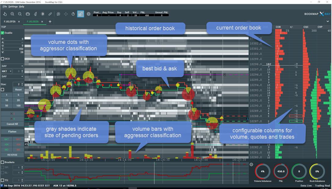
How we visualize the order book
We had to deal with this question when we developed HFT strategies. We wanted to better understand other types of market participants and also see what happens in the market when we send our orders. We decided to visualize the order book using a heatmap, which is updated very frequently (video-like 25-40 FPS).
The heat map records and visualizes every change in the order book by displaying it on a scale of gray shades. The brighter shades mark price levels with more resting paper while darker shades mark areas of lower liquidity.
The heatmap gave us a clear view of how the entire limit order book and traded volume evolve. This enabled us to get more profound insights into market dynamics faster. Let me explain it further.
Regular charts, such as bar charts, are two dimensional (price and time). When you use a heatmap, you add another dimension. In this case, it also lets you see the historical size at each price/time. Besides, by updating the chart very frequently (40 updates/second), you get a video that lets you also examine the frequency of the changes, giving you a ‘feel’ of market accelerations.
Visualization lets you see patterns that cannot be seen or understood without it. Below are a few questions that can be investigated with a visualization platform like Bookmap:
- How did the size at each price level change over time?
- What happened to a certain level when the price moved toward it?
- Are there additional strong levels below or above that level?
- What was the volume traded around these levels?
- What is the activity on the other side of the book? Are there areas where the order book is not symmetric?
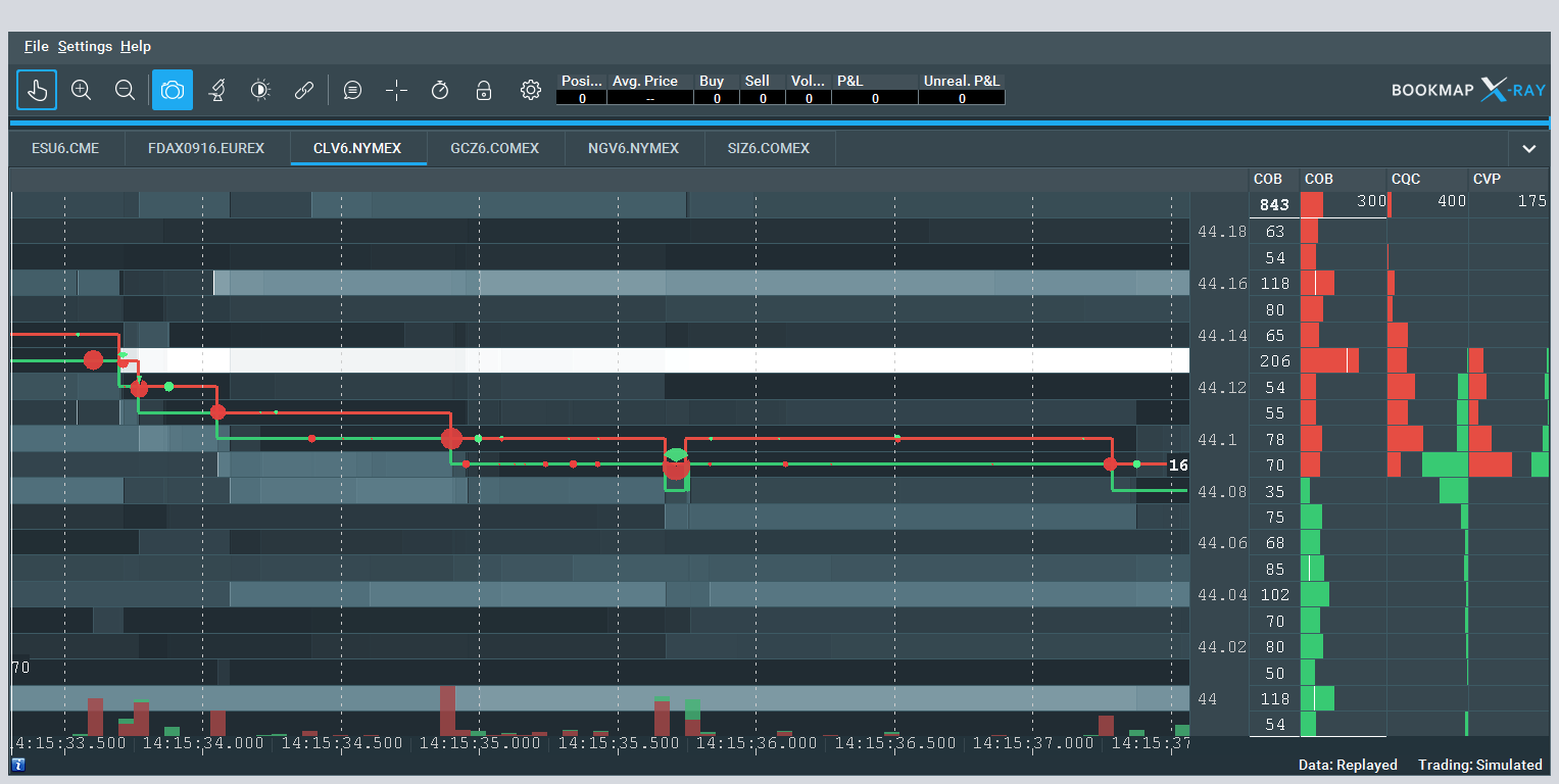
Example of price bounced back
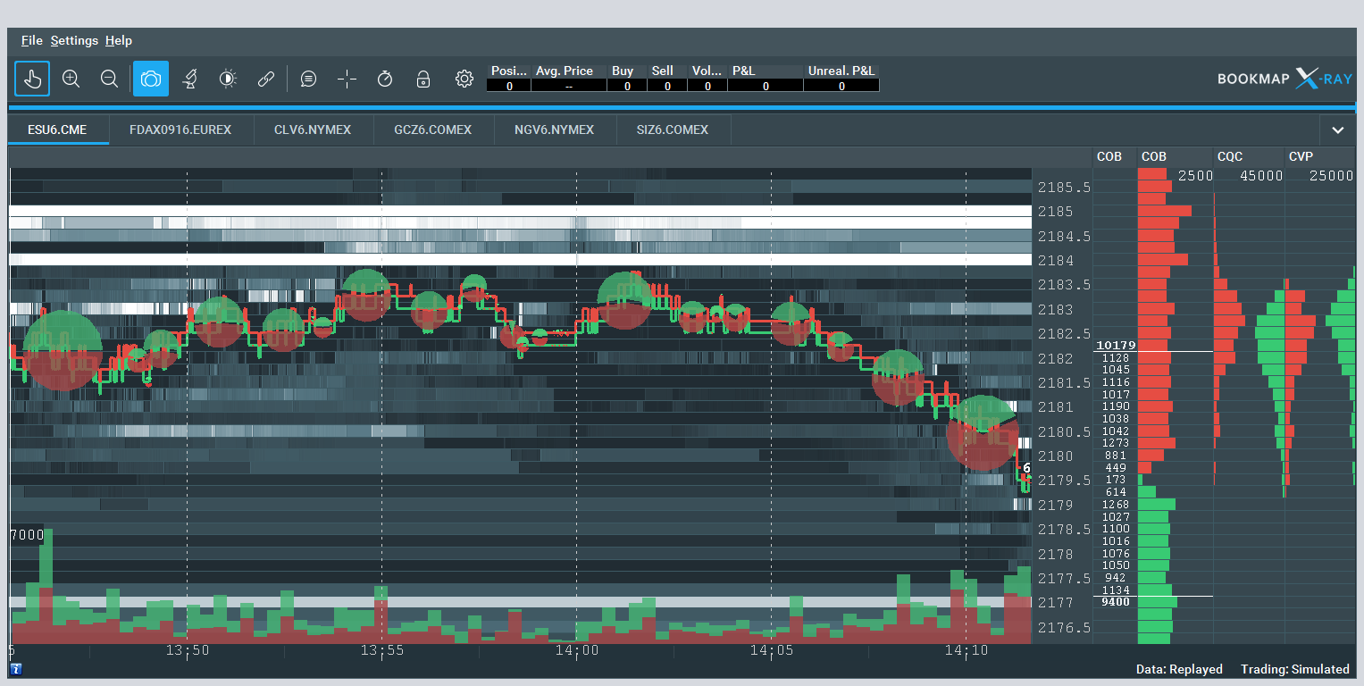
The above image shows a significant concentration of limit sell orders at several neighboring ask levels. Typically in real-time, we wish to examine the hypothesis that price will bounce back (at least for a while) if it reaches such level.
Here are some factors that can vote in favor of that hypothesis:
- When the price approaches that level, the number of sellers
- remains the same or
- becomes even larger (in this case the price may bounce even before trades occur at that level).
- When trades start occurring at that level
- more sellers join and/or
- we observe hidden sell orders being executed there against market buy orders.
Example of estimating the amount of liquidity that belongs to HFT participants
Using heatmap, it is easy to notice the presence of HFT agents and to estimate their participation rate.
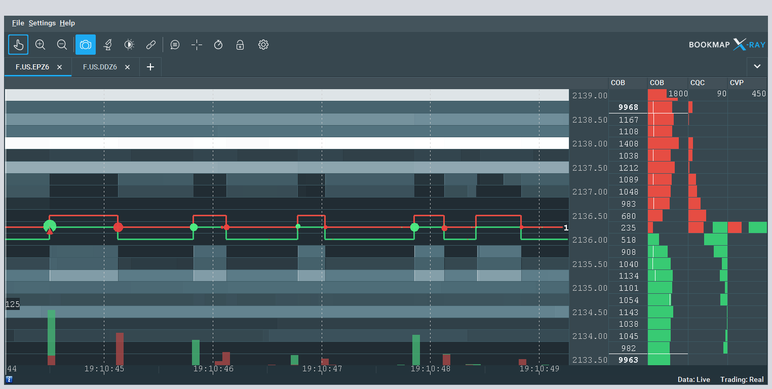
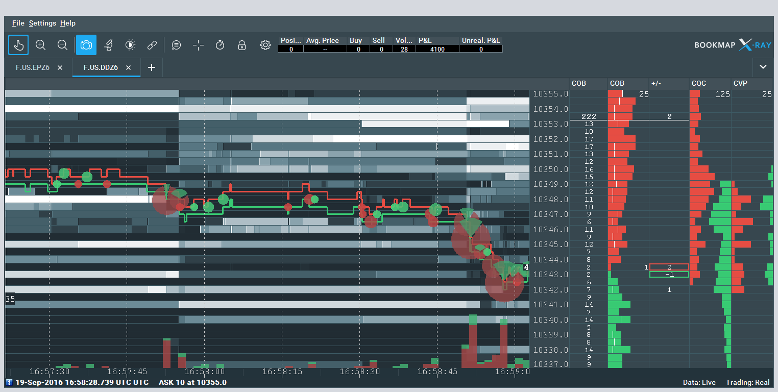
Example of zooming to milliseconds
In the above image, a single limit sell order at the size of about 180 contracts was partially executed, and the rest remained unfilled.
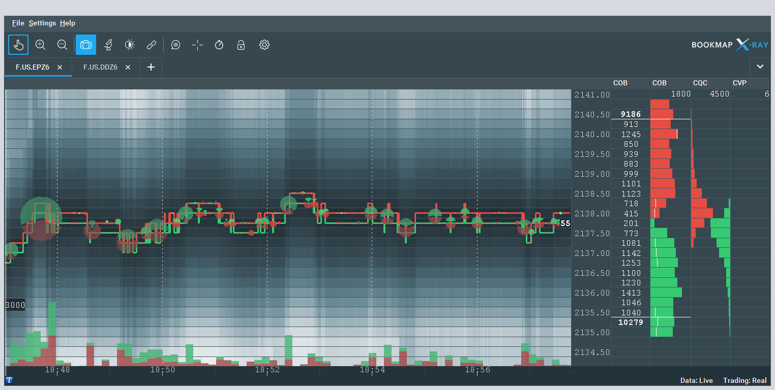
Example of significant change in the order book
The above image illustrates instantaneous cancellation of buy orders and an addition of sell orders of a significant amount. This was followed by the price drop. Based on what we observed in zoom in, it is likely that those orders belong to the same trader.
Example of aggregated order book view
There are also other ways to look at market data, for example, via an aggregated view. This lets you see in many cases how the price is affected by the liquidity.
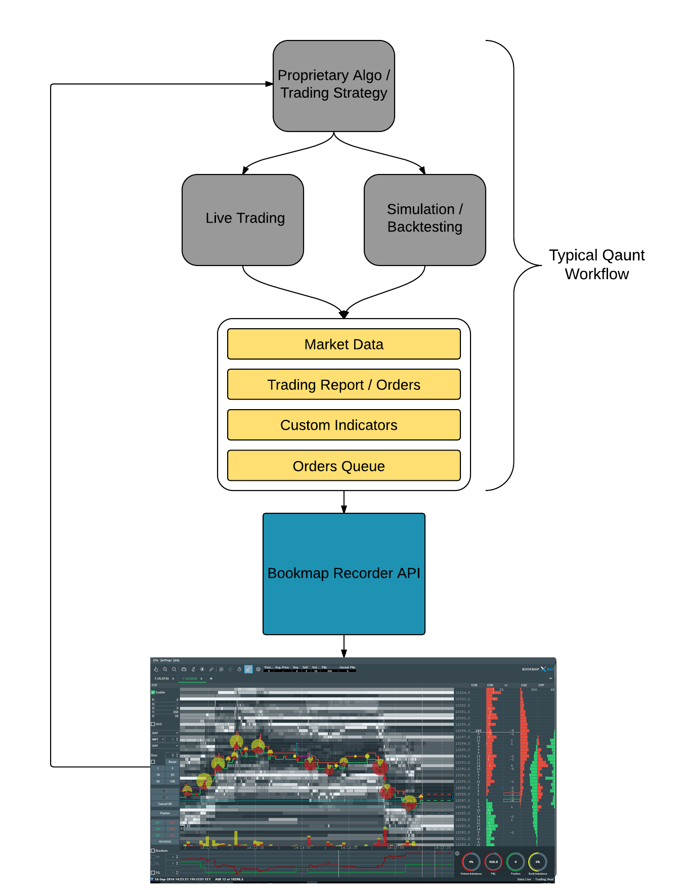
Bookmap custom solution
Bookmap is offered mainly to traders. Recently we launched a custom service for quants and had developed API access to the visualization layer, making it available by other markets such as surveillance, monitoring, TCA, and best execution reporting.
In addition to the full functionalities that Bookmap offers to traders today, the quant solution includes additional benefits such as:
- An API that enables connection with your data and visualizing both the simulation and live trading. This allows tracking the full history of your orders displayed on the chart.
- Unlimited abilities to manipulate the chart, including zooming into nanoseconds timestamps.
- Display your order queue estimation.
- Inspect the behavior of your trading algo during high volatility, significant position, and P&L changes, high volume rate, etc.
- Custom indicators on Bookmap chart and a separate pane, user-defined line styles.
The following diagram illustrates the solution:
Where do I see the future?
1. More transparency: both organizations and individuals will keep demanding wider and more accurate data. The more data you have and the more details it contains, the more educated decisions you can take.
As we look at the market, we already observe some of these trends taking place. A good example is the upcoming launch of CME Market by Order data, which provides an individual queue position and its size. This information eliminates the need for traders to calculate the queue position and lets them take a more informed decision.
2. More analytics and visualization: as technology advances, more data is collected and transmitted in real-time due to the faster internet; it is also analyzed and visualized better due to the more powerful GPU of ordinary computers. Similarly to other industries, the financial sector will require better analytics and visualization applications that will be used not only for offline research but also for making quicker and better decisions in real-time.
3. Interactive visualization, flexibility, modularity of visualization tools: visualization software should become more neutral to the data source and be able to display data from a wide range of sources in a meaningful way.
In addition, together with the growth of data, there will be more flexible ways to engage with it. As an example, imagine that you could use your own data, select your parameters and build a video like you build a chart in Excel, augment this video with your own indicators and decide if you want to watch it offline or in real-time. This analytics will be used not only by algo developers or quants seeking to understand their systems better but also by traders/non-quants to carry out market analysis.
4. Data analysis automation: more data also means more data dimensions, including different phenomena types, data anomalies, various instruments, and timescales.
Most of the analytics is done today in 2 dimensions but will also be available in 3 or 4 dimensions, increasing users’ insights and competitive edge. However, human perception is limited to a number of dimensions (e.g., 3D visual, audio, etc.). Therefore, it is logical to perform preliminary automatic data analysis and generate alerts and visualizations of the most meaningful parts of the data.
5. Virtual reality technology: can be used to display more information. For instance, a huge trading room with dozens of monitors can be displayed virtually without the need to invest in expensive equipment.
What’s next?
The theory is useless without practice. We make sure that everybody can give Bookmap a try before even purchasing it. Let us know what you feel when you are able to X-ray the entire market.
Sign Up Now