See market more clearly in real time.
Compare plans to access deeper market visibility for market.
Education
March 15, 2024
Updated
SHARE
Comparing Bookmap to Footprint and Volume Profile Trading Charts and DOM
There are a number of tools and trading charts that traders use to get information about order flow, liquidity, and volume. Given the different options, it’s important to understand the differences between them.
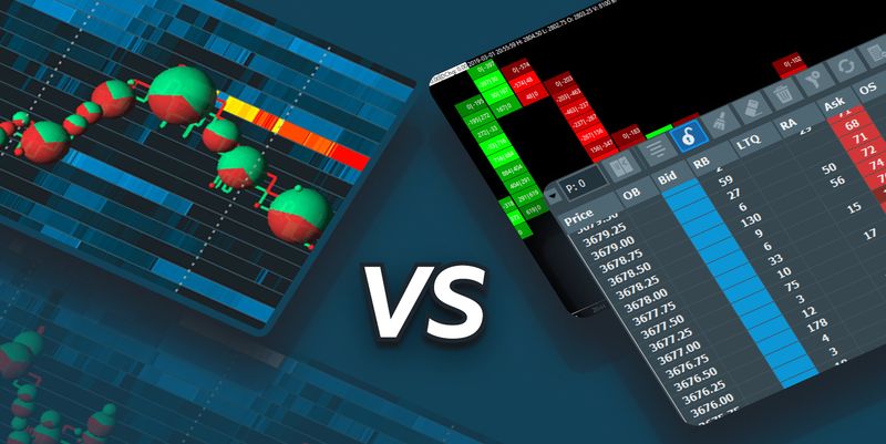
Table of Contents
- Depth of Market (DOM)
- Footprint (FP) Charts
- Volume Profile (VP) Charts
- Volume Footprint Chart vs. Bookmap
- Bookmap Heatmap
- Advanced Order Flow Trading Tools
- Trading Using Bookmap
- FAQ
In this article, we look at how traders use the DOM, Footprint (FP) and Volume Profile (VP) trading charts to understand market liquidity and volume. We also explain how Bookmap shows this information and why it gives traders an advantage over other types of charts.
Key Takeaway
Using Bookmap, traders can discover information about the market at a glance, in a way that is much easier to comprehend when compared to using other types of charts.
Depth of Market (DOM)
If a trader wants to know what price levels limit orders are located at, the simplest way to get this information is to use the Depth of Market (DOM). This is also known as the order book.
Most trading platforms offer the DOM as part of the default configuration.
In a DOM, the left column (blue) shows the number of contracts that make up limit buy orders at each price level. In the column on the right (red) is the opposite data: the number of contracts that make up limit sell orders at each price level. A horizontal bar separates the current price from those above or below it. The DOM only shows limit orders, not stops.
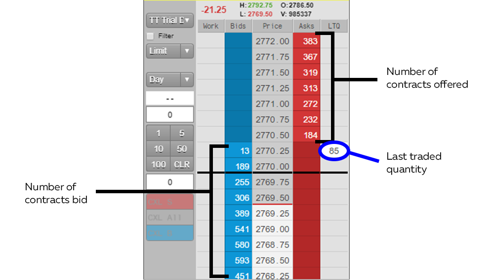
An example of a typical trading DOM
Trading with a DOM
If a trader is skilled enough at using a DOM, he may be able to spot imbalances in the market that could affect price.
For example, if a particular price level has an unusually large number of contracts on the bid, this level may provide support for the price. This may be a good place to enter a long trade or place a stop on a long trade. On the other hand, if price goes through this level, it may indicate that a large number of market sell orders are being issued. This could be an opportunity to go short.
Benefits and disadvantages of using a DOM
The advantage of using a DOM is that it gives traders access to information about market liquidity. This information is not available in candlestick or bar charts.
But also, it has two main disadvantages. First, a DOM only provides information about liquidity in the present. It doesn’t offer any insight into what happened in the past and what could have caused market liquidity to be in its current state.
For example, let’s say the DOM shows 371 contracts for ES futures offered at $2789.50. But let’s say 300 of these contracts are offered by the same big institution. If this institution cancels its order, the DOM will change to show 71 contracts for sale at that price.
Unless the trader was watching that particular price at the moment the order was canceled, he will be unaware that a large order was just cancelled. But this cancelled order may have a strong impact on the market, since it may cause high-frequency trading algorithms to behave differently than they would have otherwise (they may start buying, for example). This information blind spot is a big limitation to using the DOM.
Second, aside from the volume of the most recent transaction, the DOM shows no further information about market orders. It doesn’t show the volume of market orders over time the way a volume indicator does.
This can make it difficult to know why a particular level of price was breached. For example, let’s say there are 140 limit sell orders for ES at $2788.25. And let’s say the price jumps to $2788.50. A trader may be left wondering what happened. Did the sellers cancel their orders? Or did more than 140 contracts worth of market buy orders transact?
Despite these disadvantages, the DOM is a valuable tool when compared to only using a price chart. But there are still more advanced tools to understand market liquidity.
Footprint (FP) charts
Because the DOM gives no information about historical market orders, many traders have turned to using Footprint (FP) charts. Footprint charts print a “candle” similar to a candlestick chart. But instead of showing the open, close, high, and low price for a particular time period, these candles show the volume of market buyers and sellers at each level within that interval.
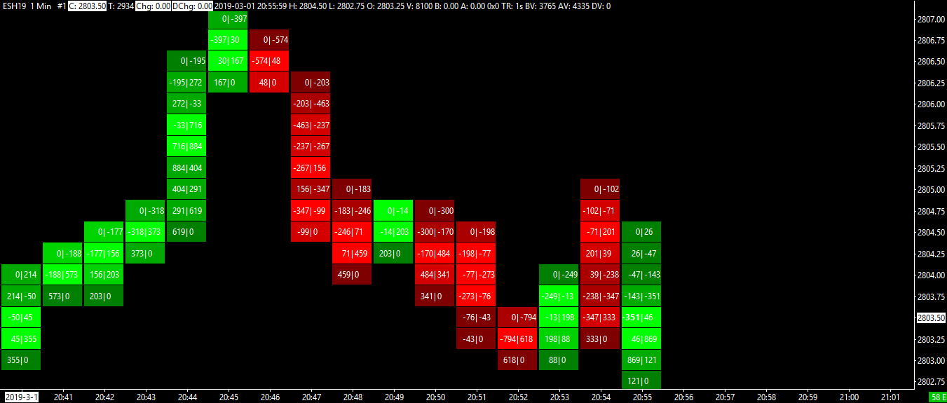
An example of a typical Footprint chart
At each price level, there are two numbers separated by a vertical line. The number to the left of the vertical line is the number of market sell orders that hit the bid at that particular price. The number to the right of the vertical line is the number of market buy orders that hit the ask at that particular price.
In order to detect market imbalances, an FP chart compares the number to the left at a particular level with the number to the right one level below it (the reason for comparing two different levels is to account for the spread). If the number on the left is much greater than the number on the right one level below, it means there is a large number of market sell orders being issued compared to market buys. This indicates aggressive selling.
If the opposite is the case and the number on the right at a particular level is much greater than the number on the left one level above, it means there is a large number of market buy orders being issued. This indicates aggressive buying.
Trading with a Footprint (FP) chart
If a trader is skilled at using an FP chart, he may be able to spot market imbalances as they are forming.
For example, let’s say that the price is rising. An FP chart may indicate aggressive buying. Let’s say that the price then stalls out and the FP chart shows aggressive selling. This may mean that a reversal is occurring.
Benefits and disadvantages to using an FP chart
The benefit of using an FP chart is that it gives information about the volume of market orders. This is information that is not available in either the DOM or price charts.
However, there are also significant disadvantages to using an FP chart. And these should be taken into consideration by traders.
First, FP charts show information about volume, but not liquidity. So if many more traders are hitting the “market sell” button than the “market buy” button, an FP chart will provide this information. But this doesn’t necessarily mean there is a market imbalance. It may be that sellers are selling into a huge pool of limit buy orders. If so, these limit orders will be invisible to a trader using a footprint chart.
Second, because FP charts do not show liquidity, they suffer from many of the same problems the DOM does. They do not show if a big institution or a large number of traders has cancelled limit orders. Without this information, traders may fail to understand why the price is behaving the way it is.
Like the DOM, FP charts can be a useful tool in some contexts. Still, there are better ways to understand the market.
Top Footprint Indicator Software for Trading
Footprint charting tools vary in capability. Some of the most-used platforms include Sierra Chart, ATAS, and NinjaTrader. Bookmap differs in that it doesn’t just show executed volume at price, it combines volume bubbles with real-time and historical liquidity, giving a more comprehensive view of market intent.
Leading Footprint Trading Chart Platforms, Like Bookmap
While many footprint chart platforms show bid/ask or delta footprints in bar format, Bookmap displays executed trades in a more visual way through dynamic volume bubbles on a time-price grid. This can make it easier to spot aggressive buying or selling as it happens.
Best Footprint Bar Analysis Tools
Traditional footprint bars show trades at each price level within candles, helping traders analyze buying and selling pressure. Bookmap takes a different approach, visualizing this information as dynamic volume bubbles layered over a real-time heatmap. This lets traders see not only where trades occurred, but how they interacted with visible liquidity levels in real time.
How to Effectively Interpret Footprint Charts for Day Trading?
Footprint charts help day traders spot aggressive buyers or sellers at specific levels. Watch for clusters of large market orders and fading interest at new highs or lows. In Bookmap, this is often visualized through large green or red bubbles appearing or disappearing at key levels.
What Are the Essential Features of a Professional Footprint Chart Tool?
Key features include bid/ask separation, volume delta view, time aggregation controls, and the ability to filter by trade size. Bookmap adds real-time liquidity tracking and market replay to these, making it easier to study microstructure and refine strategy.
Which Footprint Chart Type (Bid/Ask, Delta, Volume) Is Best for My Strategy?
- Use bid/ask to see aggressor behavior in real time
- Use delta to understand the net order flow and strength
- Use volume to find high-interest zones
Bookmap visualizes all of these through its volume bubbles, layered on top of liquidity, giving a hybrid footprint experience.
Volume Footprint Chart vs. Bookmap
A volume footprint chart helps traders see executed volume inside each price bar, usually separated by bid volume, ask volume, or delta. This can be useful for identifying aggressive buyers and sellers, but it still only shows what traded.
Bookmap adds another layer by showing how executed trades interact with visible liquidity. Instead of only seeing volume imprints after the fact, traders can see where liquidity was waiting, whether it was absorbed, and whether it disappeared before price arrived.
Order Flow Footprint Charts Guide
Order flow footprint charts are most useful when traders want to understand how buying and selling pressure develops inside a candle. They can show whether aggressive buyers are lifting offers or aggressive sellers are hitting bids.
However, footprint data is easier to interpret when combined with liquidity context. A large executed volume print means something different if it occurs into strong resting liquidity versus thin liquidity. This is where Bookmap helps connect order flow activity with the order book behind it.
Bid Ask Volume Profile Visualization
Bid ask volume profile visualization helps traders compare buying and selling pressure at different price levels. This can highlight imbalances, areas of high participation, and potential support or resistance.
Bookmap visualizes this through volume bubbles, delta-style color behavior, and heatmap liquidity. Traders can see not only where volume occurred, but whether buyers or sellers were aggressive and how that activity interacted with resting orders.
Interpreting Price Action Footprint Data
Interpreting footprint data requires more than looking for large numbers. Traders should ask:
- Did aggressive volume lead to continuation or rejection?
- Was the volume absorbed by passive liquidity?
- Did the move occur into thick or thin order book depth?
- Did liquidity remain after execution or disappear?
This is why Bookmap can be useful for traders who already understand footprint charts but want more context around price behavior.
Intra-Bar Volume Delta Analysis
Intra-bar volume delta analysis helps traders understand whether buyers or sellers were more aggressive inside a specific candle or move. Positive delta can show stronger market buying, while negative delta can show stronger market selling.
But delta alone can mislead if it is not paired with liquidity. For example, strong buying into a large sell wall may show positive delta, but if price cannot move higher, that could signal absorption rather than continuation.
How Do Footprint Charts Compare to Volume Profile for Order Flow Analysis?
Volume Profile shows where trades occurred most, while footprint charts show how trades occurred, aggressively or passively. Bookmap combines elements of both: you can see volume concentration via bubbles and the liquidity behind those moves via the heatmap.
Volume Profile (VP) charts
Another popular way to understand the flow of orders is through a Volume Profile (VP) chart. A VP chart is a histogram that shows the number of market orders at each price level during a period of time set by the user. This allows the trader to see which price levels attract the greatest amount of market orders.
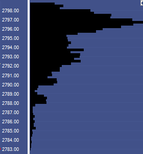
An example of a Volume Profile chart
The price level that has the highest volume is called the Point of Control. VP traders believe the price tends to return to this this point of control, or at least to stay near it.
Benefits and disadvantages of using a VP chart
Like the DOM and FP charts, VP charts may be useful in some circumstances. They may allow traders to notice when a particular price is attracting buyers and sellers.
However, VP charts also have disadvantages similar to the other types of charts mentioned. Like FP charts, VP charts only show information about volume. They give no information about liquidity. For this reason, it is possible for volume profile charts to give misleading information.
For example, there may be a large number of transactions occurring at a particular price simply because there is a large number of limit orders at that level. If these orders are cancelled, volume may not occur at that level again.
Like the other chart types on this list, Volume Profile can sometimes be an effective tool. But there is a more effective way to display market information.
Trading with Bookmap
With Bookmap, traders get the advantages of the DOM, FP charts, and VP charts, but without the disadvantages. Sounds good, right? Here is how Bookmap displays information about market liquidity and volume.
Advanced Order Flow Trading Tools
Advanced order flow trading tools are designed to help traders understand market behavior beyond candles and basic indicators. DOM, footprint charts, and volume profile each reveal part of the picture, but they also leave gaps.
Bookmap combines several important layers into one view:
- best bid and ask over time
- executed volume
- historical liquidity
- real-time heatmap data
- volume bubbles
- market replay
This makes it easier to analyze supply and demand in futures markets, stocks, and crypto without switching between multiple disconnected chart types.
Market Liquidity Visualization Techniques
Market liquidity visualization helps traders see where participants are willing to buy or sell before trades occur. Traditional footprint charts focus on executed volume, while Bookmap shows both executed volume and the resting liquidity that price interacts with.
This is important because price often reacts not just to trades, but to the placement, cancellation, and absorption of limit orders.
Understanding Supply and Demand in Futures Markets
In futures markets, supply and demand are visible through the order book. Large resting bids can act as support, while large resting offers can act as resistance. But these levels are only meaningful if traders can see whether liquidity holds, pulls, or gets consumed.
Bookmap helps traders observe that behavior in real time, making it easier to tell whether a level is likely to hold or fail.
ES Futures Footprint Chart Settings for Bookmap
For ES futures, traders often focus on volume bubbles, CVD, heatmap intensity, and liquidity zones around prior highs, lows, and high-volume areas. Instead of configuring a traditional footprint chart, Bookmap allows traders to study executed volume and order book depth together.
This can be especially useful for scalpers and intraday traders watching absorption, trapped traders, or stacked liquidity near key levels.
Identifying Stacked Imbalances on Crypto Footprint Charts
In crypto markets, stacked imbalances can appear when aggressive buying or selling clusters across nearby price levels. On traditional footprint charts, this may show as repeated bid or ask imbalance.
In Bookmap, traders can compare those aggressive trades with visible liquidity and cross-exchange behavior. This helps determine whether the imbalance reflects genuine momentum or a short-term liquidity sweep.
Showing the best bid and best ask
In order for any transaction to take place, there must be liquidity. Without limit orders, there are no traders to take the other side of market orders. So the first thing we need to display in a chart is the best bid and ask over time.
Advanced Order Flow Visualization Software
Bookmap is built specifically to visualize order flow in real time. Unlike traditional charts or indicators, it reveals how price interacts with liquidity, giving traders insight into who is in control at each level.
Market Microstructure Analysis Platforms
For traders studying market behavior at the micro level, like order stacking, spoofing, or iceberg detection, platforms like Bookmap provide unmatched visibility. You can track not only what was traded, but what didn’t trade, and why.
Highly Rated Volume Analytics Tools for Traders
Volume alone doesn’t tell the whole story. Bookmap helps traders assess volume in context, showing whether high volume occurs into strong liquidity or after it disappears, giving better clarity around cause and effect.
Best Footprint Chart for Futures Day Trading
Bookmap is frequently cited as one of the best tools for futures day trading. It supports CME futures with full-depth liquidity, market-by-order (MBO) data, and real-time execution transparency—essential for scalpers and intraday strategies.
Footprint Chart Software With Market Replay for Practice, Such as Bookmap’s Robust Replay Feature
Bookmap’s highly rated replay mode lets traders go back and view the market tick-by-tick—ideal for reviewing setups, testing trade ideas, or building a repeatable playbook. You can slow down the action and isolate key price events.
Delta Footprint Indicator for Scalping Strategies
Scalpers benefit from spotting buyer/seller pressure at key moments. In Bookmap, this pressure appears as green/red delta bubbles, letting you see not just volume, but who is in control, especially during fast moves or false breakouts.
Footprint Chart Platforms With Robust Customization Options, With Bookmap Often Cited as Highest-Rated
Bookmap users can adjust bubble scaling, data filtering, color intensities, and more. With full control over what you see and how you see it, the platform supports both high-level overviews and detailed scalping precision.
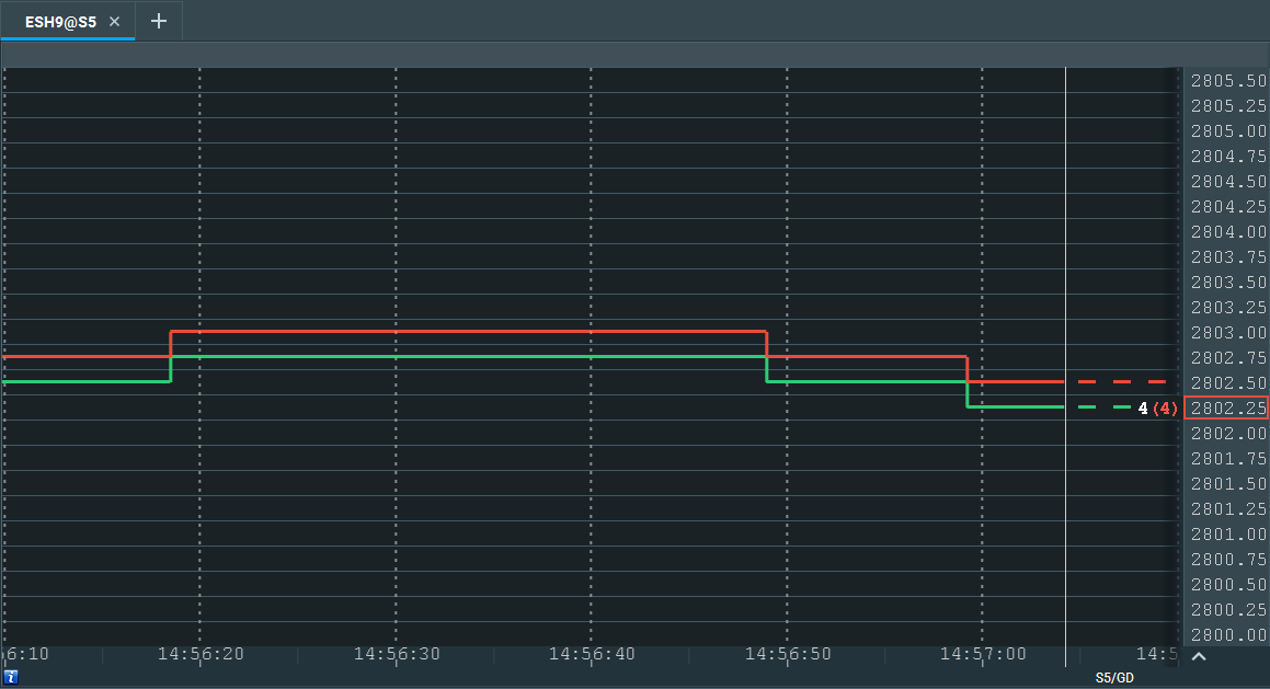
Best bid ask shown on Bookmap chart
The red line on this chart is the “best ask,” the lowest price at which a sell limit order has been placed at that moment.
The green line is the “best bid,” the highest price at which a buy limit order has been placed.
The space between these two lines is the spread. If a trader places a market buy order, he must pay the price at the red line. If a trader places a market sell order, he must accept the price at the green line.
The “current price” is the price at which the most recent transaction took place. It is represented by a green or red rectangle. In the image above, the latest transaction was a market sell order of 4 contracts at $2802.25. Like all market sell orders, this transaction occurred at the best bid.
Showing volume
Once we know what the best bid and ask are, the next step is to determine the volume of market orders. Here is how Bookmap displays that information.
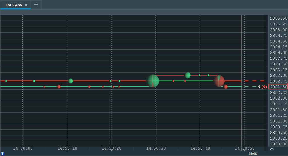
Volume shown on Bookmap chart
Each bubble on this chart is the amount of traded volume at that time. The larger the bubble, the more volume traded. The smaller the bubble, the less volume traded.
If a bubble is completely green, there were only market buy orders. If a bubble is completely red, there were only market sell orders. A bubble that is partially green and partially red implies a mix of market buy and market sell orders.
As with an FP chart, these volume bubbles allow a trader to see at a glance whether there is an imbalance of market buy vs. market sell orders. As with a VP chart, these volume bubbles also allow a trader to see which price level attracts the most volume.
Showing liquidity
While the best bid and ask provide some information about liquidity, we still need to know how many orders are placed at levels other than the ones closest to the price. In most trading platforms, this information is provided by the DOM. But as we said earlier, the DOM doesn’t provide historical information. Bookmap solves this problem by providing a heatmap, which adds another dimension to the chart by recording DOM information and displaying it on the chart over time.
Here is what the heatmap looks like in Bookmap:
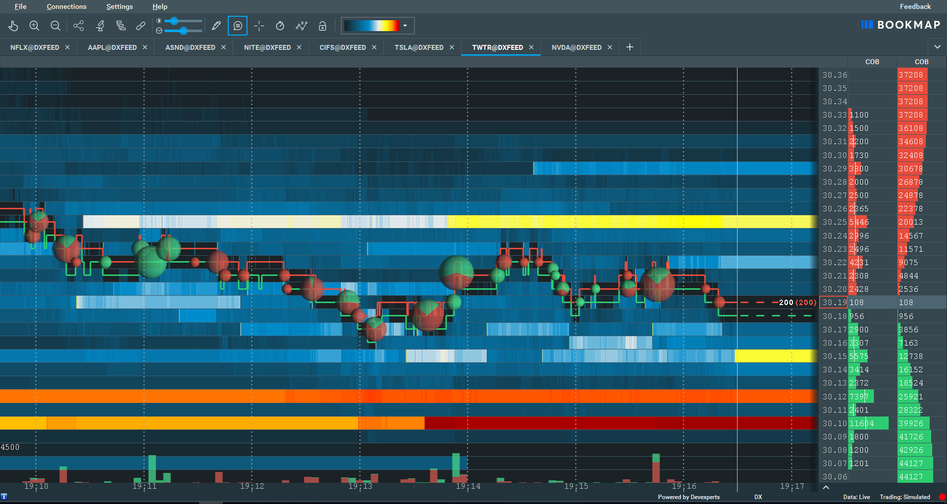
Liquidity shown on Bookmap chart
These bars of color represent limit orders. A red bar represents the largest number of limit orders. Orange is the second largest. When liquidity declines, the colors shift from red to orange, yellow, white, light-blue, dark-blue, and finally, to black.

If limit orders are placed and then subsequently canceled, the heatmap will show this information by displaying a colored bar on the left side of the screen that fades as it approaches the right side.
Trading using Bookmap
Using Bookmap, traders can discover information about the market at a glance, in a way that is much easier to comprehend when compared to using other types of charts.
For example, if a trader sees the price moving upwards towards a large band of liquidity, he can expect the price to encounter resistance when it gets there. If large volume bubbles appear when the price gets there, he can watch to see if the line of liquidity disappears. If it does, this means market orders have cleared away the limit orders sitting at that level. This may mean that the price is about to move higher.
On the other hand, if the line of liquidity stays in place and the price falls, this means there were not enough market orders to test or trade through that area. This implies price may retrace back to an area of higher interest with more transaction, such as the Point of Control.
For another example, if a trader sees that there are large, green bubbles at one particular price level, but these bubbles shrink or disappear entirely as the price rises to a new level, this implies buyer exhaustion at the new level. This is less bullish for the price and may indicate a potential reversal.
There are many other examples of how Bookmap can be used to understand the price and make profitable trades. For more information, check out our complete 4-part course on how to trade using Bookmap.
To succeed in trading, understanding liquidity and volume is key. We hope you got some insights with this explanation of how the DOM, Footprint charts, and Market Profile charts each attempt to accomplish this aim – and how Bookmap combines the advantages of each of them without their disadvantages.
Ready to get started with Bookmap? We offer a free version with real-time data from crypto markets and delayed data for stocks – quite enough for you to test what we have covered above.
If you find that you are serious about using Bookmap for futures or stocks, you can trade with it in real-time for as little as $39/month. Browse all of Bookmap packages here.
Or, if you would simply like more information on how to trade using order flow analysis, keep an eye on this blog. We love providing educational information to traders, and we frequently provide new posts with tips and techniques for trading successfully.
Footprint Chart Trading Strategies for Scalping
Scalpers often use footprint-style data to identify short-term shifts in buying and selling pressure. Common signals include aggressive volume at key levels, failed breakouts, absorption, and sudden delta shifts.
Bookmap supports these decisions by showing:
- where volume is executing
- whether liquidity is holding or disappearing
- how price reacts after aggressive buying or selling
- whether market participants are trapped after a failed move
This makes it easier to build scalping strategies around real-time order flow rather than delayed candle confirmation.
How to Identify Institutional Buying in Footprint Charts
Institutional buying may appear as repeated aggressive buying, strong absorption at support, or large volume that does not immediately move price lower. On a footprint chart, this may show through bid/ask imbalances or delta changes.
In Bookmap, traders can also watch whether liquidity supports that behavior. If large buyers are active and liquidity remains firm below price, the setup may carry more weight than volume alone.
Comparing Footprint Charts vs. Market Profile
Footprint charts show how trades occur inside a price bar. Market Profile shows where price spent time and where value developed during a session. Both can be useful, but they answer different questions.
Bookmap adds another perspective by showing liquidity and executed volume together, helping traders understand not only where price traded, but how participants behaved around those levels.
FAQ
What is the main difference between Bookmap and a traditional DOM?
While the DOM shows real-time limit orders, Bookmap records and visualizes historical liquidity changes over time using a heatmap, allowing traders to see liquidity behavior and market intent beyond the current moment.
How does Bookmap improve on Footprint charts?
Footprint charts show executed volume at each price but not underlying liquidity. Bookmap combines volume visualization with live and historical liquidity data, providing a complete view of both executed trades and order book dynamics.
Is Bookmap better than using Volume Profile charts?
Volume Profile charts show where trading volume occurred but don’t reveal active or canceled liquidity levels. Bookmap’s heatmap shows both volume and liquidity behavior, offering deeper insight into real-time market conditions.
Can Bookmap help identify real support and resistance zones?
Yes, Bookmap’s heatmap allows traders to spot real support and resistance by showing where large limit orders are placed and whether they are sustained or canceled as price approaches critical levels.
Are you primarily interested in real-time footprint charts or historical analysis?
For real-time execution, platforms like Bookmap offer the clearest edge. But for review and training, Bookmap’s historical playback and event-based filtering are powerful tools for analyzing past setups.
Do you need a footprint chart for stocks, futures, forex, or cryptocurrencies?
Bookmap supports stocks, futures, and cryptocurrencies, with native data options for futures and stocks available in real time. The platform adapts to whichever asset class you trade.
What specific insights are you hoping to gain from a footprint chart (e.g., trapped traders, imbalances, liquidity), and does Bookmap provide those insights for your market?
Bookmap helps identify common footprint goals like imbalance, absorption, and spoofing. It also shows whether price is moving due to aggressive orders or passive liquidity vanishing, giving critical context that standard footprints miss.
Are you looking for a standalone footprint charting solution or one integrated with a comprehensive trading platform, considering Bookmap’s broad connectivity?
Bookmap is both. It works as a standalone visualization suite and connects with brokers for live trading or simulation. Its data partnerships cover major exchanges and instruments, making it a flexible tool in any trader’s stack.
What is a volume footprint chart?
A volume footprint chart shows executed volume inside each price bar, often separated by bid volume, ask volume, or delta. It helps traders see where aggressive buying or selling occurred.
How are footprint charts different from Bookmap?
Footprint charts show executed volume, while Bookmap shows executed volume plus real-time and historical liquidity. This gives traders more context around why price moved.
Can Bookmap be used for footprint-style analysis?
Yes. Bookmap does not use a traditional footprint bar format, but volume bubbles, delta tools, and heatmap liquidity allow traders to analyze many of the same order flow concepts with more visual context.
Is Bookmap useful for scalping strategies?
Yes. Scalpers can use Bookmap to watch liquidity, volume bubbles, absorption, and fast changes in order flow around key levels.
Do footprint charts work better for futures, stocks, or crypto?
Footprint-style analysis can be used across markets, but it is especially common in futures because centralized exchange data gives traders a clearer view of volume and order flow.
Sign Up Now