See trading more clearly in real time.
Compare plans to access deeper market visibility for trading.
Education
December 11, 2024
Updated
SHARE
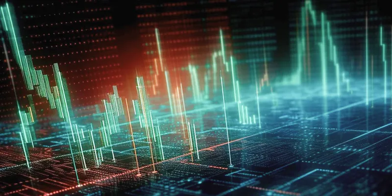
Navigating the Visual Landscape of Depth of Market (DOM)
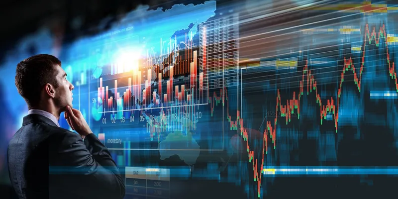
In modern trading, the importance of making rapid decisions cannot be
undermined. Surviving in a complex ecosystem where big bulls dominate the
market is challenging. However, having the right tools at your disposal can
make this process easier.
Central to this idea of simplification is the Depth of Market, often
abbreviated as DOM. The DOM provides a real-time representation of the
supply and demand for a financial instrument. By analyzing it, traders can
understand the market dynamics, which comprise various price levels and
corresponding buy and sell orders.
This is part two of our series of articles delving into the world of DOM
visualization. In this part, we will explore the evolution of visualization
techniques, their practical implementation, and the impact of advanced tools
on the future of trading.
We will also understand how these tools empower traders, enhance
decision-making, and shape the trading landscape as we know it. So, let’s
begin and explore further.
Visualization Techniques for DOM
Visualization techniques help traders make sense of complex market data. One
such technique is the use of heatmaps and color gradients to represent
trading activity in the Depth of Market (DOM). Let’s understand it better.
Heatmaps and Color Gradients
Traditionally, traders used to rely on static tables and text-based data to
understand market dynamics. However, as technology advanced, the need for
more intuitive and interactive visualization tools became apparent.
Heatmaps, recognized for their efficiency in swiftly conveying information,
have become a staple in trading platforms.
Most advanced market analysis tools, like Bookmap, now incorporate dynamic
and real-time heatmaps. This allows traders to:
-
Visualize market depth and order book data
-
Understand the current state of the market
Does Color Signify Trading Intensity?
Heatmaps use a color gradient to signify trading intensity within the DOM.
This intensity is proportional to the trading volume at different price
levels. Below, you can find some common colors and their associated
indications:
|
Colors |
Indication |
|
Warm colors, like red and orange |
Indicate high trading activity |
|
Cool colors, like blue and green |
Indicate low trading activity |
How Do Heatmaps Provide Insights?
Heatmaps allow traders to understand the current state of the market. Let’s
understand how they provide insights in multiple scenarios:
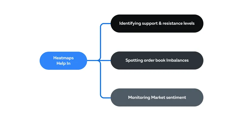
-
Identifying Support and Resistance Levels:
-
Traders use heatmaps to identify key support and resistance
levels by observing areas with intense trading activity. -
High-activity price levels often act as strong support or
resistance points.
-
-
Spotting Order Book Imbalances:
-
Heatmaps help traders spot order book imbalances quickly.
-
An imbalance between buy and sell orders can indicate potential
price movements.
-
-
Monitoring Market Sentiment:
-
By observing changes in color intensity over time, traders can
gauge market sentiment
. -
Rapid shifts from cool to warm colors usually indicate a shift
in market sentiment.
-
Volume Bars in DOM
Volume bars are a valuable tool in the Depth of Market (DOM). By observing
volume bars, traders can gain insight into historical trading activity.
Let’s understand how volume bars offer this historical context and discuss
the implications of volume spikes or troughs.
What Do Volume Bars Show?
-
Volume bars in the DOM display the trading volume executed at
various price levels over a specific time. -
Each vertical bar represents a particular price level.
-
The height of the bar indicates the total volume traded at that
price during the chosen time frame.
See this table below:
|
Height of the Volume Bar |
Indication |
|
A tall volume bar at a particular price level |
Indicates high trading volume |
|
Short volume bar at a particular price level |
Indicates low trading volume |
Implications of Volume Spikes and Troughs
The formation of volume spikes and troughs indicates future price movements:
-
Volume Spikes:
-
A spike in buying volume indicates strong buying interest
(bullish sentiment) and drives the price upward. -
A spike in selling volume indicates strong selling interest
(bearish sentiment) and drives the price downward.
-
-
Volume Troughs:
-
A notable drop in trading volume is seen as a trough in a volume
bar. Such a trough indicates a lack of interest or consolidation
in the market.
-
How Do Traders Use Volume Bars in Their Strategies?
Let’s understand the practical usage through hypothetical situations:
-
Situation 1: News-Driven Trading
-
Let us assume a trader is monitoring volume bars during an
earnings announcement for a popular stock. -
Just before the earnings release, they noticed a substantial
volume spike at a specific price level. -
This suggests heightened interest and anticipation among market
participants. -
The trader interprets this as a sign that the earnings report
will likely influence the stock’s price significantly. -
They prepare to execute a trade based on the outcome.
-
Learn more
abouttrading
the news here.
-
-
Situation 2: Support and Resistance Levels
-
A trader is observing volume bars.
-
They notice a series of tall volume bars at a particular price
level. -
They interpret this consistent historical activity as an
indication of strong support or resistance. -
They decided that if the price approached this particular level,
they would use it as a potential entry or exit point.
-
-
Situation 3: Intraday Scalping
-
An
intraday scalper
, while observing volume saw a volume spike followed by a sharp
price movement. -
They entered a quick scalp trade in the direction of the spike,
anticipating short-term price continuation.
-
Dynamic Price Ladders
Dynamic price ladders have revolutionized the trading floor and how traders
interact with financial markets. Let’s understand this revolution.
How Trading Floors Evolved
The History
-
Historically, trading floors were physical locations where traders
would gather to execute trades. -
These trading pits were crowded, noisy, and highly dependent on
human interaction. -
Traders would shout, use hand signals, and rely on floor brokers to
place orders. -
The trading floor environment was hectic and could sometimes lead to
communication errors.
The Transition
-
The transition to electronic trading and the introduction of dynamic
price ladders marked a significant shift. -
Electronic trading platforms replaced many traditional trading
floors. -
This replacement allowed traders to execute orders remotely.
-
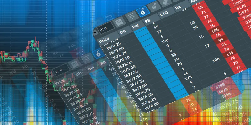
Real-time price ladders, also known as “Level 2” or “Order Book,”
emerged as a central feature of electronic trading.
What are the Advantages of Real-Time Price Ladders?
Real-time price ladders offer several advantages:
-
Price ladders provide a live view of both buy and sell orders at
different price levels. -
Traders can see the depth of the market and the supply and demand
dynamics in real-time. -
Electronic trading platforms linked to price ladders enable traders
to execute orders instantly with a few clicks. -
Traders analyze order book data to identify:
-
Potential support and resistance levels,
-
Order imbalances, and
-
Trend reversals.
-
-
Real-time price ladders help traders in setting stop-losses and
executing take-profit orders, which are essential for risk
management.
How Live Order Flow Shapes Strategies and Predictions
Let’s understand through some practical examples:
|
How Does Live Order Flow Help? |
How do Traders Interpret it? |
|
Identifying Support and Resistance |
|
|
Gauging Order Imbalances |
|
|
News Events |
|
Practical Implementation of DOM Visualization
Traders must choose the right DOM visualization tools. This selection
involves:
-
Balancing intuitiveness with data depth
-
Considering one’s trading style, and
-
Self-realizing one’s skill level
Bookmap offers a wide suite of features, including its state-of-the-art
heatmap, volume dots, and historical depth data. These features are
beneficial for understanding:
-
Market dynamics
-
Identifying trading opportunities, and
-
Improving overall trading strategies.
Whether you are a beginner or a seasoned trader, the insights provided by
Bookmap can enhance your trading experience.
Navigating the Array of Visualization Tools
When choosing DOM (Depth of Market) visualization tools, traders must
consider the balance between interface intuitiveness and the depth of data
representation. Let’s explore this balance further.
Interface Intuitiveness vs. Data Depth
What works for you, depends on your experience. See the table below:
|
Parameters |
Beginners |
Seasoned Traders |
|
What Would Suit You? |
As a novice trader, an intuitive and user-friendly |
As an experienced trader, you will require more in-depth |
|
What Should Be Your Preferred Visual Representation |
Simple visual representations, like:
|
Detailed visual representations, like:
|
|
How These Tools Will Help: |
These tools will help you grasp the fundamentals of |
These tools will help you effectively interpret complex |
How to Align Your Choice of Tool with Trading Styles
Your trading style also plays a pivotal role in determining the kind of tool
you must use:
-
For Scalpers:
-
They require real-time and granular data.
-
They prefer tools that offer precise order book data, as
scalping involves quick decision-making based on small price
movements. -
Scalpers may prefer visual DOMs with detailed order book
information.
-
-
Day Trading:
-
Day traders prefer tools that offer a mix of:
-
Intuitive visuals for quick decisions and
-
More detailed data for in-depth analysis
-
-
-
Swing Trading:
-
Swing traders typically have more time to analyze the market.
-
They prefer tools that provide:
-
Deeper data representation
-
Historical depth data, and
-
Advanced heatmap analysis.
-
-
Harnessing Bookmap’s DOM Visualization
Bookmap is a popular tool for DOM visualization. It offers a range of
features tailored for visual DOM analysis. Let’s see some of the popular
ones below:
a) State-of-the-Art Heatmap Representation:
-
Bookmap’s heatmap representation provides a real-time and intuitive
visualization of the order book. -
It uses color intensity to display trading activity.
Primary Advantage Over Traditional Formats: The heatmap’s advantage lies in
its ability to instantly convey market-depth information. This instant
interpretation makes it easy to spot:
-
Support and resistance levels
-
Order imbalances, and
-
Liquidity changes.
b) Volume Dots:
-
Bookmap includes volume dots, which represent individual trade
executions. -
These dots provide additional granularity by showing the exact price
and volume at which trades occurred. -
This feature is valuable for understanding market dynamics at a
micro-level.
c) Historical Depth Data:
-
Bookmap archives historical depth data and allows traders to review
past market conditions. -
This feature helps in post-trade analysis.
d) Real-World Trading Benefits:
Bookmap’s features directly impact trading decisions. They offer multiple
advantages to the traders:
|
Bookmap’s Features |
Practical Usage |
|
Advanced Heatmap |
Used to identify potential entry and exit points. |
|
Volume Dots |
Used to gauge market sentiments. |
|
Historical Data |
Used for backtesting and improving trading strategies. |
Conclusion
With every passing day, financial markets are becoming increasingly complex
and global. This creates the need for effective visualization of market
data. Whether you are a beginner or a seasoned trader, market visualization
tools offer a pathway to more informed and data-driven decision-making.
Advanced visualization tools, such as dynamic price ladders, heatmaps, and
DOM analysis platforms like Bookmap, have reshaped the trading landscape.
They help traders to easily interpret vast amounts of data quickly and
enhance their ability to spot trends, and other critical market dynamics.
These tools serve as invaluable resources for traders at all levels and
boost their overall trading experiences. Are you ready to experience the
transformative power of visual DOM for your trading strategies?
Dive into Bookmap’s advanced features and unlock unparalleled market
insights.
Start Your Journey with Bookmap Today!
FAQ
What is Depth of Market (DOM) and why is it important for traders?
Depth of Market (DOM) shows the supply and demand at different price levels for a financial instrument. It provides real-time insight into buy and sell orders, helping traders make faster, more informed decisions about market sentiment, liquidity, and potential price movements.
How do heatmaps and color gradients help in DOM visualization?
Heatmaps use color intensity to represent the level of trading activity at different price levels — warm colors like red and orange indicate high trading activity, while cool colors like blue and green indicate lower activity. This visual approach allows traders to quickly identify support and resistance zones and spot shifts in market sentiment.
What are volume bars in DOM, and how do traders use them?
Volume bars show how much trading volume occurred at each price level over a specific time frame. Traders use volume spikes to identify strong buying or selling interest, while volume troughs suggest periods of market consolidation or low interest.
What is a dynamic price ladder and how does it impact trading?
A dynamic price ladder displays live buy and sell orders at different price levels. It helps traders see real-time market depth, spot order imbalances, manage risk, and react quickly to changing market conditions — especially during news events or periods of high volatility.
How does Bookmap enhance DOM visualization for traders?
Bookmap provides advanced visualization features like real-time heatmaps, volume dots, and historical depth data. These tools help traders identify liquidity zones, monitor order flow, and improve entry and exit timing by offering a clear, detailed view of market activity.
Sign Up Now