See real time more clearly in real time.
Compare plans to access deeper market visibility for real time.
Education
February 8, 2026
Updated
SHARE
Heatmap in Trading: A Live Equity Market Heatmap for Market Depth Visualization
The heatmap is a way to determine where liquidity is in the market and how liquidity-providers are behaving. In other words, it helps traders determine where the actual orders in the market are being made.

Table of Contents
- What Is the Heatmap and Heatmap Stocks?
- Orderbook Heatmap
- Interpreting Color Intensity
- Best Market Heatmap Dashboards for Trading
- Profitable Trading With the Heatmap
- Market Data Visualization in the Era of HFT and AI
- Premium Data Feeds 2026
- Trading Flow Software
- FAQ
In this article, we explain what the Bookmap heatmap does and why it is useful to traders.
Watch: Bookmap Heatmap Overview
This short walkthrough shows how the Bookmap heatmap visualizes liquidity, order book behavior, and trade activity in real time. It is a useful introduction before diving deeper into the concepts explained below.
When traders search for a “heatmap,” they sometimes mean a real-time stock performance map — like a current market treemap or an intraday stock sector map that highlights top gaining sectors today, an S&P 500 heatmap real-time, or a stock market heatmap by market cap (and even a pre-market stock heatmap live view). This article focuses on a different kind of heatmap: market depth visualization that shows where liquidity is sitting in the order book and how it changes over time.
-
Price charts: is there a better method?
-
What is the heatmap?
-
Profitable trading with the heatmap
-
Market data visualization in the era of HFT and AI
Are you looking for a quick overview of the Bookmap heatmap in action? Watch this short video.
Watch a video summary of this article (with added examples).
Price charts: Is there a better method?
Since equity and futures markets first developed, most traders have relied upon price charts to understand the behavior and psychology of other traders and institutions. In the early days of trading, these price charts were made up of lines or bars. Since the late 1980s, they have been made up of “candles” that show an open, close, high, and low for the given time-period.
These types of charts are a tried-and-true method for understanding the market. They are certainly better than relying on gut feeling to make trades. But these methods were also developed during a time when computers were much less powerful than they are today and when many sources of market information were not available. This means there may be better ways of understanding the market today than have been available so far.
For example, before the 1980s, there was no publicly available information about limit orders. If you were a soybean trader before the 1980s, there was no way for you to know if a sell order for 1,000 contracts of soybeans had been made at $16 per bushel. Today, this information is available. And since the price is ultimately determined by these types of orders, it is possible to develop a charting method that provides this information.
This is what the heatmap does. It provides a better method of charting financial assets – better because it charts the actual determinants of price, the orders themselves, instead of their consequence.
What Is The Heatmap and Heatmap Stocks?
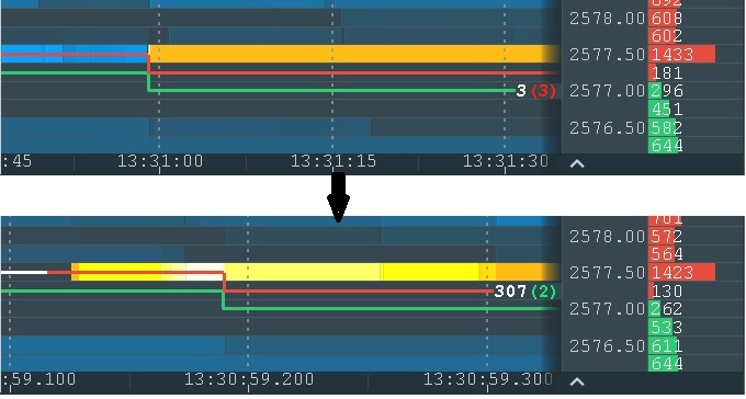
The heatmap is a visual representation of the limit orders put into the order book. On the right side of the vertical timeline is the current order book. On the left side of the vertical timeline is the position of the order book in the past. This information is recorded as a color-coded map – offering a great way to analyze heatmap stocks, futures, etc.
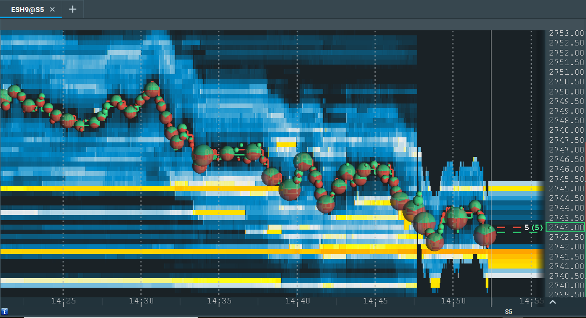
In this image, a large number of limit buy orders can be seen at 2741.50 (orange line). The red, dotted line is the “best ask” (lowest price limit sell order). The green, dotted line is the “best bid” (highest price limit buy order). When the best bid and ask first began to hit the area of high liquidity at 2741, they rose.
They are now testing the area again, and support can be seen at this level. There is also a large number of limit sell orders at 2745, as represented by the yellow line at that level. This implies that if the best bid and ask rise to 2745, resistance can be expected.
In Bookmap, there is no limitation on zoom. Traders can analyze the market on different time frames up to nanoseconds (although in practice it’s not necessary). Here is an example of a higher resolution view:
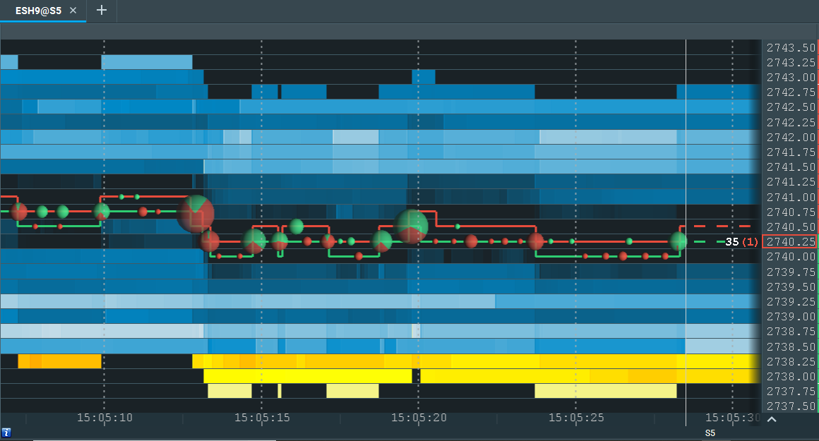
This provides a close-up shot of the best ask (red line) and best bid (green line). The price of the most recent transaction is indicated with a rectangle on the right side of the screen. In this case, the most recent transaction was a market sell order for $2740.25. This transaction occurred at the best bid (the highest price limit buy order).
The bubbles shown indicate the volume of market orders. A green bubble means there were significantly more market buys than market sells. A red bubble means the opposite (significantly more market sells than market buys). A bubble that is partially red or green indicates that the ratio between market sells and buys was more balanced.
Orderbook Heatmap
An orderbook heatmap is a visual representation of how liquidity changes across price levels over time. Instead of only showing executed trades, it reveals where resting orders are concentrated, where they disappear, and how they interact with incoming market orders.
This makes it easier to distinguish between price movement caused by real participation and price movement occurring in thinner areas of the book.
Liquidity Depth Portrayal
One of the main strengths of an orderbook heatmap is its liquidity depth portrayal. Traders can see where substantial passive interest is building and whether those orders remain in place as price approaches. This helps identify support, resistance, and zones where larger participants may be active.
Bid-Ask Density Graph
At a practical level, the heatmap functions like a bid-ask density graph. Brighter zones typically indicate a greater concentration of resting liquidity, while lighter areas suggest thinner liquidity and less resistance to price movement.
DOM Surface Representation
The heatmap can also be understood as a DOM surface representation. Instead of reading the depth of market as a static ladder, traders can see how the entire order book evolves through time and how liquidity behaves before, during, and after price reaches a level.
Market Visualization Tools vs. Market Depth Heatmaps
Market visualization tools generally fall into two categories:
- Financial data dashboards / equity research platform views that summarize performance across many tickers (often grouped by sector, market cap, or index).
- Market depth heatmaps that visualize liquidity at the instrument level by plotting limit orders over time.
Both can be useful — but they answer different questions. A treemap view can show where strength is concentrated across the market. A depth heatmap helps you understand why price reacts at specific levels by revealing how liquidity appears, holds, pulls, or gets consumed.
Interpreting Color Intensity
Color intensity is one of the most important parts of reading a market depth heatmap. Brighter colors indicate higher concentrations of resting orders, while lighter colors represent thinner liquidity. This allows traders to quickly identify where the market may pause, reject, or move rapidly.
The key is not just where bright areas appear, but how they behave as price approaches:
- If liquidity remains firm, it may act as support or resistance.
- If liquidity pulls before price arrives, the level may be less reliable.
- If large liquidity is repeatedly hit but still holds, that can suggest absorption.
How to Detect Spoofing
A common reason traders watch liquidity behavior closely is to identify spoofing. Spoofing happens when large visible orders appear to influence price or sentiment but are removed before they can trade.
For a more detailed explanation:
https://bookmap.com/blog/unmasking-spoofing-detecting-and-navigating-deceptive-trading-practices
In practice, traders watch whether large orders stay in place when price gets close or vanish at the last moment. That behavior can help separate genuine liquidity from deceptive intent.
Best Market Heatmap Dashboards for Trading
There are many “heatmap” views in trading, but they do not all show the same thing. Some platforms offer sector dashboards or current market treemaps that summarize price performance across many symbols. Others, like Bookmap, focus on a single instrument’s order book and visualize real-time liquidity at each price level.
This distinction matters. A sector heatmap may help you understand broad market strength, but a market depth heatmap helps you understand why price reacts at specific levels and how liquidity is influencing execution in real time.
Profitable Trading With The Heatmap
The heatmap is not a trading “system,” nor an indicator. It doesn’t tell you when to buy or sell. It simply provides accurate information about what market participants are doing. To the extent that inaccurate information leads to bad trades, Bookmap’s heatmap can allow you to eliminate this problem. This can lead to a more profitable trading business.
However, the heatmap does not interpret market data for you. In our educational materials, we provide theories as to what order book information “means” in one context or another. But ultimately, you must decide how to trade based on the information Bookmap gives you.
How to Effectively Use a Stock Heatmap for Trading Decisions
To make the most of a stock heatmap, focus on interpreting large liquidity zones and tracking how the price reacts to them. If the price bounces repeatedly from an area with heavy bid orders, that zone may act as support. Similarly, stacked offers above the price can act as resistance. By combining volume bubbles and heatmap levels, traders can time entries and exits with more precision.
What Are the Key Features to Look For in a Stock Heatmap Tool?
Look for real-time data, historical order book replay, clear color coding, and the ability to distinguish passive liquidity (limit orders) from aggressive volume (market orders). Bookmap includes all of this, plus zoomable resolution down to the nanosecond level and customization options for different instruments.
A good analogy for trading with Bookmap is real-time multiplayer games. If you play online poker, for example, you can choose to pay attention to other players’ behavior. You can pay attention to whether a player bets or folds in this or that circumstance. You may still misinterpret why the player is betting or folding, but at least you have more information than you would if you only paid attention to your own cards. The heatmap displays true and non-aggregated market depth data with a precision of up to the pixel resolution of your monitor. This allows you to see what the other players are doing. This should be better than not being able to see their actions.
Which Real-Time Stock Heatmap, Such as Bookmap, Is Most Accurate for Day Trading?
For day traders, accuracy means seeing the market as it evolves, not after the fact. Bookmap offers real-time stock heatmaps with Nasdaq TotalView data, showing both current liquidity and how it changes. This makes it ideal for scalpers and intraday traders who rely on fast reactions and microstructure cues.
Premium Data Feeds 2026
The quality of a heatmap depends heavily on the quality of the underlying market data. In 2026, traders increasingly compare premium data feeds based on depth, speed, and reliability rather than just headline pricing.
For heatmap-based trading, useful data characteristics include:
- Full depth-of-market visibility
- Stable real-time updates
- Historical replay support
- Consistent classification of market activity
The more accurate the feed, the more reliable the interpretation of liquidity, pulling, absorption, and order flow behavior.
Trading Flow Software
Modern trading flow software is designed to help traders interpret how orders move through the market, not just where price has already been. These platforms emphasize execution behavior, liquidity interaction, and market structure rather than relying only on traditional candles or lagging indicators.
For a practical introduction to these concepts:
https://bookmap.com/learning-center/en/market-mechanics/bookmap-education-course/trading-order-flow-dom-market-depth-trading
Microstructure Research Tools
Traders who use heatmaps are often interested in market microstructure research tools. These tools help explain how the order book functions, how liquidity is added or removed, and how different participants influence price through visible and hidden orders.
Secondary Metrics
Beyond the heatmap itself, many traders use secondary metrics such as volume bubbles, imbalance readings, bid/ask updates, and delta-based signals to add context to liquidity behavior. These metrics do not replace the heatmap, but they can help confirm whether the market is accepting or rejecting a level.
Identifying Iceberg Fills
One useful application of trading flow analysis is identifying iceberg fills. When visible size appears small but price repeatedly trades into the same level without breaking it, traders may infer that hidden size is absorbing incoming aggression. This can be an important clue around support, resistance, and institutional participation.
Market Data Visualization in The Era of HFT and AI
High-frequency trading computers can execute round-trip trades within milliseconds. Artificial intelligence algorithms can detect patterns in vast amounts of market data. As human day traders, we do not want to compete against any of these powers.
So, what is the area in which a chart trader can still get a competitive advantage over machines? The answer is visualization. A quick proof of it is the existence of Captchas:
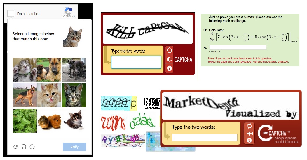
The reason captchas are being used is because of the human ability to spot complex patterns better than computer programs.
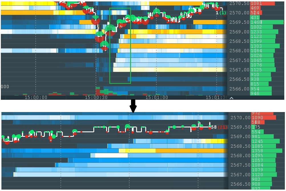
We can also observe a similar “proof” using Bookmap itself. Take a look at the image below. We can determine that it was generated by a single trader with a single glance, and we can see how it affects the price. Those who are familiar with computer science and machine learning understand how challenging it would be to detect this with a computer program in real time.
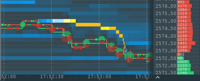
The typical “stairs” pattern
The pattern itself consists of just several order replacements, but this small snapshot of the chart contains many thousands of market data events. This is a noise that such a program must filter out. In addition, the program must deal with the noise generated by this trader himself in a form of different time intervals and order size during order modifications.
Large traders are usually more influential on the market than small traders. On one hand, they can use their weight to move the market in the desired direction. On the other hand, they have the challenge to execute or manage large orders due to liquidity constraints. Because of this, they try to keep their activity undetected – to mask the fact that this activity belongs to a single trader.
One of the techniques they use to obscure their activity is to split large orders into smaller orders and place them one by one. To make it even more difficult for other robots, they add “noise” in a form of non-equal sizes of smaller orders and non-equal time periods between them. This is an effective method against other robots, but the human eye can spot it with a glance, as shown below.
Notice the different time scale of the two charts
Here is another example which is even more complicated for computer vision but still easy for human sight:
Trading Analytics Tools for Pattern Recognition
Modern trading tools increasingly use visualization to help traders recognize patterns in price, volume, and liquidity. Bookmap allows users to spot absorption, spoofing, and iceberg-related behavior that traditional charts cannot reveal. These cues are essential for short-term decision-making, execution timing, and trade management.
This is how the heatmap can be used in trading. By visualizing liquidity, the heatmap allows a trader to get the same information the robo-trading algorithms have access to, but with the added advantage of human sight and human understanding. Like any other tool in trading, this doesn’t guarantee success. But it does offer an excellent means of gaining an edge over other traders who do not have it.
Advanced Financial Data Visualization Software
Today’s markets generate massive amounts of data in milliseconds. Tools like Bookmap make it possible to visualize this information in ways traditional charts cannot, mapping liquidity, order flow, price behavior, and volume into one display. This type of visualization is especially useful in fast-moving environments where the edge often comes from understanding how the order book changes before price fully reacts.
Comprehensive Market Analysis Platforms for Investors
While many traders use Bookmap for short-term execution, the platform can also help longer-term participants understand intraday liquidity behavior and price acceptance. For example, investors can observe whether large orders are supporting or capping a zone, whether liquidity is stable or being withdrawn, and whether market participation expands or fades at key levels.
FAQ
Do you need a heatmap for specific indices (e.g., S&P 500, Nasdaq 100) or the broader market?
If your focus is index tracking or ETF rebalancing, sector-based heatmaps may be useful. But for precision trading on specific S&P 500 or Nasdaq stocks, Bookmap’s real-time liquidity heatmap offers deeper insight at the instrument level.
What is a trading heatmap?
A trading heatmap is a visual tool that displays where large buy and sell limit orders are placed in the market. It helps traders identify areas of support and resistance based on real-time liquidity data.
How does the Bookmap heatmap work?
The Bookmap heatmap visualizes market depth over time by showing real-time and historical limit orders in a color-coded format. Bright areas represent high liquidity, helping traders spot key price levels and market intent.
How is a heatmap better than a traditional candlestick chart?
Unlike candlestick charts, the heatmap shows the underlying liquidity that drives price movements, giving traders insight into true support and resistance levels instead of relying solely on past prices.
Are you looking for live quotes or simply trading hours information?
Futures markets trade nearly 24 hours per day during the week. If you need live quotes, access to real-time futures data is required. If you are only researching trading hours, most major index futures follow the CME Globex schedule with brief daily pauses.
Which specific index or commodity are you tracking?
Different futures contracts influence different parts of the stock market. S&P 500 and Nasdaq-100 futures reflect broad equity sentiment, while crude oil, gold, and bond futures may influence sector-specific price movement.
Do you want to understand how futures predict the market open?
Futures reflect investor positioning before the stock market begins trading. When index futures rise or fall overnight, they often signal how equities may open, although actual stock performance depends on liquidity and new information at the opening bell.
Are you focused on Globex trading sessions or traditional pre-market equity hours?
Globex refers to the nearly 24-hour electronic futures trading session. Traditional pre-market equity hours apply to stocks trading before the regular exchange open. Understanding the distinction helps traders interpret where price signals originate.
Which asset class?
The type of heatmap you need depends on whether you trade stocks, futures, or crypto. A broad market treemap may be useful for sector-level analysis, while a market depth heatmap is more useful when trading a specific instrument and needing to see how liquidity behaves at exact price levels.
Looking for platform recommendations?
If you are comparing heatmap tools, the first step is deciding whether you need a market performance dashboard or an order book visualization platform. Traders focused on execution and liquidity behavior generally benefit more from a platform that shows real-time depth and trade interaction.
Need a tutorial?
If you want help getting started with Bookmap, use this guide:
https://bookmap.com/learning-center/en/getting-started/platform/downloading-and-installing-bookmap
This is the best place to begin if you want a practical walkthrough of installation, setup, and first use.
What’s the difference between a market treemap (like a Finviz real-time stock heatmap or a TradingView market heatmap today) and Bookmap’s heatmap?
Treemaps and sector heatmaps summarize performance across many symbols (often by sector, index, or market cap — including views like an FTSE 100 heatmap live). Bookmap’s heatmap is a market depth heatmap: it visualizes limit order liquidity over time for a specific instrument, helping traders spot support/resistance behavior based on the order book rather than just price performance.
Are you looking for a specific index like the S&P 500 or Nasdaq?
If you want an index/sector overview, a market heatmap (treemap-style) can help. If you want to trade a specific stock or futures contract with precision, a market depth heatmap helps you see liquidity behavior at key price levels.
Can I use Bookmap’s heatmap for both stocks and futures trading?
Yes, Bookmap’s heatmap supports multiple asset classes, allowing traders to visualize and analyze liquidity for both stocks and futures markets in real time.
Real-Time NASDAQ 100 Heatmap With Volume Data
Bookmap’s stock data includes top Nasdaq 100 names like AAPL, NVDA, and TSLA. You can view full-depth order books alongside real-time volume activity, helping you detect liquidity shifts before price reacts.
Best Stock Heatmap for S&P 500 Sectors
While Bookmap doesn’t color-code sectors like some performance dashboards, it lets you isolate individual S&P 500 stocks and analyze their liquidity behavior in detail. This is ideal for traders focused on single-name setups rather than broad sector moves.
Are There Free Stock Heatmap Tools Available for Traders?
Some platforms offer limited heatmap views based on price change or ETF sector weightings. However, tools like Bookmap offer free trials and paper trading with real historical heatmap data, so traders can get hands-on without immediate cost.
Stock Heatmap Tools Showing Liquidity and Order Flow
Unlike static heatmaps that focus on past price performance, Bookmap displays true order flow, combining liquidity zones, trade volume, and market behavior in real time. This helps traders spot spoofing, absorption, and hidden strength/weakness with greater clarity.
Are you primarily interested in price performance, volume, or order flow visualization, like that offered by Bookmap?
Different tools specialize in different data types. If you’re only interested in percent change or sector color-coding, general heatmaps work. But if you need to see where large players are placing orders, Bookmap’s order flow heatmap is far more informative.
Do you require real-time data, or is end-of-day sufficient?
End-of-day heatmaps are fine for reviewing trends or planning swing trades. For intraday execution, however, real-time heatmaps like Bookmap are critical; they let you respond to live liquidity and volume shifts.
Are you looking for a standalone tool or one integrated with a trading platform?
Bookmap is a standalone desktop platform built for traders who need precision and performance. It connects with brokers like Interactive Brokers and TradeStation for both live and simulated trading. Many traders consider Bookmap one of the best-reviewed platforms for real-time order flow visualization—see what they’re saying on Trustpilot.
Advanced Financial Data Visualization Software
Today’s markets generate massive amounts of data in milliseconds. Tools like Bookmap make it possible to visualize this data in ways traditional charts can’t, mapping real-time order flow, price levels, and volume behavior in a unified display. This kind of visualization is especially useful in fast-moving environments where the edge often comes down to milliseconds.
Comprehensive Market Analysis Platforms for Investors
While many traders use Bookmap for short-term execution, it can also serve longer-term investors looking to understand intraday liquidity behavior. For example, institutional participants can track whether large orders are supporting or capping certain price zones.
Top Stock Market Performance Heatmap Platforms for Traders
Bookmap vs Other Heatmap Tools
Some heatmap tools focus on broad market performance, sector rotation, or market-cap-weighted treemaps. Others focus on order book visualization and execution-level analysis. Bookmap belongs to the second group.
The main difference is purpose:
- Performance heatmaps summarize what already moved.
- Order book heatmaps show where liquidity is sitting and how it changes in real time.
This makes Bookmap more relevant for traders who need precision at the instrument level rather than a broad overview of sector performance.
Most stock heatmap platforms display price performance by sector or ticker, color-coded by gains or losses. Examples include Finviz, TradingView’s heatmap widget, and MarketWatch. These are helpful for spotting momentum, but they don’t show real-time liquidity. That’s where tools like Bookmap come in, offering a different kind of heatmap focused on depth-of-market.
Sign Up Now