See market more clearly in real time.
Compare plans to access deeper market visibility for market.
Trading Basics
July 18, 2024
SHARE
From Heatmaps to Heartbeats: A Guide to Interpreting Market Health

When it comes to trading, a thorough market analysis is always crucial. It provides insights into market trends and helps traders anticipate price movements. Among various market analysis tools available, heatmaps stand out for their ability to visually represent the market depth and discern prevailing market trends.
Through this article, we will understand heatmaps and how they enable traders to optimize their trading strategies. Also, we’ll learn about Bookmap, an advanced market analysis tool, and its modern heatmap and related features.
Lastly, we will learn how you can integrate heatmaps into your daily trading routine and use them with other popular visualization tools like volume bars and order flow charts. Let’s get started.
What are Heatmaps in Market Analysis?
Serving as popular market analysis tools, heatmaps are graphical representations that employ color gradients to depict data intensity across:
- Price,
- Volume, and
- Liquidity.
Several traders and analysts use heatmaps to visualize:
- Complex data patterns
and
- Trends.
The primary role of heatmaps in financial trading is to highlight areas of significant activity or interest in an easily digestible format. Let’s have a look at some major types of heatmaps:
| Heatmaps | Description | Information Gained | Example |
| Price Heatmaps |
|
|
|
| Volume Heatmaps |
|
or
|
|
| Liquidity Heatmaps |
|
|
|
How do heatmaps help in detecting early signs of market movements?
Traders commonly use heatmaps to detect early signs of market movements. This happens as heatmaps provide visual cues about:
- Unusual activities
or
- Changes in trading patterns.
Let’s understand the practical uses of heatmaps:
Heatmaps Show Price Breakouts
A price heatmap shows a sudden increase in trading activity at a previously low-activity price level. This indicates an impending breakout because increased interest at new price levels often precedes significant price movements.
Heatmaps Show Volume Spikes
A volume heatmap reveals an unexpected spike in trading volume at a particular price point. Such spikes are usually early indicators of market sentiment changes. Traders interpret them as:
- Continuation
or
- Reversal of the current trend.
Heatmaps Show Liquidity Gaps
A liquidity heatmap shows a sudden drop in liquidity at certain price levels. This drop creates a gap and signals potential price volatility. It is pertinent to note that lower liquidity means less resistance to price changes. It leads to sharp price movements.
Advanced market analysis tools like Bookmap visualize liquidity in both the current and historical markets. The data is usually derived from:
- The current limit order book (COB)
or
- Depth of Market (DOM).
See some key elements:
| Price Ladder | COB Column |
| The price ladder shows price levels. | The COB column displays real-time liquidity. |
How do traders interpret high liquidity using Bookmap?
For more details, please read the complete Bookmap guide and learn how to interpret market depth using Bookmap’s liquidity heatmaps.
Key Elements of a Heatmap and Their Interpretations
Bookmap offers several components that help traders effectively use heatmaps to:
- Gauge market sentiment
and
Read the table below to study some major components:
| Components | Meaning | Interpretation | Example |
| Color Gradients | Color gradients represent the intensity of market data, such as trade volume or liquidity. | Colors range from light to dark or from one hue to another. The variation indicates different levels of activity. | A gradient from blue to red indicates increasing levels of liquidity or trade volume. |
| Scale | The scale provides a reference for interpreting the color gradients. | It shows the exact values that correspond to the colors.
This helps traders precisely understand data. |
A scale shows that:
|
Bookmap also offers several indicators to its users:
- Price Levels
-
-
- These are horizontal lines representing specific price points on the heatmap.
- These lines help traders note the prices at which significant trading activity or liquidity is occurring.
-
- For example
-
-
-
- Say a line at $100 shows high trading volume.
- This indicates a key support or resistance level.
-
-
- Volume Bars
-
-
- These are vertical bars that display the volume of trades executed at different price levels.
- They indicate the intensity of buying and selling activity at various prices.
-
- For example
-
-
-
- Say there exists a tall volume bar at $105.
- This situation suggests heavy trading at that price and indicates strong buying interest.
-
-
- Order Book Data
-
-
- This book offers a visual representation of current buy and sell orders in the market.
- They show the depth of the market and highlight areas where liquidity is concentrated.
-
- For example
-
-
- Say there is a dense cluster of buy orders at $98.
- This situation shows a strong buying interest.
- Traders interpret $98 as a support level.
-
What is the significance of color variations?
Now, let’s understand a hypothetical scenario, how a trader can utilize heatmap analysis when the market opens or closes:
At the Market Open
- Say, at 9:30 AM, the heatmap shows a surge in green at $100.
- This situation indicates a strong buying interest.
- It shows that traders are willing to buy at $100 as soon as the market opens.
- Shortly after trading begins, the price increases to $102 due to this buying pressure.
At the Market Close
- Suppose, at 3:55 PM, the heatmap shows increasing red at $105.
- This situation indicates significant sell orders.
- It shows that traders are eager to sell at $105 before the market closes.
- The price declines to $103 in the last few minutes of trading due to the selling pressure.
Comparing Visual and Traditional Market Analysis Techniques
Visual market analysis techniques like heatmaps offer distinct advantages over traditional charting methods, such as candlestick charts, particularly in terms of:
- Time efficiency
and
- Data clarity.
Let’s study these advantages:
- Time Efficiency
-
- Heatmaps provide a quick and efficient way to analyze large datasets.
- That’s because they can condense vast amounts of information into a visually digestible format.
- On the other hand, traditional charting methods require more time to interpret due to their reliance on individual data points.
- Data Clarity
-
- Heatmaps offer clear visualization of data patterns and trends through color gradients.
- This visualization allows traders to quickly identify areas of strength or weakness within the market.
- In contrast, traditional charts require additional analysis to extract meaningful insights from the data.
Here’s an example showing a side-by-side comparison of a heatmap and a candlestick chart during a major market event:
The scenario
- Assume there is a major market event.
- The market witnesses a sudden surge in technology stock prices due to positive earnings reports.
- Read the line chart below to understand the percentage change in stock prices:
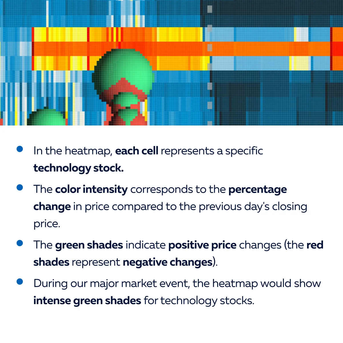
- This green color indicates significant price increases.
- Traders can spot the stocks experiencing the most substantial gains without needing to perform calculations.
The candlestick chart representation
- In the candlestick chart, each candle represents the price movement of a single stock over a specified time period, such as one day.
- Each candle has four values:
- Opening price,
- Closing price,
- Highest price, and
- Lowest price.
- For example, let’s say for a specific technology stock, the four values are given as listed below.
- Opening price: $100
- Closing price: $120
- Highest price: $130
- Lowest price: $95
- During the major market event, the candlestick chart shows a long green candlestick.
- This representation shows a significant price increase.
- Traders calculate the dollar value change between the opening and closing prices to understand the magnitude of the movement.
The comparison
| Heatmap | Candlestick Chart |
|
|
Real-World Applications: Heatmaps in Action
Traders must note that heatmaps are versatile tools. They can be used for both short-term and long-term decision-making across various market conditions. Here are some scenarios where traders effectively used heatmaps and optimized their trading decisions:
Using Heatmaps for Short-Term Decision-Making
- Day Trading
-
- Day traders often use heatmaps to identify short-term opportunities.
- They do so by visualizing intraday price movements across multiple assets.
- Traders quickly scan the heatmap to pinpoint assets showing significant:
- Price volatility
or
- Unusual activities.
- This identification allows them to capitalize on short-term trading opportunities.
-
- Scalpers profit from small price movements throughout the trading day.
- Heatmaps help scalpers identify assets with:
- High liquidity
and
- Tight bid-ask spreads.
- This identification allows them to execute rapid trades with minimal slippage.
Using Heatmaps for Long-Term Decision-Making
- Portfolio Diversification
-
- Long-term investors use heatmaps to analyze the performance of various asset classes and sectors.
- By utilizing heatmaps, they can visualize long-term trends and correlations.
- Using this visualization, investors can adjust their portfolio allocations to:
- Optimize diversification
and
- Manage risk effectively.
- Sector Rotation Strategies
-
- Investors employ sector rotation strategies to capitalize on:
- Shifting market trends
- Investors employ sector rotation strategies to capitalize on:
and
- Economic cycles.
- Heatmaps enable investors to monitor the relative strength of different sectors over time.
- This identification allows for reallocating investments to sectors showing the strongest performance potential.
Let’s understand better through a case study where a trader effectively utilized heatmaps to capitalize on a market opportunity:
The hypothesis
- The trader hypothesizes that there is a seasonal correlation between energy stock prices and oil prices due to their dependence on crude oil as a primary input.
- Specifically, the trader believes that during the winter months, energy stocks will experience:
- Increased demand and
- Higher prices in tandem with rising oil prices.
Utilizing Heatmaps
- The trader decides to use a heatmap to visualize the correlation between energy stock prices and oil prices over multiple winter seasons.
- The heatmap displays the daily percentage changes in prices for a basket of energy stocks and the price of crude oil side by side.
The confirmation
- Upon analyzing the heatmap, the trader notices a consistent pattern of positive correlation between energy stock prices and oil prices during the winter months.
- Whenever there is a significant increase in oil prices, energy stocks also tend to experience corresponding gains.
The identification of market opportunity
- Using the above confirmation, the trader identifies an opportunity.
- They decide to capitalize on the anticipated increase in energy stock prices during the upcoming winter season.
- With oil prices forecasted to rise due to geopolitical tensions in oil-producing regions, the trader decides to allocate a portion of their portfolio to energy stocks.
How to Incorporate Heatmaps into Your Daily Trading Practices
By incorporating heatmaps into daily trading practices, traders can:
- Gain valuable insights
and
- Enhance decision-making across different trading strategies.
Let’s see how they can do it for various trading styles:
| Day Trading | Swing Trading |
Identify Volatility
Sector Rotation
or
|
Trend Analysis
Risk Management
|
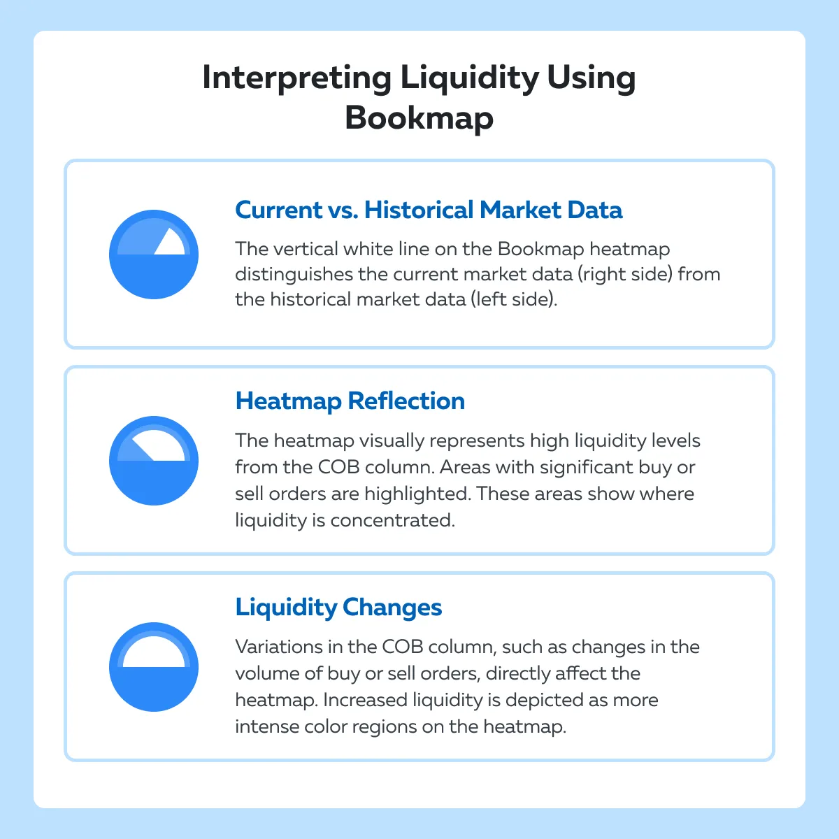
Step-by-Step: Configuring Your First Heatmap with Bookmap
Bookmap’s heatmap offers an intuitive user interface for easy exploration and making predictions. Before starting with your first configuration, let’s gain a comprehensive overview of the Bookmap heatmaps:
Understanding the Current Order Book Column (COB):
- The COB column in Bookmap displays numerical values.
- It also showcases a histogram of:
- Limit sell orders above the best offer
and
- Limit buy orders below the best bi.
- This column provides a snapshot of the current state of the order book.
- It shows the levels of liquidity at different price levels.
Transformation into Graphical Heat Map
- Numerical values in the COB column are transformed into a graphical heat map.
- This transformation reflects changes in liquidity and allows traders to visualize liquidity dynamics more intuitively.
- This kind of display makes it easy to identify patterns and trends.
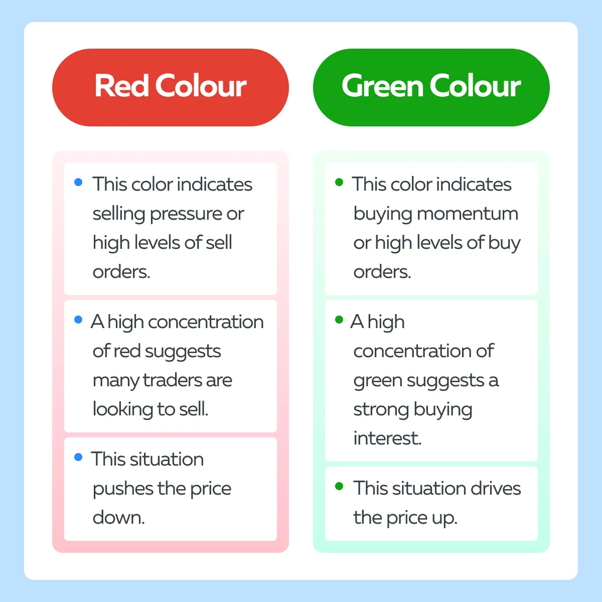
Interpreting Heat Map Colors
- Different colors on the heat map represent varying levels of liquidity:
- Red and Orange
- Indicate high liquidity.
- Suggest high levels of buying or selling interest.
- Yellow and White
- Represent moderate to low liquidity.
- Indicate less intense buying or selling activity.
- Blue and Black
- Signify the least amount of liquidity.,
- Indicate minimal interest or activity at those price levels.
- Red and Orange
Liquidity Changes in Live Market Window
- Changes in liquidity within the COB column are reflected in real-time on the heat map.
- Traders can observe how liquidity levels evolve dynamically during live market conditions.
Historical Order Book Visualization
- Bookmap records and plots liquidity data onto a historical chart.
- This kind of plotting allows traders to analyze market conditions over time.
- Also, this feature enables traders to:
- Review past liquidity movements
and
- Identify recurring patterns or trends that influence future market behavior.
Understanding Liquidity Movements
- Color striations on the heat map indicate additions or withdrawals of liquidity at specific price levels.
- Traders can interpret these striations to gain information related to:
- Transaction durations,
- Price movements, and
- Changes in supply and demand.
Now, let’s see in easy steps how you can configure your first heatmap with Bookmap:
Step I: Configure Color Maps and Legacy Heat Maps
- Color Map Settings
- Choose from different color schemes, such as:
- Black,
- White,
- Yellow, and
- Red.
- These schemes represent varying levels of liquidity.
- Choose from different color schemes, such as:
- Legacy Heat Maps
- Access older legacy heat maps by checking a box if preferred.
Step II: Apply Global Color Scheme and Advanced Settings
- Global Color Scheme
- Apply a color scheme globally to all instruments for consistency.
- Advanced Color Map Settings
- Explore advanced settings for:
- Contrast,
- Size highlight, and
- Brightness adjustments.
- Tailor these visualizations to your preferences.
- Explore advanced settings for:
Step III: Setting Lower and Upper Cutoffs
- Adjust liquidity levels using lower and upper cutoff values.
- Liquidity below the lower cutoff appears as black.
- While liquidity above the upper cutoff appears as orange or red.
Step IV: Vertical Smoothing and Averaging
- Vertical Smoothing
- Utilize vertical smoothing with the Gaussian blur feature.
- Use it to highlight important liquidity levels.
- Manual or Auto Mode
- Adjust the smoothing manually.
- Alternatively, select auto mode for automatic adjustment based on market conditions.
Step V: Aggregate View and Market Depth Settings
- Aggregate View Selection
- Opt for an aggregate view, to sum up liquidity levels while moving away from the current price point.
- This adjustment allows you to gain a broader perspective on market depth.
- Customizing Market Depth Settings
- Override default depth settings.
- Try inputting a specific amount of choice for an in-depth analysis of liquidity distribution.
- This customization lets traders focus on specific levels of market depth for detailed analysis.
Monitoring Market Health with Advanced Visualization Techniques
Traders can use heatmaps alongside other visualization tools like:
- Volume bars
and
- Order flow charts
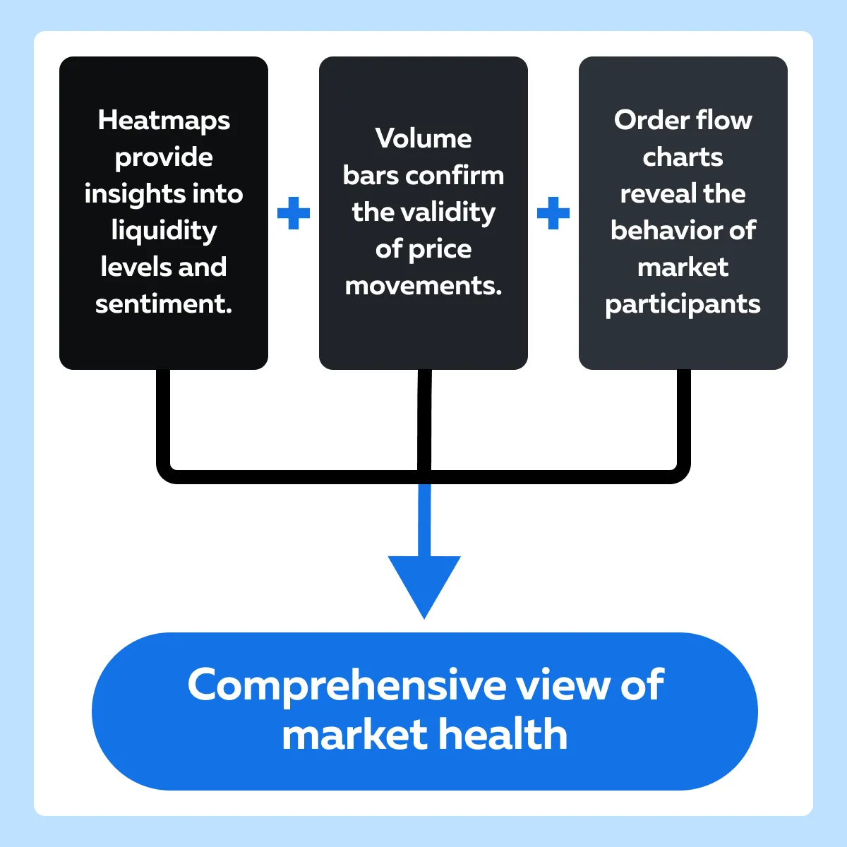
This way you can gain a comprehensive view of market health by integrating different layers of market data. Let’s understand in detail:
| Volume Bars | Order Flow Charts |
|
|
Conclusion
Using heatmaps and visual tools for market analysis offers several advantages. Heatmaps provide a clear and intuitive visualization of market liquidity and sentiment. They allow traders to quickly identify trends and potential trading opportunities.
By integrating these tools into their trading strategies, traders can gain deeper insights into market dynamics. They can accurately confirm hypotheses and make more informed decisions. Some practical benefits include improved risk management, better timing of entries and exits, and enhanced overall trading performance.
To experience the benefits firsthand, traders are encouraged to explore the Bookmap’s heatmap features. Visit here to learn more about market depth visualization. Discover how Bookmap can help improve trading outcomes.
Sign Up Now