


See liquidity more clearly in real time.
Compare plans to access deeper market visibility for liquidity.
Education
August 26, 2025
Updated
How to Set Profit Targets Using Liquidity Maps
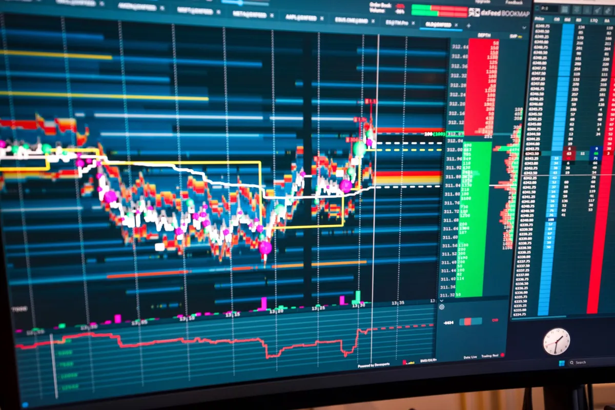
Most traders spend hours perfecting their entries. But when it comes to exits, they rely on gut feeling. They grab profits too soon out of fear, or hold on too long, hoping for more. The sorry result? They watch the price getting reversed exactly at a level where big players were waiting.
Want to avoid this trap? Liquidity maps can help you! They show you, in real time, where the market is likely to react. These maps also display the hidden zones where large buy or sell orders sit. By reading these heatmaps, you can plan your exits with logic and not emotion.
Read this article to learn how to use liquidity maps and set better profit targets. You will also understand the ideal trader reactions at key price levels and the usage of popular liquidity analysis tools, such as Bookmap.
Why Liquidity Defines the Real Market Structure
Do you know what truly defines how the market moves? You might be guessing, price or volume, isn’t it? But you are wrong! It’s “liquidity”. When you study a “liquidity map”, you start to see where traders are waiting to take action, not just what has already happened.
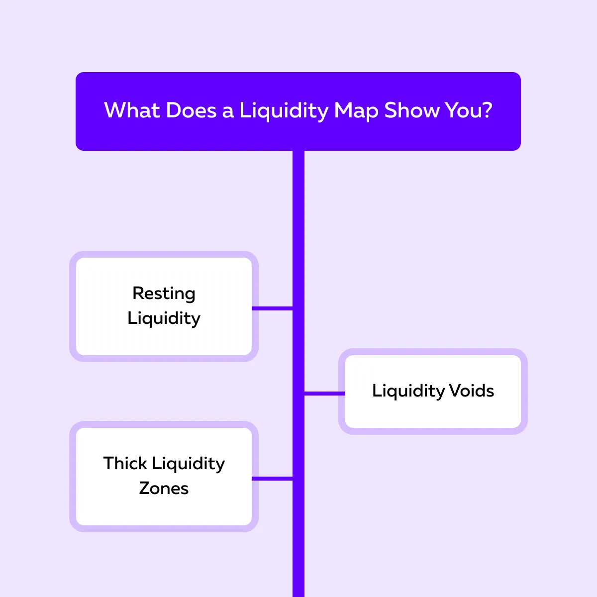
Be aware that traditional charts only show price candles and trading volume. Both represent past activity. But a liquidity map shows you the:
and
- Buy and sell orders that are resting in the order book, waiting to be triggered.
Let’s understand why both of them matter:
| Resting liquidity | Liquidity voids |
|
|
Additionally, a liquidity map shows you the “thick liquidity zones,” which are areas with many orders. In these zones, the market usually reacts or pauses, as buyers and sellers meet in large volume.
So, as a trader, you must understand that price doesn’t move randomly in the market. It travels from one liquidity zone to another, where most orders are placed. By following the liquidity maps trading approach, you can plan better profit targets and exits.
For more clarity, let’s study an example:
-
- Say you entered a long trade at 4600.
- You notice on your liquidity map that a large sell liquidity zone exists near 4630.
- Now, that zone becomes a logical profit target.
- Why? Because it’s where many traders will likely:
- Take profits
or
- Open new short positions.
- When that happens, the price will stall or reverse.
Veteran trader Tom B. from Trader Lab explains in his sessions that by aligning your strategy with these liquidity levels, you’re trading in sync with the underlying structure that drives the market, rather than just reacting to price moves after they happen. Use liquidity maps to plan exits with precision → Compare Packages.
How Do Liquidity Heatmaps and Depth Charts Visualize Market Depth?
“Liquidity map” is often used loosely to describe a few related but distinct visualizations, and it’s worth being precise about which one you’re looking at:
- A liquidity heatmap (what Bookmap displays) shows resting limit orders across price levels over time, using color intensity to represent size — brighter or thicker bands mean more resting liquidity at that price. This is a real-time, continuously updating picture of the order book as it actually exists.
- A depth chart shows the same resting order data at a single moment, typically as a static step chart of cumulative bid and ask size moving away from the current price. It’s a snapshot rather than a time-based view — useful for seeing the book’s current shape, but it doesn’t show how that shape has been evolving.
- A DOM (Depth of Market) ladder shows the same resting orders as a numeric list by price level, typically used for direct order entry rather than visual pattern-reading.
All three are built from the same underlying order book data — the difference is presentation and whether time is part of the picture. The heatmap is what most of the liquidity-reading techniques in this article assume, since spotting whether liquidity is building, pulling, or holding steady requires seeing it change over time, not just at one instant.
How to Read Liquidity Maps for Target Placement
Reading a liquidity map is like reading the hidden blueprint of the market. Why? That’s because it shows you where traders have placed their buy and sell orders. This knowledge allows you to set better entry and exit levels, particularly your profit targets.
Is there a tool for this purpose? Yes, Bookmap is one of the most popular tools for liquidity map trading. Let’s understand how you can use it step by step:
Step I: Identify Major Liquidity Clusters
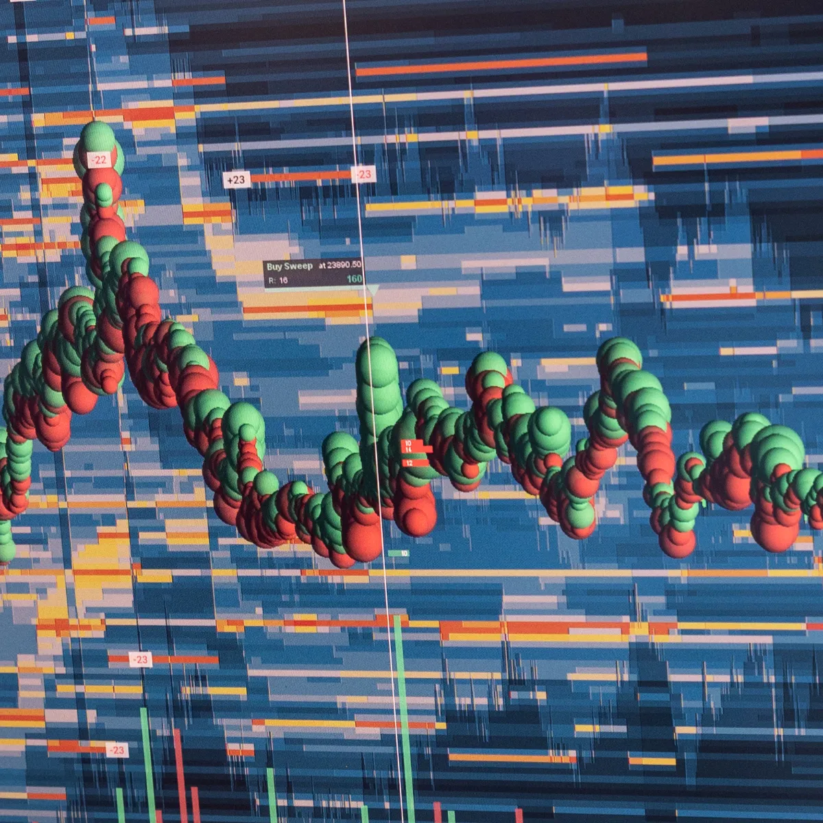
On the Bookmap heatmap, you’ll see bright horizontal lines. These lines represent resting limit orders. For those unaware, these are large buy or sell orders sitting in the order book. The brighter or thicker the line, the greater the liquidity waiting there. These are key zones where price is likely to react.
Step II: Determine Relative Size and Importance
Remember that not every line carries equal weight. Thicker or brighter zones show areas of heavy order concentration. The more intense the color, the higher the chance that price will slow down, bounce, or reverse there. These are your high-probability target areas.
Step III: Mark The Likely Profit-Taking Levels
Now, look for places on the map where the price previously stalled or reversed. Those spots often attract new reactions when the price returns. You can mark these as profit-taking zones for your trades.
Step IV: Adjust as Liquidity Updates
Liquidity is not static. It changes constantly as traders add or remove orders. Thus, continue to monitor your map and update your targets accordingly as new liquidity forms or old zones fade.
For more clarity, let’s study an example:
- Assume that on Bookmap, you see several liquidity bands stacked near a round number like 4600.
- Now, that level becomes a strong magnet for price.
- It’s a clear signal that many traders plan to act there.
- This makes it an ideal spot to reduce or exit a position.
Use Bookmap’s heatmap to align your exit plan with true market structure → Compare Plans.
Types of Targets Based on Liquidity Behavior
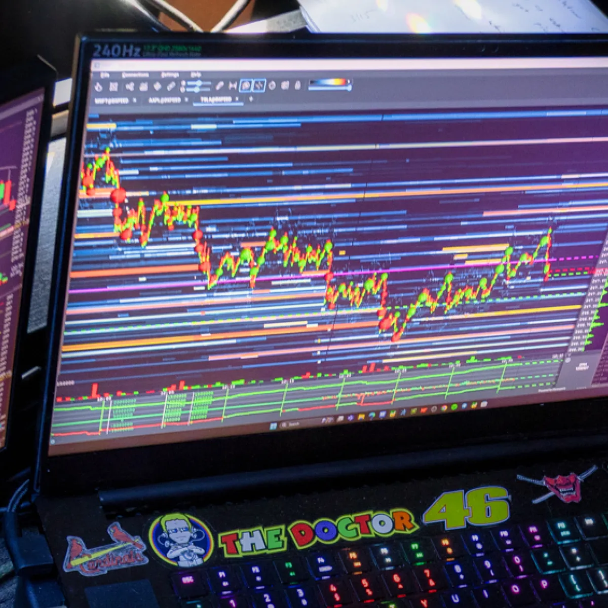
When you perform liquidity map trading, not every liquidity zone has the same meaning. That’s because the market’s behavior around those zones tells you:
- How to manage your trade
and
- When to take profits.
To improve your decision-making, check out the different types of targets based on liquidity behavior:
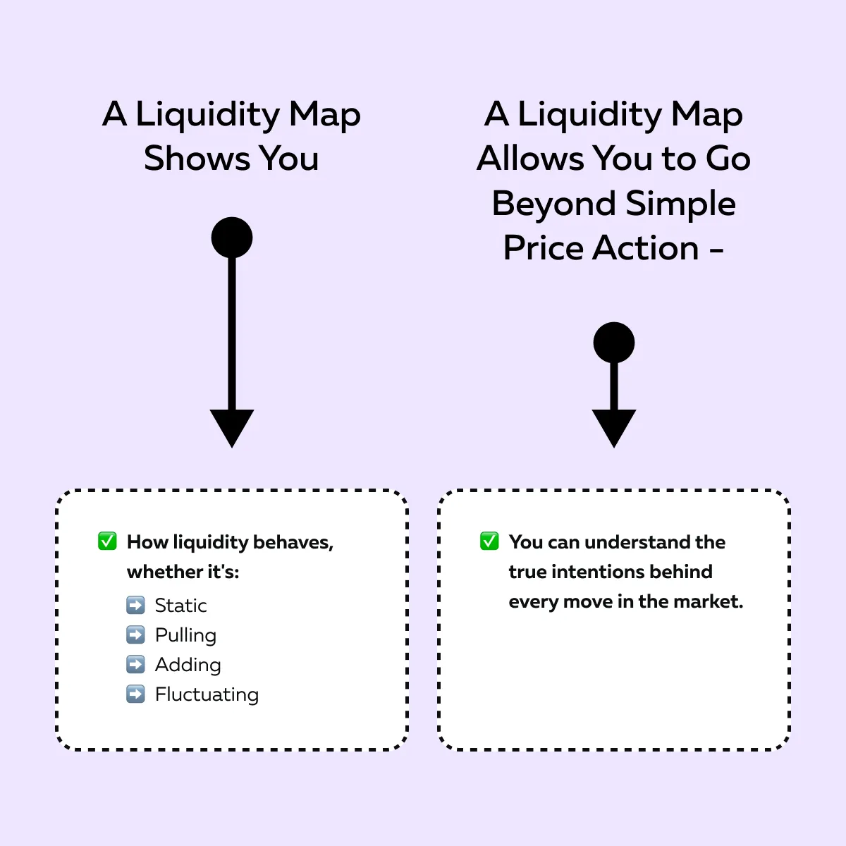
1. Static Targets
Static targets appear when liquidity remains steady and visible as the price approaches.
It shows that large traders are confidently waiting there. These zones are ideal for partial profit-taking because the price is very likely to react when it reaches them. For example,
- Let’s say you are long from 4600.
- A strong static liquidity zone sits at 4620.
- Now, as the price nears 4620, taking some profits there is smart.
- That’s where many others will do the same.
2. Pulling Liquidity
Sometimes, just before the price reaches a large liquidity area, those orders suddenly disappear.
Now, that’s a sign that traders are no longer confident. They’re pulling their orders to avoid getting filled.
In such cases, the price may move faster and overshoot. However, remain cautious as it also shows fading conviction. As a trader, you may want to exit earlier before the market reverses.
An Expert Tip – When you see pulling liquidity, be alert! It often means the move is losing strength.
3. Adding Liquidity
In this scenario, as the price approaches a level, new orders continually appear. This makes that zone thicker or brighter on your liquidity map. Interpretation? This behavior usually signals that strong sellers or buyers are preparing to defend that area.
Thus, it often becomes a reversal or absorption zone. As a trader, it is always wise to book profits or reduce your position before the price hits it. For example,
- Let’s say heavy sell liquidity gets added just above your target.
- Now, this means strong sellers are waiting there.
- Therefore, it is advisable to book profits before a potential reversal.
4. Spoofing or Fluctuating Liquidity
Sometimes, liquidity flashes on and off rapidly. This is called spoofing, where traders fake their intent to mislead others. Be aware that this is a manipulative tactic and these zones are unreliable. Thus, always avoid treating them as solid targets because they can vanish instantly.
See where the market is likely to react before it happens → Compare Packages.
Combining Context and Liquidity for Smarter Exits
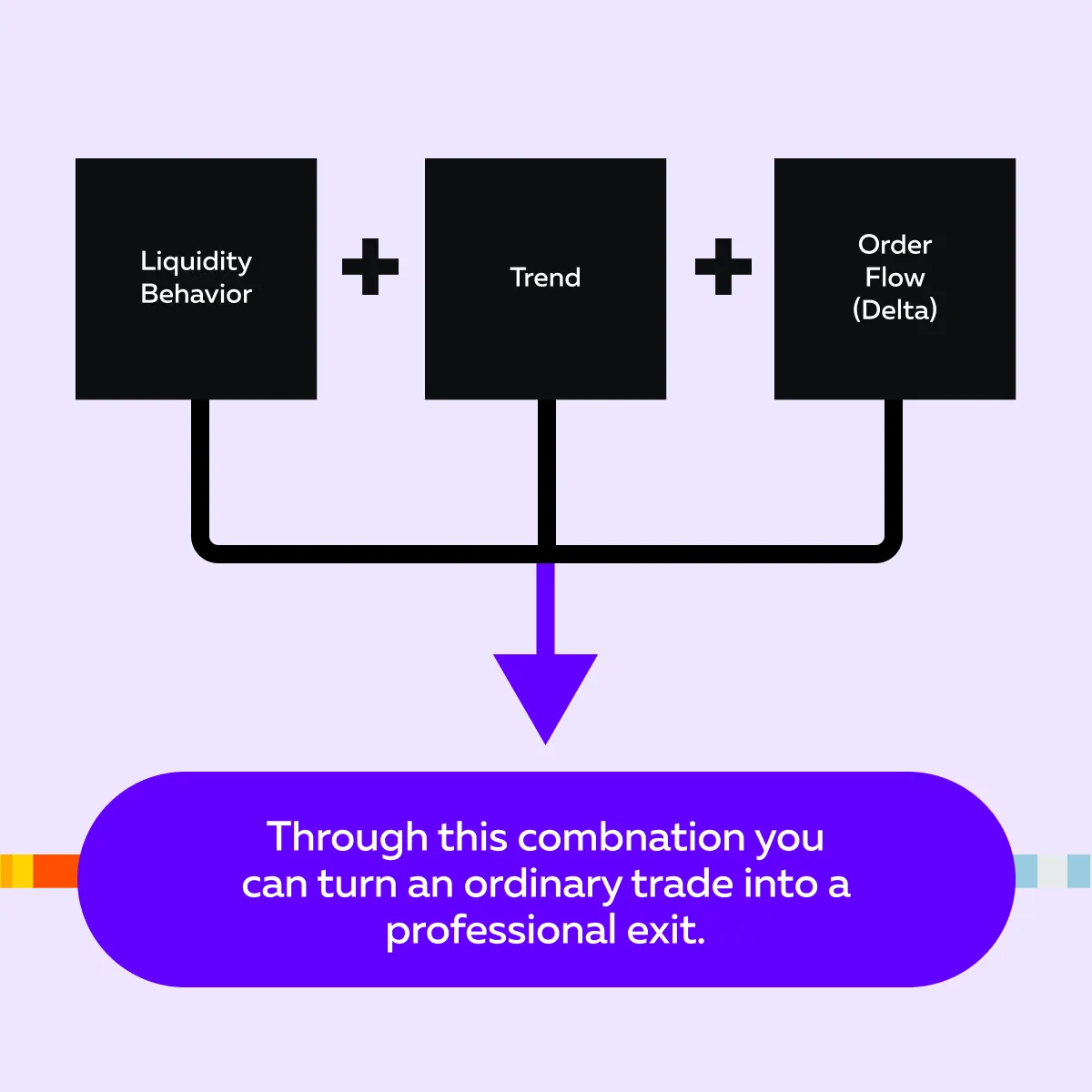
Okay, so how to trade effectively with liquidity maps? You need to combine what you see on the map with the market context, such as things like:
- Trend,
- Structure, and
- Delta.
The benefit? Liquidity alone tells you where orders are, but context tells you which zones actually matter most. Let’s see how to connect both of them:
1. Combine Trend with Liquidity
In a strong trend, price often keeps pushing forward, even through the first few liquidity zones. Reason? That’s because momentum is high, and traders are aggressively buying or selling in the same direction. Let’s see what your ideal approach is:
| In a Trending Market | During Range-Bound Days |
|
|
2. Watch Delta and Absorption
Delta measures buying vs. selling pressure. It shows whether aggressive buyers or sellers are in control. Now, when the price approaches a liquidity zone, look at delta closely:
Similarly, if you see absorption (large orders holding price in place without moving), it signals a slowdown. This is another reason to consider exiting.
3. Apply It in a Real Trade Example
Let’s say you’re long in an uptrend, and you see strong sell liquidity ahead on your map. Now, if delta remains positive, hold part of your position. There might be a final push higher before reaction.
In contrast, if delta weakens as the price reaches that zone, take profits. That’s a sign of absorption and shows that strong sellers are stepping in. It also indicates that momentum is slowing down.
Stop guessing targets — let real liquidity guide your exits → Compare Plans.
Mastering Price Structural Analysis: Key Financial Asset Metrics
Beyond the liquidity heatmap itself, a handful of supporting metrics help confirm whether a given zone is actually likely to hold as a profit target rather than get run through:
- Cumulative Volume Delta (CVD) — a running total of aggressive buy volume minus aggressive sell volume. Rising CVD into a resistance-side liquidity zone suggests buyers are still pushing; flattening or falling CVD into that same zone suggests the move is losing conviction right where it matters.
- Open interest (for futures and crypto derivatives) — rising open interest alongside a price move suggests new positioning is driving it; flat or falling open interest suggests the move is being driven by existing positions unwinding, which behaves differently around liquidity zones.
- Volume profile — where volume has concentrated historically at a given price. A liquidity zone that lines up with a high-volume historical price level tends to carry more weight than one sitting in a historically thin area.
None of these metrics work well in isolation — the case study later in this article shows how combining a liquidity zone with a delta read (rather than looking at either alone) is what actually separates a reliable profit target from a coincidental price level.
How to Execute Trades Using Liquidation Levels
Liquidation levels are a distinct concept from the resting-order liquidity covered throughout this article, and worth not confusing with it. A liquidation level is the price at which a leveraged position — most commonly in crypto perpetual futures — gets forcibly closed because posted margin can no longer cover the position’s losses. Liquidation clusters form where large numbers of leveraged positions share a similar liquidation price, typically visualized through aggregated open-interest and leverage data rather than the order-book depth a liquidity heatmap shows.
The trading relevance is real: price approaching a dense liquidation cluster can trigger a cascade — forced closures push price further in the same direction, triggering the next cluster, and so on — producing fast, sharp moves that don’t necessarily reflect organic buying or selling interest. This makes liquidation clusters worth checking as a separate input alongside a liquidity heatmap, particularly in crypto markets where leverage is common and liquidation cascades are a frequent source of the sharpest intraday moves. Since liquidation data comes from a different source than order-book depth, treat the two as complementary reads rather than expecting one tool to show both.
Where Can You Track Asset Concentration in Crypto and Forex?
Liquidity and order concentration look somewhat different depending on the asset class, since market structure itself differs across crypto, forex, and traditional futures/equities.
Choosing the Right Data: Crypto vs. Equity Systems
Crypto markets are fragmented across many exchanges, each with its own separate order book — meaning liquidity visible on one exchange doesn’t capture the full picture across the asset. Equity and futures markets, by contrast, are more centralized around a smaller number of primary venues, so a liquidity heatmap on a major futures contract captures a larger share of total market activity than the equivalent view on a single crypto exchange typically does. This is worth factoring in specifically when comparing how “reliable” a liquidity zone looks across asset classes — a crypto liquidity zone on one exchange carries different weight than a futures liquidity zone on the CME.
Analyzing Bitcoin Derivatives Clusters and Ethereum Spot Concentration
Bitcoin’s most actively traded liquidity sits predominantly in derivatives (perpetual futures) rather than spot markets, which is part of why liquidation clusters (covered above) are especially relevant for BTC specifically — a large share of BTC price action is driven by leveraged derivatives positioning rather than direct spot buying and selling. Ethereum shows a somewhat more balanced split between spot and derivatives activity, meaning spot order book concentration carries relatively more weight for ETH than it does for BTC.
This difference matters practically: a trader applying the same liquidity-reading approach across both assets should weight liquidation-cluster data more heavily for BTC and give relatively more attention to spot order-book concentration for ETH.
Forex Institutional Zones
Forex liquidity is structurally different again — the market is decentralized across a network of banks and liquidity providers rather than a single order book, and the largest resting size tends to concentrate around round numbers and prior significant highs/lows where institutional desks are known to manage large flows. This is part of why round-number levels carry outsized significance in forex specifically, more so than in equities or futures, where liquidity concentration is less tied to psychologically round prices and more tied to actual historical volume.
Interpreting Cumulative Delta Across Asset Classes
Cumulative delta’s usefulness varies by how centralized the underlying market is. On a centralized futures contract, delta reflects a large, representative share of total aggressive order flow. On a fragmented crypto asset, delta calculated from a single exchange only reflects that exchange’s activity — a divergence between delta on one exchange and price action driven by flow on a different exchange is a real limitation worth being aware of, not a sign the tool is broken.
Case Study: Using Liquidity to Set and Manage Targets
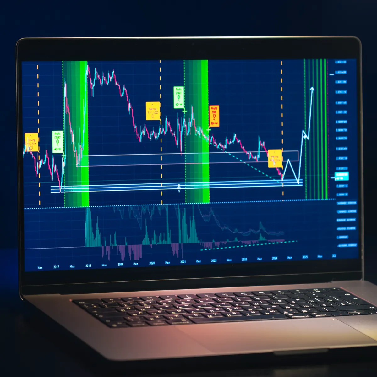
Let’s walk through a simple case study to understand how a trader can use a liquidity map to plan and manage targets with confidence (not emotion).
The Scenario
- The ES (S&P 500 futures) breaks out from 4550.
- It is showing clear support below.
- This means buyers are in control for now.
At this time, when you look at your liquidity map, you notice stacked sell orders between 4578 and 4580. These bright horizontal bands represent “resting liquidity”, where large sellers are waiting to act.
So, The Trader Builds a Plan. They set –
| The First Target | The Second Target |
|
|
What Happens Next
Later, the price climbs toward 4578. Now, you notice a change on the liquidity map. You start seeing absorption forming. This means:
- Heavy sell orders are defending that level
and
- Preventing the price from moving higher.
Now, that’s your signal – Sellers are active, and the move is losing strength. After some time, the price reverses from 4578 back to around 4565 before rebuilding for the next attempt.
The Result
- The trader followed the plan and took partial profits near 4578.
- They avoided getting caught in the pullback.
- There was no panic or second-guessing.
- This exit was based on structure and liquidity and not on emotion or hope.
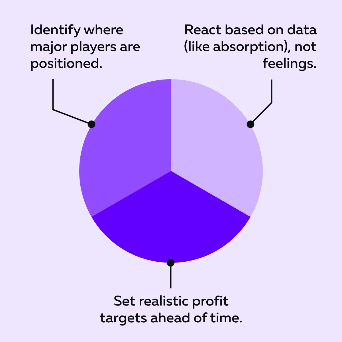
This example shows how liquidity map trading lets you:
Conclusion
How many times have you, as a trader, watched a winning trade turn into a loss? We can understand that frustration. But now you know the reason behind it —it was your lack of clear exit planning.
However, after reading this article, you have a solution. Liquidity maps help remove uncertainty. They reveal where big buyers and sellers are waiting and let you see where the price is most likely to react. With this insight, your profit targets become logical and based on real market intent. Also, instead of exiting on emotion, you can manage trades with clarity and confidence.
If you want to visualize liquidity in real time, you can start using Bookmap, one of the leading platforms for professional liquidity map trading. Plan exits using real market intent — not emotion. Compare Packages to see how Bookmap’s liquidity visualization transforms trade management.
FAQs
1. What is a liquidity map in trading?
A liquidity map shows where large buy and sell orders are placed in the market. Through it, you can see where big players are waiting to act. This knowledge allows you to understand which price levels might attract or slow down price movement.
2. Why use liquidity maps for setting targets?
Liquidity maps highlight areas where price is likely to pause, reverse, or speed up. These are ideal spots to plan profit targets, because they show where other traders are expected to react.
3. How do liquidity changes affect target planning?
If liquidity disappears or pulls away, the target becomes weaker. On the other hand, if liquidity grows or thickens, it confirms strong interest at that level. Now, it is a good reason to take profits or scale out near that level.
4. How does Bookmap help with liquidity-based targets?
Bookmap is an advanced market analysis tool. It displays liquidity in real time through a live heatmap. You can watch how buy and sell orders move or shift in the market. This information allows you to adjust your targets as market conditions change.
5. What’s the difference between a liquidity heatmap and a depth chart?
A liquidity heatmap shows resting order data continuously over time, using color intensity to show size at each price level. A depth chart shows the same type of data as a single-moment snapshot, typically as a step chart of cumulative bid/ask size. The heatmap shows how liquidity is changing; the depth chart shows its shape right now.
6. What’s the difference between liquidity levels and liquidation levels?
Liquidity levels are resting limit orders sitting in the order book, visible directly through a liquidity heatmap or depth chart. Liquidation levels are the prices at which leveraged positions (common in crypto perpetual futures) get forcibly closed due to insufficient margin — a different concept, typically visualized through separate open-interest and leverage data rather than order-book depth.
7. Do liquidity maps work the same way for crypto, forex, and futures?
The underlying logic is similar, but market structure differs. Crypto liquidity is fragmented across many separate exchanges; forex liquidity is decentralized across banks and liquidity providers rather than a single order book; futures and centralized equity markets concentrate liquidity around fewer primary venues. This affects how much weight a given liquidity zone should carry across asset classes.
8. Should I look at crypto derivatives or spot data when reading liquidity?
It depends on the asset. Bitcoin’s price action is more heavily influenced by derivatives (perpetual futures) positioning, making liquidation-cluster data especially relevant. Ethereum shows a more even split between spot and derivatives activity, so spot order-book concentration carries relatively more weight for ETH.
Sign Up Now
Latest Articles