See data more clearly in real time.
Compare plans to access deeper market visibility for data.
Education
July 18, 2024
SHARE
Visualizing Success: How Advanced Data Visualization is Changing the Way We Trade
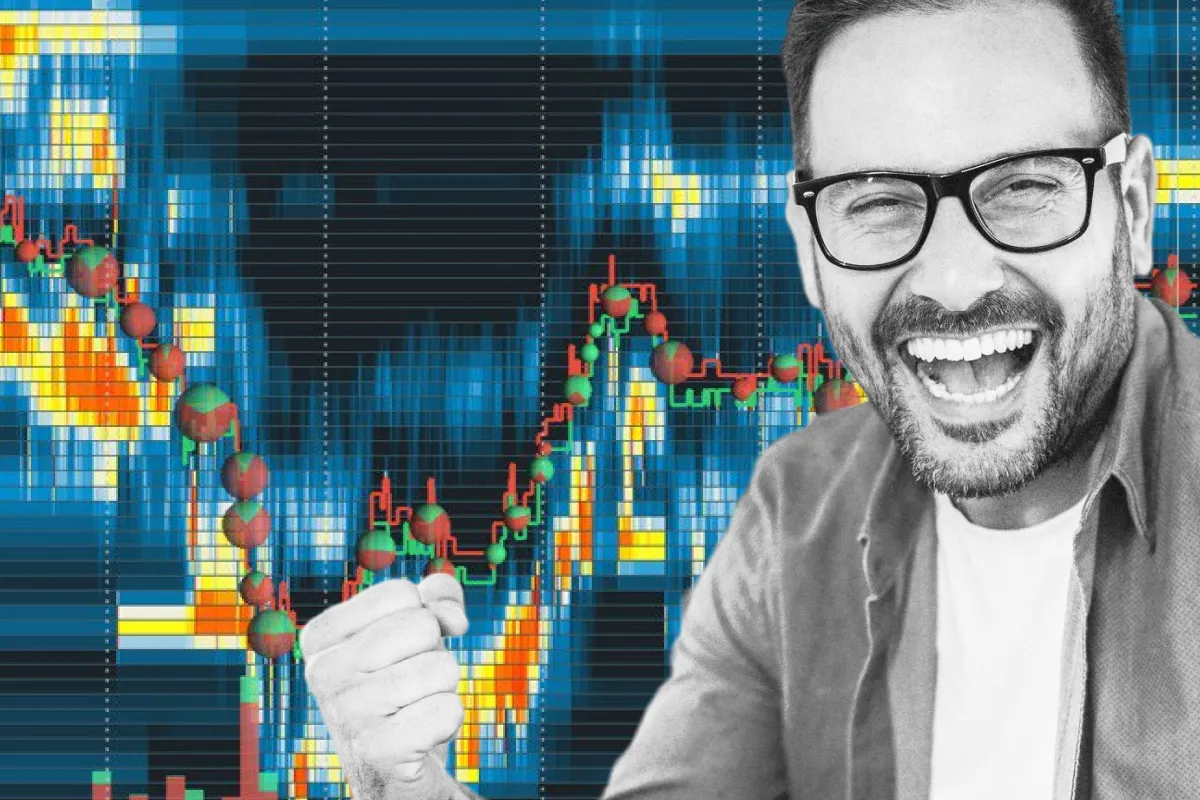
Data can be considered as trader’s fuel. Using advanced data visualization tools, traders can transform complex market data into clear visuals and understand market conditions quickly. Historically, traders relied on simple line charts and basic graphs, which struggled to keep up with the vast amounts of data in modern markets.
Now, advanced market analysis tools like Bookmap are offering modern tools like heatmaps, volume dots, and liquidity that offer deep insights into market dynamics. Through this article, let’s understand how data visualization has evolved over time and has helped traders optimize their trading decisions. Also, we will learn the practical usage of modern visualization tools through some easy examples. Let’s begin.
The Rise of Data Visualization in Trading
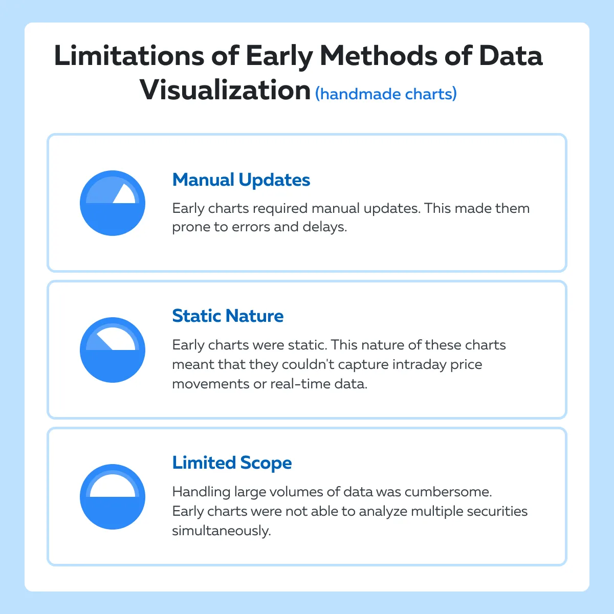
In trading, data visualization has undergone a significant transformation. It has smartly evolved and is now capable of handling vast and complex data sets. Historically, traders and analysts relied on basic methods to visualize market data, such as hand-drawn charts and tables. These traditional methods had several limitations with the primary one being their incapability to handle the sheer volume of data generated by modern financial markets.
Let’s understand better how data was visualized in the early days
In the early days of stock markets, data was visualized using simple line charts and bar graphs. These charts were often hand-drawn and represented prices and volumes on a daily or weekly basis. Early traders used to perform technical analysis using them and were able to successfully identify trends and patterns. However, these methods had several limitations:
How has data visualization evolved?
The advent of computers and digital technology in the latter half of the 20th century marked a turning point for data visualization in trading. Let’s study these changes on a timeline:
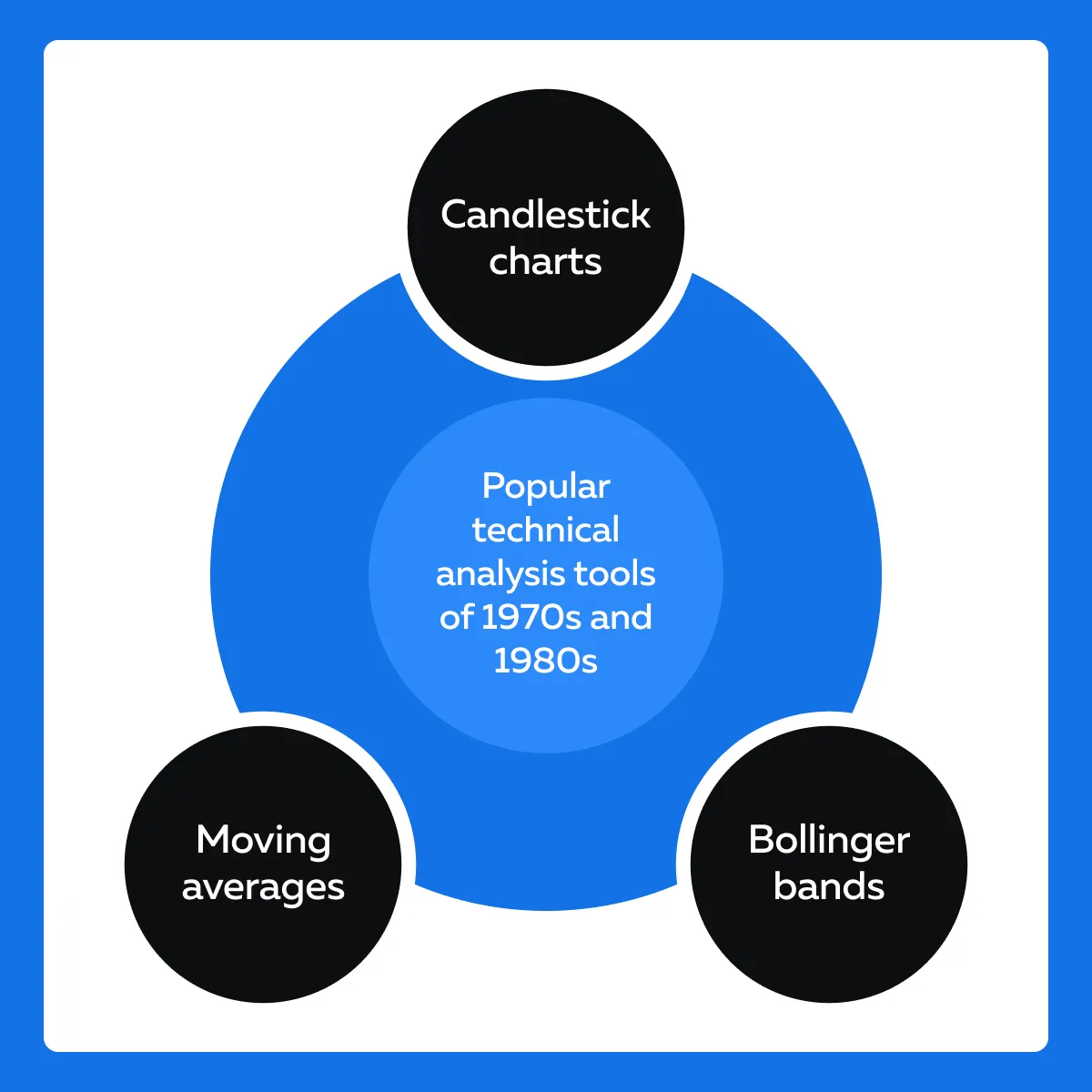
Transition to Digital Charts (1970s and 1980s)
- In the 1970s and 1980s, computer-based charting software was introduced
- This software allowed for more real-time and detailed visual representations of market data
- Traders started using tools like Excel and specialized financial software
- Using them, they were able to create and update charts automatically
Rise of Real-Time Data and Advanced Visualization (1990s and 2000s)
- The 1990s and 2000s saw exponential growth in data volume
- This growth primarily happened due to:
- Increase usage of high-frequency trading (HFT)
and
- Globalized markets
-
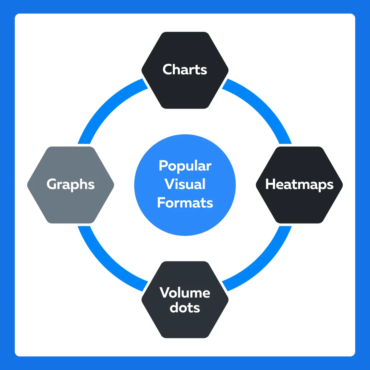
- As a result, traditional tools struggled to keep up and were replaced by advanced visualization techniques, such as:
- As a result, traditional tools struggled to keep up and were replaced by advanced visualization techniques, such as:
- Heatmaps
-
-
-
- These offered a color-coded representation of market data
- Heatmaps also highlighted areas of high activity
-
-
- 3D Visualization
-
-
- Tools like Bookmap introduced real-time 3D visualization
- It also displays liquidity, order flow, and price levels in a more intuitive format
-
The Modern Data Visualization (2010s to present)
-
- Today, data visualization in trading has reached new heights
- Advanced tools offer real-time information and can handle the complexity of modern financial markets.
- Popular market analysis platforms like Bookmap offer several features, such as:
- Dynamic Real-Time Updates
-
-
-
- Continuously updating data streams allows traders to see the market as it evolves
-
-
- Depth and Breadth of Data
-
-
-
- Visualizations include not just price and volume, but also:
- Order flow
- Liquidity heatmaps, and
- Other advanced metrics
- Visualizations include not just price and volume, but also:
-
-
- User Interactivity
-
-
- Traders can interact with the data
- They can zoom in on specific areas and filter using different parameters
- Also, they can customize their views to suit specific strategies.
-
For a more detailed exploration of the evolution and benefits of modern market data feeds, you can refer to Bookmap’s Market Data articles.
Understanding the Tools of the Trade
Several successful traders use data visualization tools to gain a competitive edge. These tools allow traders to process and interpret vast amounts of market data quickly and accurately. Let’s have a look at the most prominent data visualization tools currently used in trading:
Tool I: Heatmaps
Heatmaps are visual representations of data where individual values are represented by colors. In trading, heatmaps are used to display:
and
- Order flow
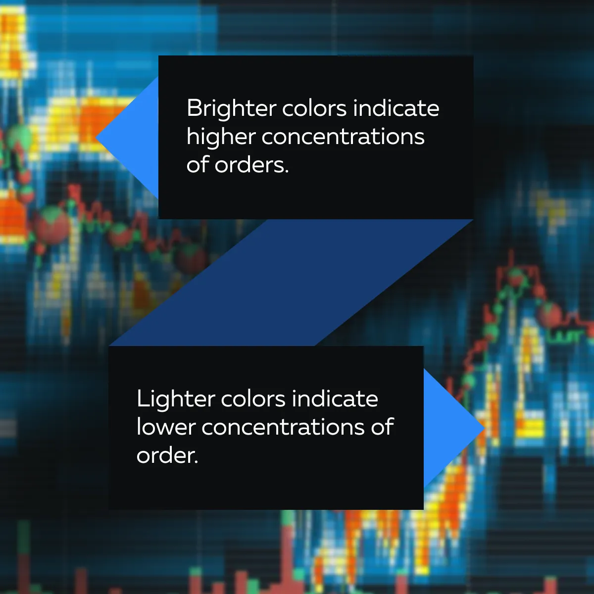
In platforms like Bookmap, a heatmap visualizes the liquidity in the market. It shows the concentration of buy and sell orders at various price levels. See the graphic below to understand how colors represent different levels of activity:
How do you gain a competitive edge?
| What are the benefits? | What does it mean? | How do these benefits help you? |
| Knowledge of Market Depth | Heatmaps show where the most significant buy and sell orders are placed | Using heatmaps, you can identify key support and resistance levels |
| Order Flow Analysis | Heatmaps track the movement of orders and reflect the intentions of large market participants | You can infer and anticipate expected price movements |
| Trend Spotting | Heatmaps reveal liquidity pockets and trends that are not visible on traditional charts | You can spot emerging trends early |
Tool II: Volume Dots
Volume dots are graphical representations of trade volume at specific price levels and times. Each dot’s size reflects the volume of trades that occurred. Further, the color indicates whether the trades were primarily buys or sells.
In a tool like Bookmap, volume dots are overlaid on the price chart. Each dot represents a trade or a cluster of trades that occurred at a specific price point and time.
How do you gain competitive edge?
| What are the benefits? | What does it mean? | How do these benefits help you? |
| Trade Visualization | Volume dots show exactly where significant trades occurred. | Using volume dots, you can get a clearer picture of market activity. |
| Volume Analysis | The dots have their own size and color offering unique interpretations. | By analyzing the size, color, and distribution of volume dots, you can:
and
|
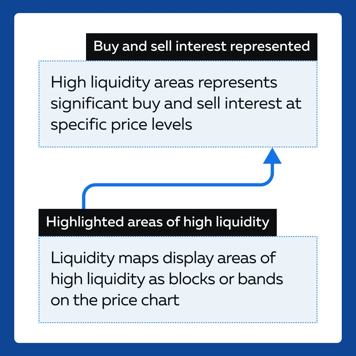
Tool III: Liquidity Maps
Liquidity maps provide a detailed visualization of where liquidity (buy and sell orders) is concentrated in the market. They often combine elements of heatmaps and traditional order book data.
How do you gain a competitive edge?
| What are the benefits? | What does it mean? | How do these benefits help you? |
| Support and Resistance Levels | Liquidity maps show where large blocks of liquidity are located. | Using them, you can better understand likely support and resistance levels |
| Order Flow Prediction | Liquidity maps display areas where large orders might be filled | You can predict future price movements |
| Market Sentiment | Maps offer visualization where traders are willing to buy or sell in large quantities | You get clues about overall market sentiment and potential market turn |
Practical Applications and Benefits
Modern traders are increasingly applying advanced data visualization tools such as heatmaps, volume dots, and liquidity maps in their daily routines. Let’s understand how:
| Heatmaps | Volume Dots | Liquidity Maps |
|
|
|
Let’s understand better using a hypothetical example.
The scenario
- Consider a trader Sarah with 5 years of trading experience
- She prefers intraday trading in the equities market
- Sarah struggled with timing her entries and exits effectively
- She often missed out on optimal price points due to the lack of detailed market activity information
The change in trading routine
- Sarah integrated volume dots from Bookmap into her trading routine
- She focused on identifying high-liquidity areas
- Sarah started her day by reviewing the previous day’s volume dots
- This review helped her identify:
- Key levels of interest
and
- Potential high-liquidity zones
- During market hours, she monitored the real-time volume dots on her Bookmap chart
- She paid close attention to significant clusters of volume
- Even Sarah used the volume dots to time her trades
- On a particular trading day, she saw a large cluster of buy volume dots at a particular price level.
- She interpreted this as strong support and entered a long position
The improved outcome
- By identifying high-liquidity areas, Sarah was able to enter trades at levels where support was more likely to hold.
- This identification resulted in more favorable entry points.
- Volume dots helped her identify resistance levels
- Resultantly, she was able to exit trades before potential reversals
Visual Analytics for Strategy Development
Data visualization plays a crucial role in the:
- Development
- Testing, and
- Refinement of trading strategies
Let’s understand each of these terms individually:
Developing Trading Strategies
Visualization tools allow traders to identify patterns and trends in historical data. For example,
- Heatmaps can reveal recurring liquidity pockets
- Volume dots show significant trading activity at key price levels
Additionally, traders can use visual data to determine how certain market conditions affect price movements.
Testing Strategies
Backtesting is a process through which a trading strategy is tested against historical market data. This process helps traders understand how their strategies would have performed in different market conditions. Let’s observe some backtesting steps:
- Step I: Historical Data Collection: Traders gather historical market data relevant to their strategy.
- Step II: Strategy Application: The strategy is applied to this data to simulate trades based on historical price movements
- Step III: Performance Evaluation: The results are analyzed to assess the strategy’s effectiveness. The following metrics are considered:
- Profit and loss
- Win rate
- Drawdown
For a more detailed explanation of backtesting, you can refer to this Bookmap article on backtesting a trading strategy.
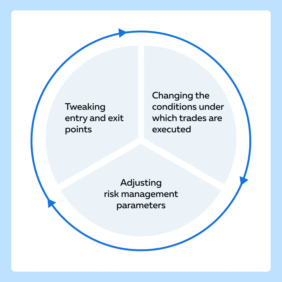
Refining Strategies
Data visualization tools allow traders to overlay historical performance with real-time market activity. This visual comparison helps in identifying:
- Discrepancies
and
- Areas for improvement
Based on the information gained from backtesting and visual analysis, traders can make adjustments to their strategies. See the graphic below to become aware of some popular refining strategies:
How Traders Use Bookmap For Strategy Refinement?
Several traders use Bookmap to overlay historical data with real-time market activity. This allows them to see a visual comparison that helps in fine-tuning strategies. Let’s understand better through a hypothetical example:
- A trader named John wants to refine his strategy for trading S&P 500 futures.
- He uses Bookmap to overlay historical data with real-time market activity.
The steps performed by John
| S. No. | Steps | What did John do? |
| I | Historical Data Visualization |
|
| II | Strategy Application |
|
| III | Performance Analysis |
|
| IV | Real-Time Comparison |
|
| V | Refinement |
|
The outcome
By using Bookmap’s visualization tools, John successfully refines his strategy. He is able to improve his trading performance by avoiding trades during high volatility.
Navigating the Market with Enhanced Insight
Advanced data visualization tools can transform vast amounts of raw market data into visual formats. This kind of visualization highlights critical information that makes it easier for traders to spot:
- Trends
- Patterns, and
- Anomalies
Visualization tools provide real-time updates and allow traders to:
- See live market movements
- Respond promptly to changes
Furthermore, using these tools traders can identify patterns and trends that are not immediately apparent in numerical data. For example, heatmaps can reveal areas of high liquidity, while candlestick patterns might indicate potential market reversals.
How Gaining a Comprehensive Market View Helps?
- Aggregated views of market data provide a holistic picture of market sentiment
- This includes visualizations of buy and sell orders
- These visualizations help traders understand overall market demand and supply situations
Overcoming Challenges with Visualization
It is common for traders to face several challenges in their daily activities, especially in the context of information overload. The vast amounts of data generated by modern financial markets can be overwhelming and make it difficult for traders to:
- Identify relevant information
and
- Make timely decisions
Often the sheer volume of data from various sources leads to analysis paralysis making it difficult to focus on what’s important.
How Effective Visualization Mitigates These Issues?
Effective data visualization techniques transform complex and voluminous data into clear and actionable insights. Let’s see how visualization helps:
- Highlighting Key Data
-
- Visualization tools highlight the most important data points, such as:
- Significant buy/sell orders
- Visualization tools highlight the most important data points, such as:
or
- High-liquidity areas
- This highlight makes it easier to focus on critical information
- Reducing Clutter
-
-
- Advanced visualization platforms like Bookmap use filtering techniques to remove unnecessary data
- This removal presents a cleaner and more focused view of the market
-
- Simplifying Complexity
-
- By representing complex data visually, these tools simplify interpretation.
- This simplification allows traders to:
- Quickly grasp market conditions
and
- Make informed decisions
Let’s study a hypothetical example and see how using Bookmap a trader transformed cluttered data into clear insights:
The Scenario
- A trader named Alex is struggling with the overwhelming amount of data from multiple market feeds
- He is confronted with raw data streams that include every single:
- Trade
- Order, and
- Price movement
- This data is overwhelming and difficult to process manually.
The Usage of Bookmap’s Visualization Tools
- Alex starts using Bookmap
- Being an advanced market analysis tool, it offers several latest visualization features that filter and simplify market data
- Let’s see which tools Alex used and how they helped him:
| Heatmaps | Volume Dots | Order Flow Analysis |
|
|
|
The Filtered Visualization
-
- Bookmap allows Alex to apply filters to focus on specific data
- For example,
- Trades above a certain volume threshold or
- Orders within a particular price range
- This filtering capability helps Alex reduce clutter and concentrate on the most relevant information.
The Outcome
- With the clutter removed and key data highlighted, Alex can now see clear patterns and trends.
- On a particular trading day, Alex notices a high concentration of buy orders
- This concentration was just below the current price
- On analysis, Alex identified that this situation suggests strong support
- He decides to enter a long position, anticipating a price bounce from this support level.
Conclusion
Advanced data visualization has truly evolved from handmade charts and graphs. Today’s modern visualization tools turn complex data into clear and easy-to-understand visuals. This transformation helps traders see important market trends and patterns that might be missed otherwise.
Advanced market analysis tools like Bookmap offer tools like heatmaps, volume dots, and much more. These tools highlight key data points and make it easier to focus on what matters the most. Understand Bookmap’s features in detail from here.
Sign Up Now