Main Chart
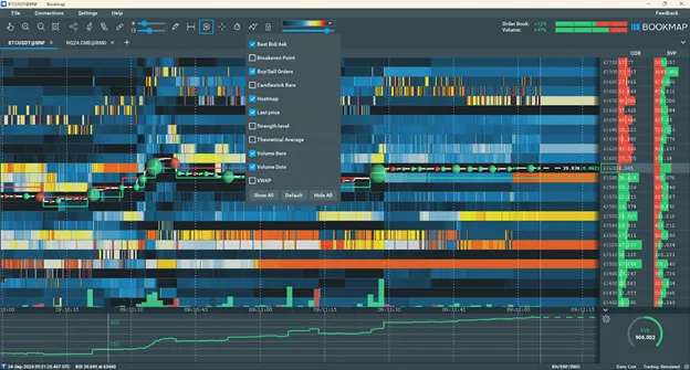
Main chart elements:
- Heatmap
- Volume Dots
- Volume Bars
- Best Bid and Ask
- Last price
These elements, alongside other components, can be enabled/disabled from the visible components menu.

Heatmap
The Heatmap visually represents both current and historical liquidity in the order book.
You can see the scale of the Heatmap in the toolbar.
- The redder the colour, the higher the liquidity.
- Colder (or bluer) colours – ending with dark blue – indicate lower liquidity.
- You can also change the intensity of the heatmap colors or use greyscale.
Volume Dots
Volume dots depict trade volume at specific prices, with larger dots indicating more volume. For volume dots:
- Bid aggressors are green.
- Ask aggressors are red.
Learn more about Volume dots and their settings in this article or this video.
Volume Bars
Volume bars show the traded volume within the bar timeframe. In other words, from the left edge of the bar to the right edge.
Learn more about Volume bars and their settings in this article or the video.
Best Bid and Ask and Last Price
Best bid and offer lines (BBO) mark prices for the highest buyers and lowest sellers.
The Last Price refers to the most recent price at which a trade was executed. This value is continuously updated in real time as trades occur in the market.
You can switch between two modes for displaying the BBO and Last Price lines:
- Show only the last value in a pixel: This option simplifies the chart, making it cleaner, but it does not capture peak values within each pixel.
- Reflect the price range for each pixel: This option displays the exact minimum and maximum values, providing precise details, though it may result in a noisier chart.
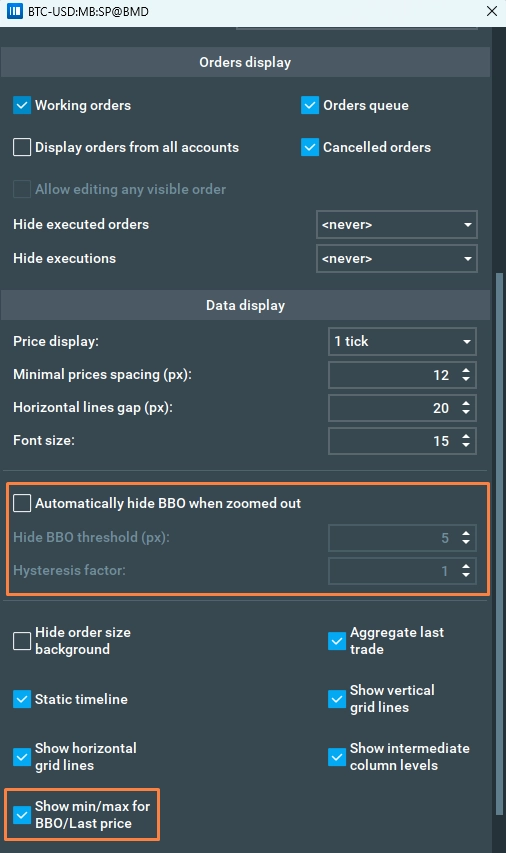
To toggle between these modes, enable or disable the "Show min/max for BBO/Last Price" option in the configuration pop-up.
Hide BBO Lines on Zoom-Out
This feature automatically hides the Best Bid and Offer (BBO) lines when you zoom out vertically, and their visual separation becomes too small to display clearly. Instead, only the Last Price line will be shown to reduce clutter and improve chart readability.
You can configure:
- Hide Threshold – The minimum pixel distance between the BBO lines. If their separation drops below this value, the lines are hidden.
- Hysteresis Factor – A margin that prevents the lines from flickering on and off. Hidden BBO lines will only reappear once their separation increases beyond:
Reappear Threshold=Hide Threshold×(1+Factor)
Example: 0.0 = no margin, 0.1 = 10% wider distance required to reappear.
